Project Updates
Project: Logo Design
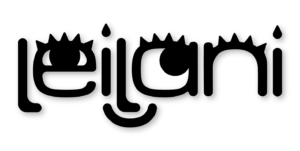
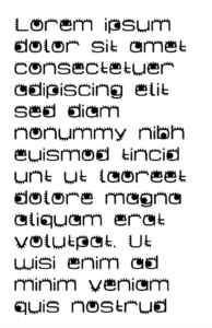
Notes: I wanted to go more in depth on how I created my wordmark logo and what I used specifically to create it. The font, was designed by me and I utilized the features of the human eye, which represented not only a unique typographical style but also a connection to being unique. The custom font allowed me to convey a sense of artistic individuality and innovation, while simultaneously upholding professionalism. The selection of the letters and their careful customization allowed for a balanced and aesthetically pleasing representation of my brand name. The result was a cohesive and memorable visual identity that left a strong and lasting impression on my audience, enhancing the overall branding of my personal branding.
Project: TBD Project
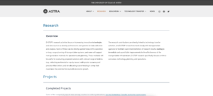
Notes: Developing a content management website for the TBD project within WordPress has been a streamlined and efficient process, aligning with the client’s preference for simplicity and readiness. Utilizing the Astra theme, Astra Pro plugin, and other essential plugins has allowed for a solid foundation and ease of design customization within the WordPress environment. Although these in-built design tools may not match the personal customization of Figma, they’ve proven to be effective in speedily crafting a functional and visually appealing site. The reduced flexibility is compensated by the advantage of delivering a website that’s almost ready for immediate deployment. As for creating a logo to complement this website, the design process has been equally seamless, ensuring the logo seamlessly integrates with the site’s aesthetics and the client’s brand identity. The combination of a user-friendly web development approach and a thoughtfully designed logo has resulted in a promising project that aligns well with the client’s vision for a straightforward content management website.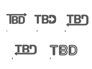
Project: Intermediate Training: UI/UX with Figma
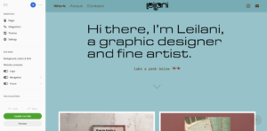
Notes: Creating my portfolio site for work training has been a rewarding experience, allowing me to develop a range of skills that extend beyond my skills already at hand. One of the most significant areas of growth has been in UI/UX design in Figma, where I learned to prioritize user experience and design interfaces that are both intuitive and visually appealing. The process of developing my portfolio site pushed me to think critically about the user journey, ensuring that navigation is seamless and information is presented in a clear and organized manner.
Self-branding became another focal point during this journey. Crafting a personal brand involves much more than just creating a logo or choosing a color scheme. It’s about defining who I am professionally and communicating that effectively through every site element. In terms of overall work organization, building my portfolio site required meticulous planning and project management. This experience also significantly improved my project management skills and reinforced the importance of organization in any design endeavor.
Surprisingly, what I initially considered a training task turned out to be an enjoyable and fulfilling experience. The creative freedom to shape my personal space online and the learning opportunities each design decision presented made the process not only educational but also genuinely fun. It was like sculpting a digital representation of my professional self. As I near the completion of my portfolio site, I’m excited about the prospect of showcasing my work, skills, and personality to potential employers or clients. The journey has been a testament to the power of design in self-expression and communication. I look forward to applying the insights gained from this experience to future projects and continuing to refine and expand my online presence.
