Updates 6/20/22
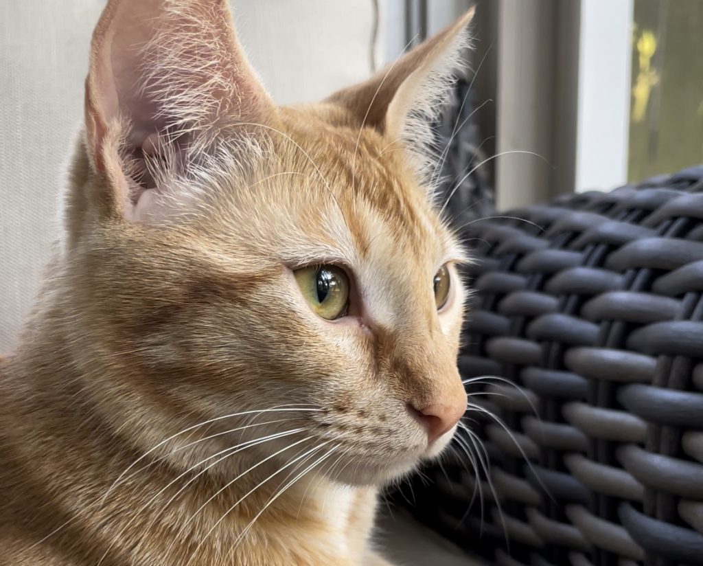
above: the striped house-cat in his natural habitat – the catio
Hello! Here are my updates as of 6/20/22:
Photo IDs
This past week I have primarily been working on photo ID requests for various COLA faculty, grad students, and staff.
We are currently planning to update the photo ID KB, and I am planning to create a document so this was a chance for me to get a sense of what I think may need be changed.
Almost all of the requests sent to me were perfect. Two graduate student images were missing, but I was able to contact them and have them successfully resubmit. I am currently waiting on one image to be resubmitted. I may need to send a follow up email if the corresponder does not respond at some point this week.
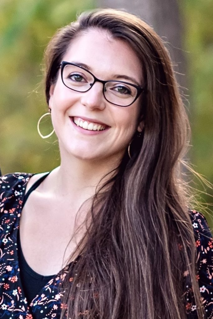
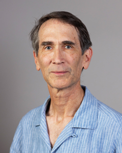
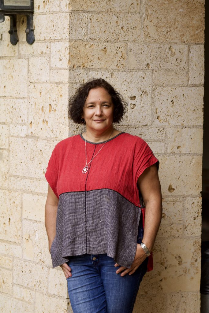
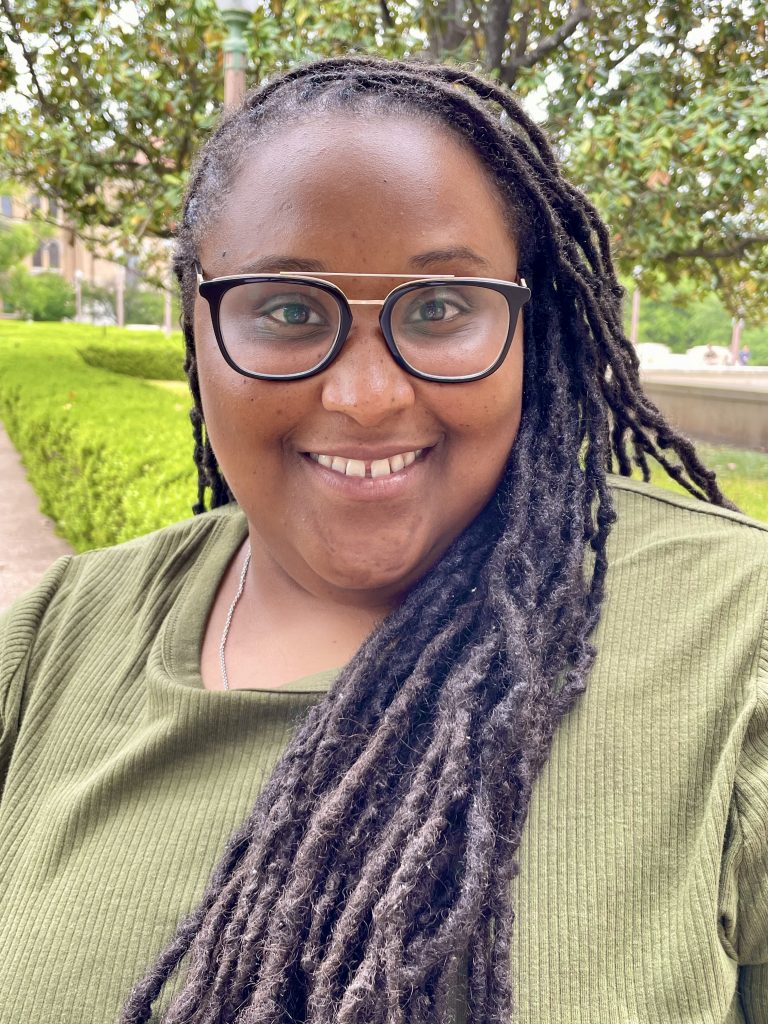
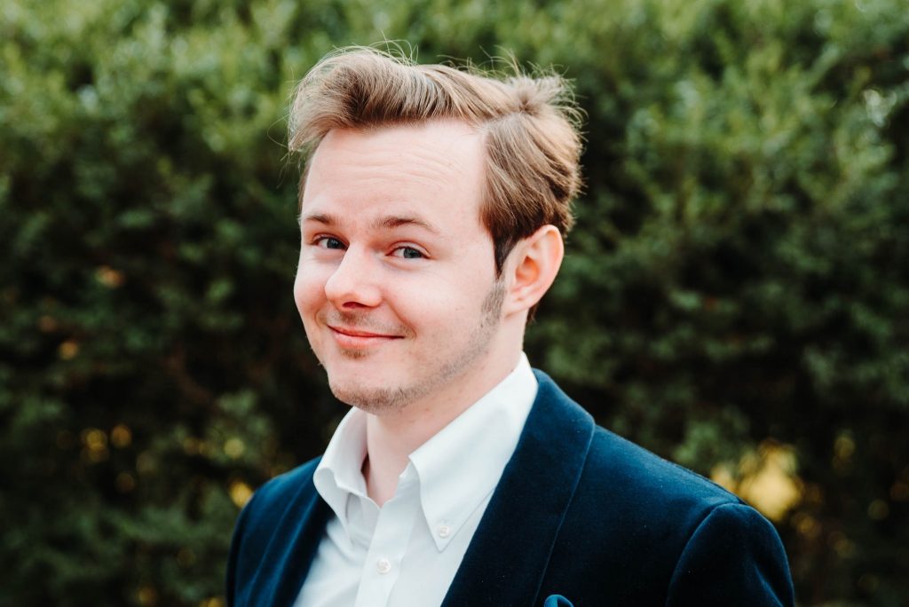
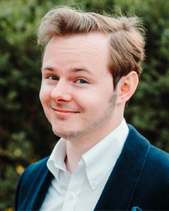
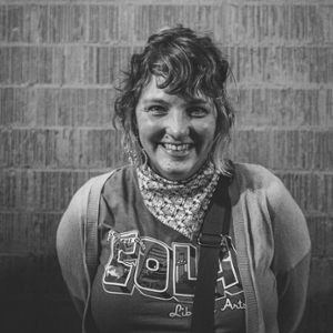
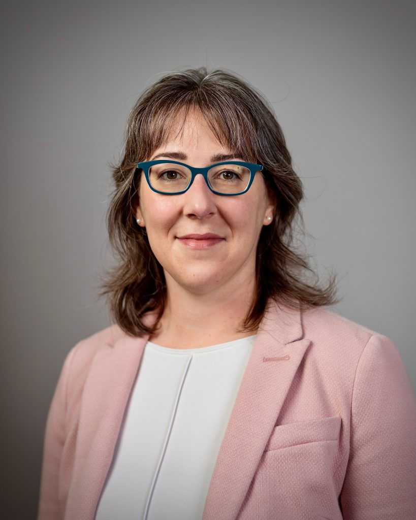
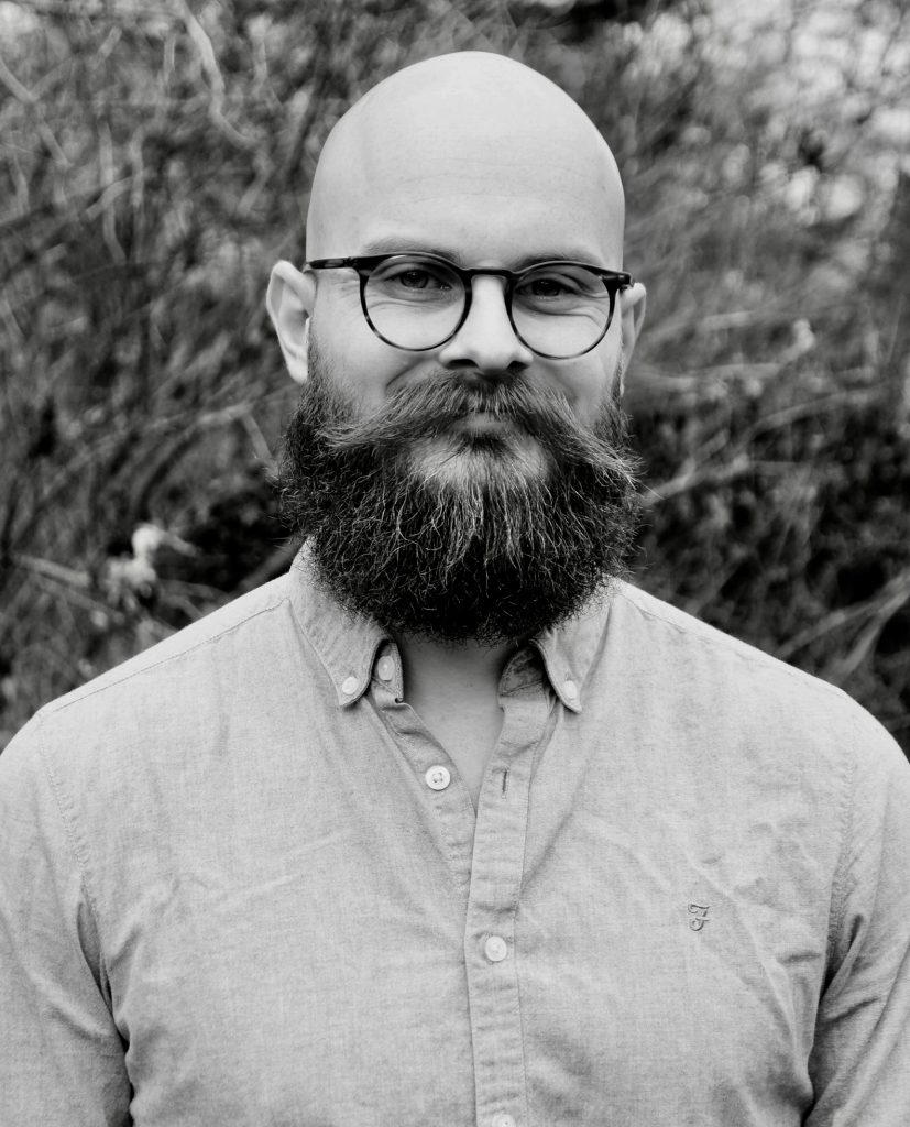
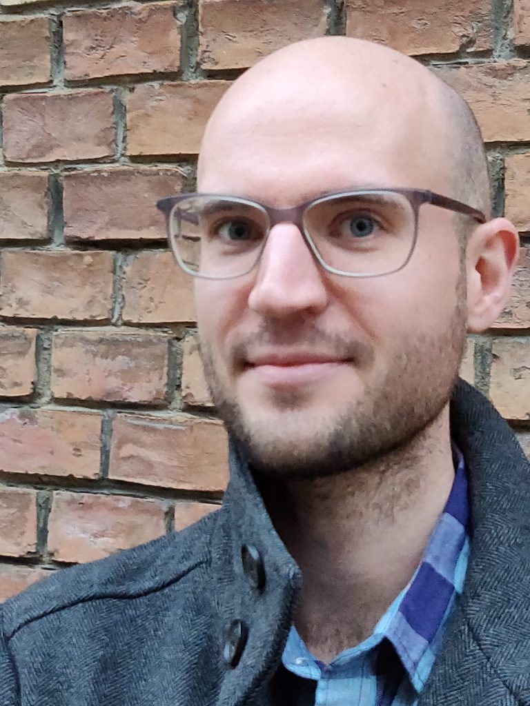
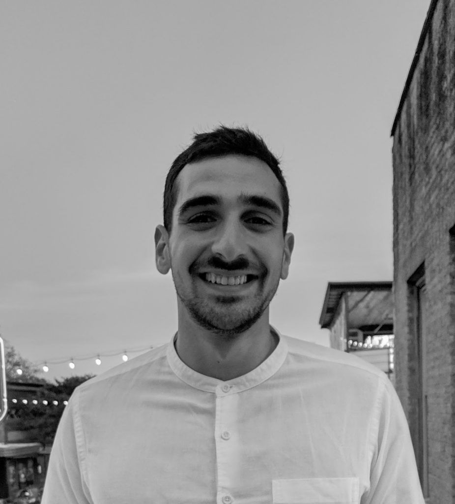
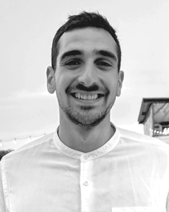
Here are the original images (left) vs. the cropped edits:
This image was very nice and needed very few edits. I up’d the saturation a bit to keep her skin from looking too cool.
Similarly – the LAITS photography is very professional and looks great. I up’d the saturation and contrast a bit to render the color a bit more cheerful.
For this one, the outside lighting rendered the professor a bit dark and was leaning a bit too heavy on the green scale. I up’d the exposure slightly (avoiding making the background too bright), and slid the color balance medium slightly over to the red so it was more neutral.
This one was definitely the most challenging. It seems like the staff member used a blue-magenta filter over the original selfie, which I had to balance out. I played around with color balance – focusing on making her face more neutral and avoiding too much blue-ish shadow in her hair. I was also able to cancel out some of the purple hues by using a yellow gradient filter over the image. The biggest challenge was not making the beautiful UT landscape behind the staff member so vibrant that it overpowers her, but I feel I was able to genuinely keep her the focal point.
This snazzy graduate student had a perfect photo!
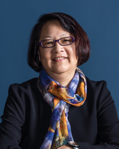
I really love the composition and lighting over this image. The textured background really complements her outfit. The initial image was a bit dark and may be hard, especially since this individual is a staff member and the images are smaller when you are scrolling through. I was able to up the brightness while also keeping the contrast about the same.
Similar to the last COLA professional photo – I just up’d the saturation a bit. Looking back, I’m not entirely sure it was even necessary.
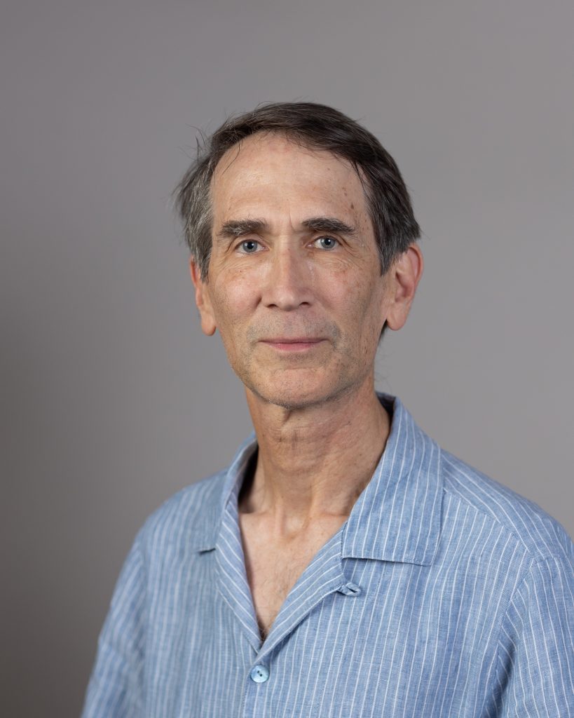
Another perfect photo!
This image doesn’t generally follow our guidelines (we usually prefer images to be centered) however the image was nice and showed his face well, so we decided to keep it. I up’d the contrast and saturation a bit to keep it in line with the other images.
This image was really nice, but a bit tricky to work with due to how low the exposure was. I ended up going back and forth quite a bit with how I wanted it to look. Now looking back, I do think I went a bit too light, but hopefully it still works for its purpose.
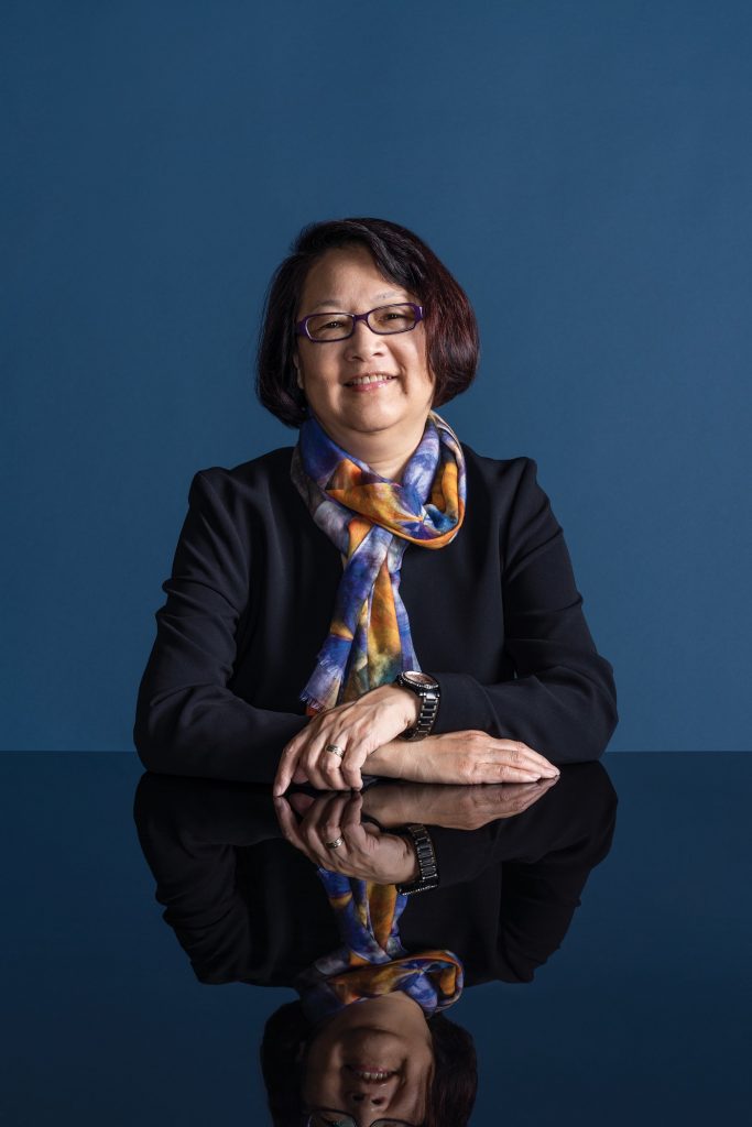
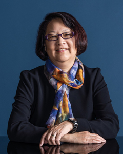
I am also currently working on a photo for one professor who had a very interesting photo where her hands are showing:
The hands really give a lot of character to the image, so I sent two versions over to Suloni and Valerie to look over. Suloni decided that the one showing her hands works better.
Which one do you prefer?
Psy Labs Banner
I am still continuing on the Psy Labs banner. Our client did not like the more realistic look that the hand details gave the original drafts, so I ended up scrapping all of the detail lines and using the paper cut-out style of graphics that is often used in advertising/UI/UX use.
Here are two separate versions that I created, one with colors and designs I personally liked, and one with the UT colors:
Our client will most likely prefer the bottom colors, but may want the shapes from the top version. However, I do like the top colors and feel they look a bit more mature.
Other projects I am working on:
- Last week I helped Suloni and Adrian organize and find some of our old course graphics and animations to show clients. This mostly involved me rendering out some stingers we had in our after effects files.
- I have begun working on my profile ID for our basecamp orientation.
- I am going to read through some instructions for a potential powerpoint project we are beginning.
