Week XXXI
I’ll be brief!
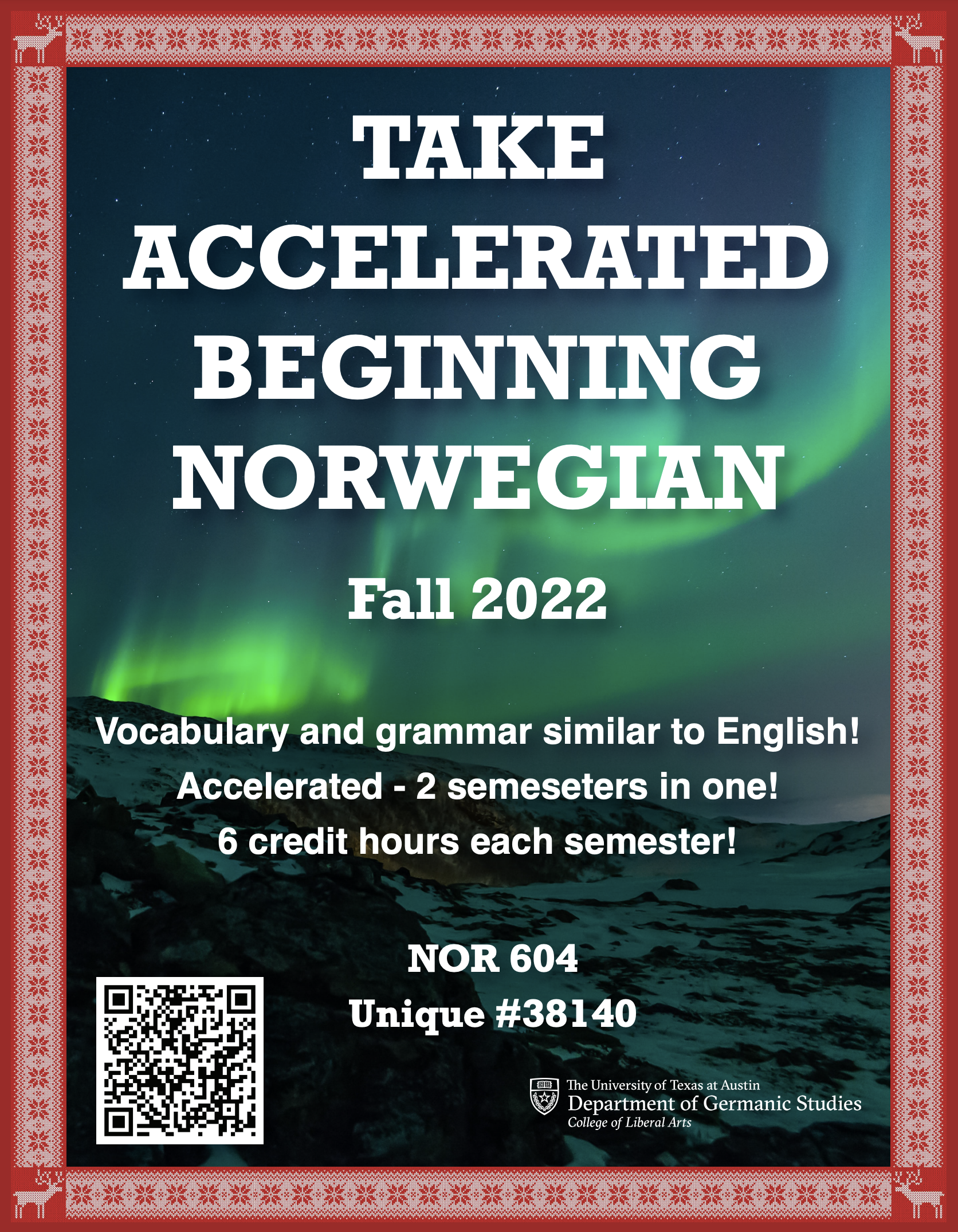
Norwegian Poster
The client preferred the my draft with the northern lights and embroidered banner, so I reformatted that for the new templates Suloni gave, in 3 sizes + a digitial banner ad. Let me tell you, Illustrator is not a program that likes to help you crop photos and tile them nicely, but I made it work eventually.
I actually saw these in person, printed out at the World Language Fair near speedway! I’ll admit, my bold color choices looked a little off, printed out. The dark-on-light posters fared much better. But still exciting! I walked up to someone and was like, hey I made that poster! I also won a bracelet in a game of Turkish trivia because I knew what the Bosporus Strait is.
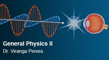
Course graphics: Physics
Just wrapped this up with some Canvas buttons.
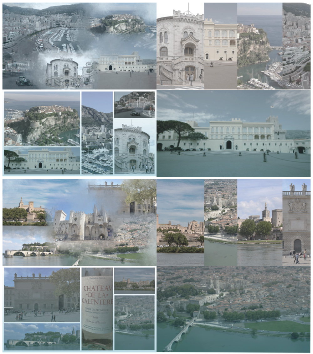
UTFC graphics
Sort of getting in the hang of these? I made a collage this time, since WordPress didn’t like my image sizes last time. These were Monaco (top) and Avignon (bottom).
There was also an alt version of each for a Picture-in-Picture background, with slightly less blue tones, but I am too lazy to collage 16 of these.
Edit: I accidentally uploaded a collage of the wrong city the first time, the backgrounds for Marseille done by someone else. Goes to show how good my french geography is.
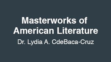
Course graphics: Masterworks of American Literature
This one was a plain Style A, so it didn’t take very long, but a good refresher. No relation to my previous E316M course.
The only thing I had to do off-model was adjust the text size/placement for no portrait photo, so the button text is a little bigger.


