Dana Center: Strategic Direction Infographics Updates 3/28/22
Hello! It’s almost April – wow. 
The past few shifts, I have been working on making edits to the strategic direction infographics. I had sent over the first two prior to spring break, and received feedback last Wednesday that allowed me to begin making changes.
Infographic 1
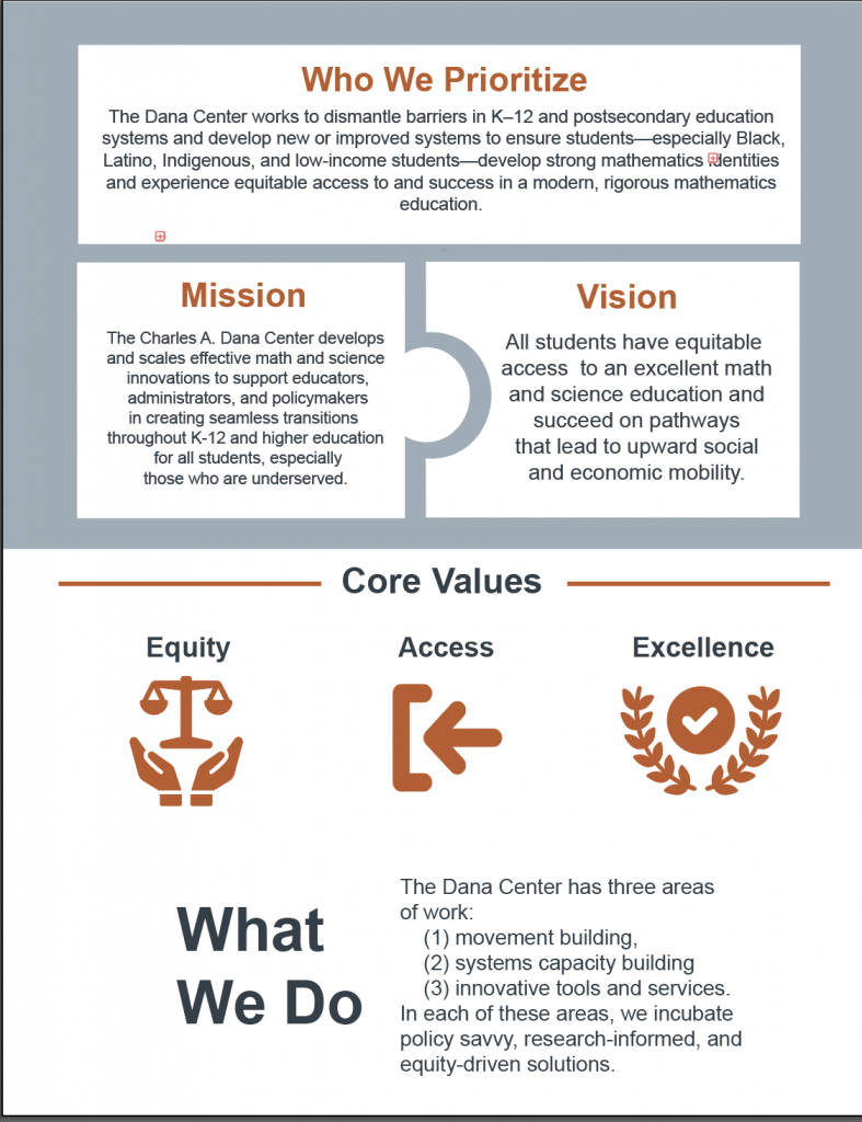
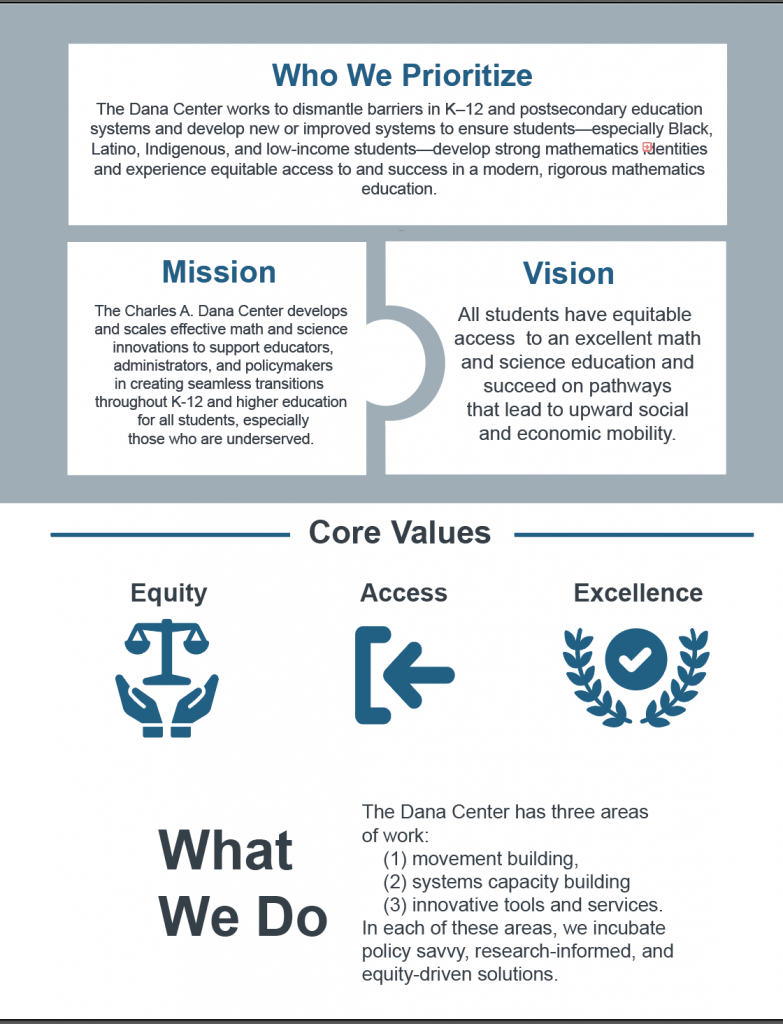
The first infographic I sent over initially had these two versions:
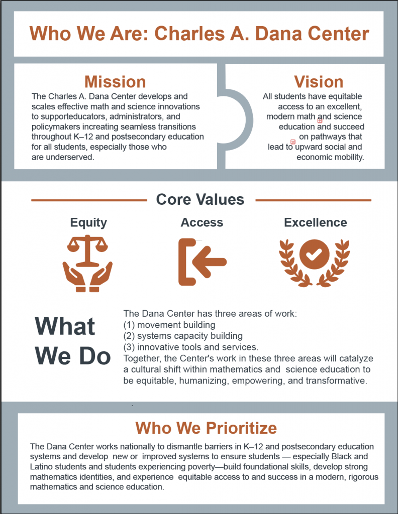
Our clients preferred the orange one. They also requested a title, as well as several changes to the general structure of the infographic. The current version I created based on these changes looks like this:
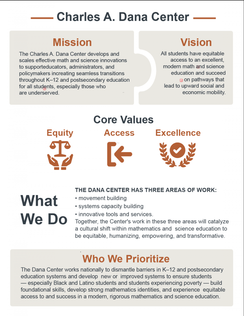
After speaking with Suloni and Maddy, we decided the graphic had quite a lot going on. Additionally, the sections are a bit hard to parse. We edited it further and currently it looks like this:
We also decided to add slight curves to the boxes to match the Dana Center website. I will update this further once more changes are made!
Infographic 2
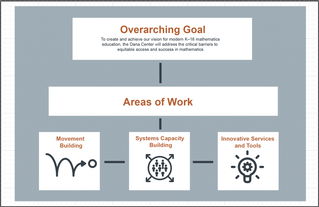
The second infographic started out looking like this:
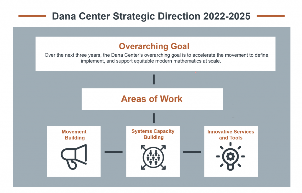
Much like the first infographic, the second one needed a title, as well as some changes in regards to general structure. The current draft looks like this:
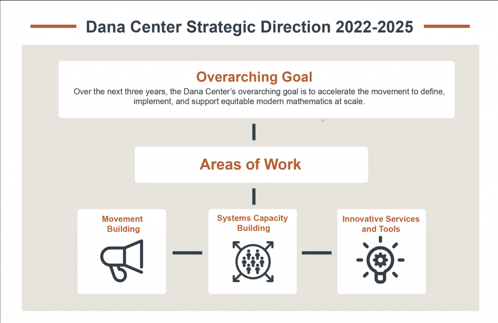
We ultimately decided to edit this graphic to better match the first one, and so right now it looks like this:
We mostly changed the color and added rounded corners. I will post again once more changes are made!
