Meaningful Brand Systems pt.2
For the next section of this training, I will be creating a branding guide for a business. I decided to choose the “Fairy Forest Cafe” because it would allow me to be creative in the design and focus on my typography and color schemes, which are areas I don’t have a lot of experience with.
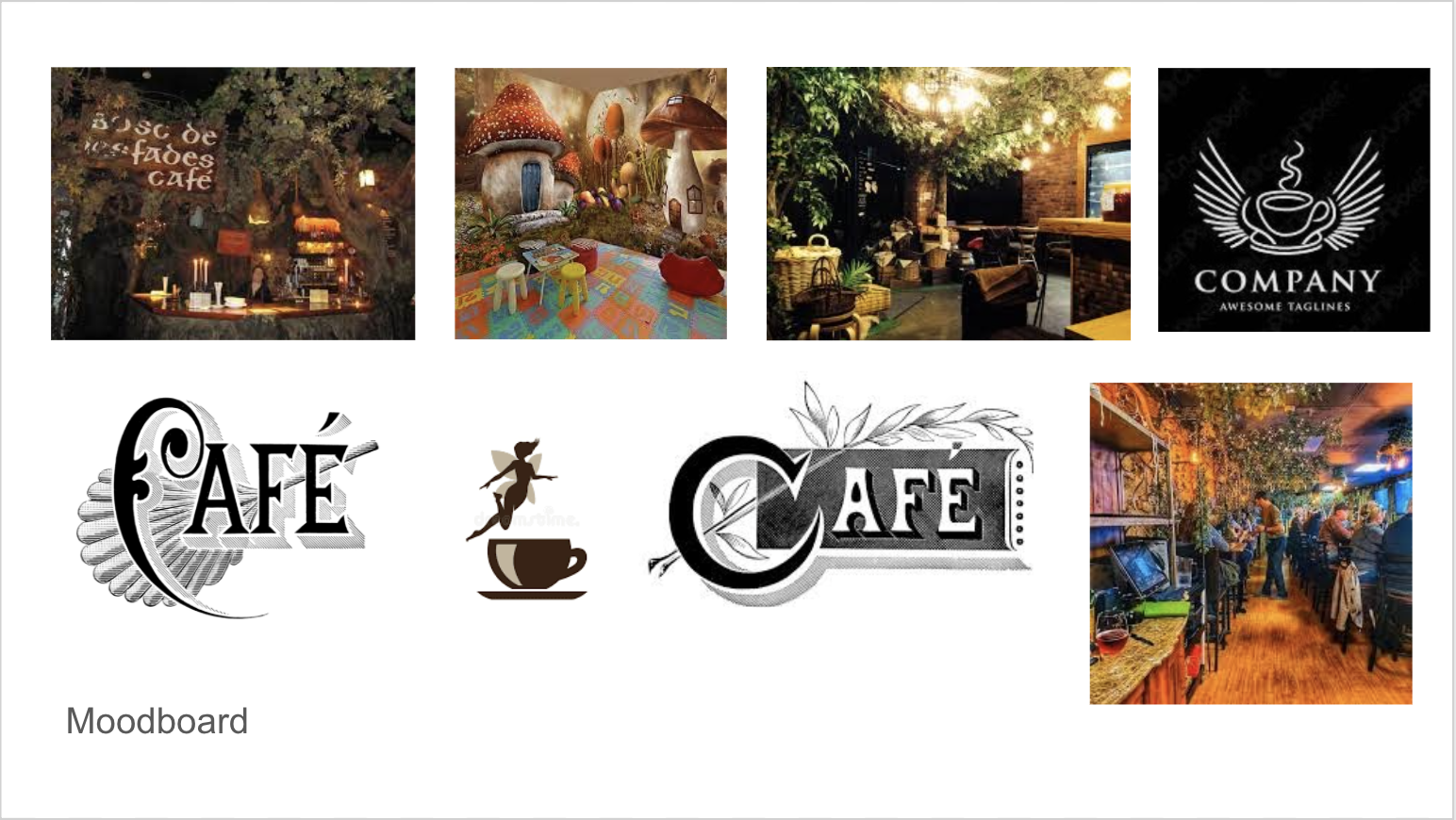
So far, I have been able to mainly focus on getting the logo design ready. Here is the moodboard I created with inspiration for the logo design. I wanted the logo to be cozy, welcoming and magical. I really wanted to express that it is a Fairy Forest Cafe.
Here are the two original designs I created for this client.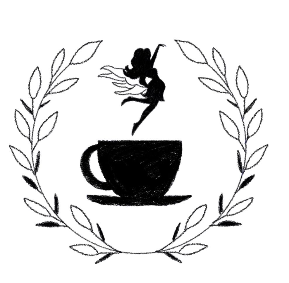
After receiving feedback from Maddy, I could tell that the second logo had a lot more potential. The coffee was still the center of attention for the brand but it still incorporated element related to a fairy. The next steps were to make the wings and the coffee cup look like they are a part of the same logo instead of different elements combined.

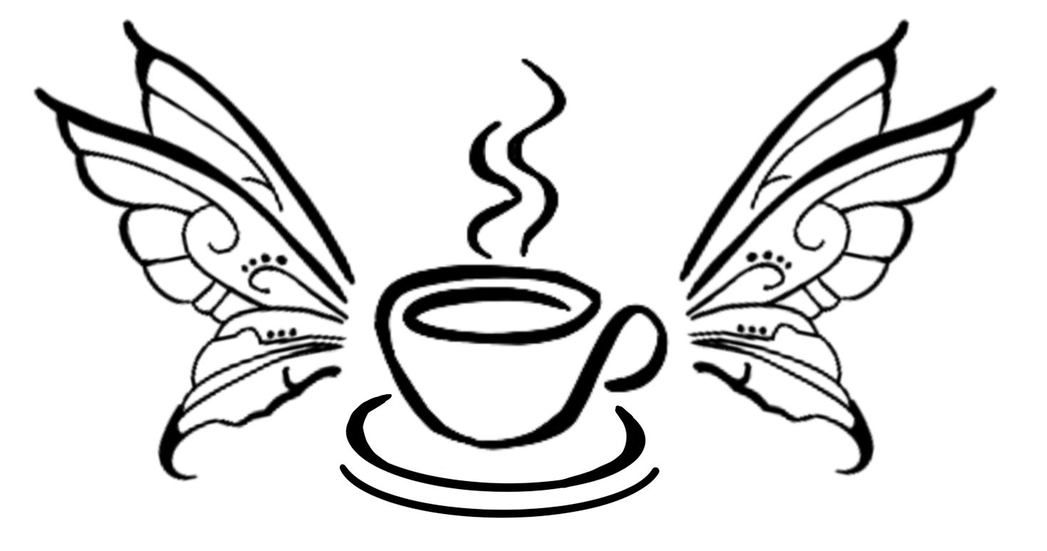
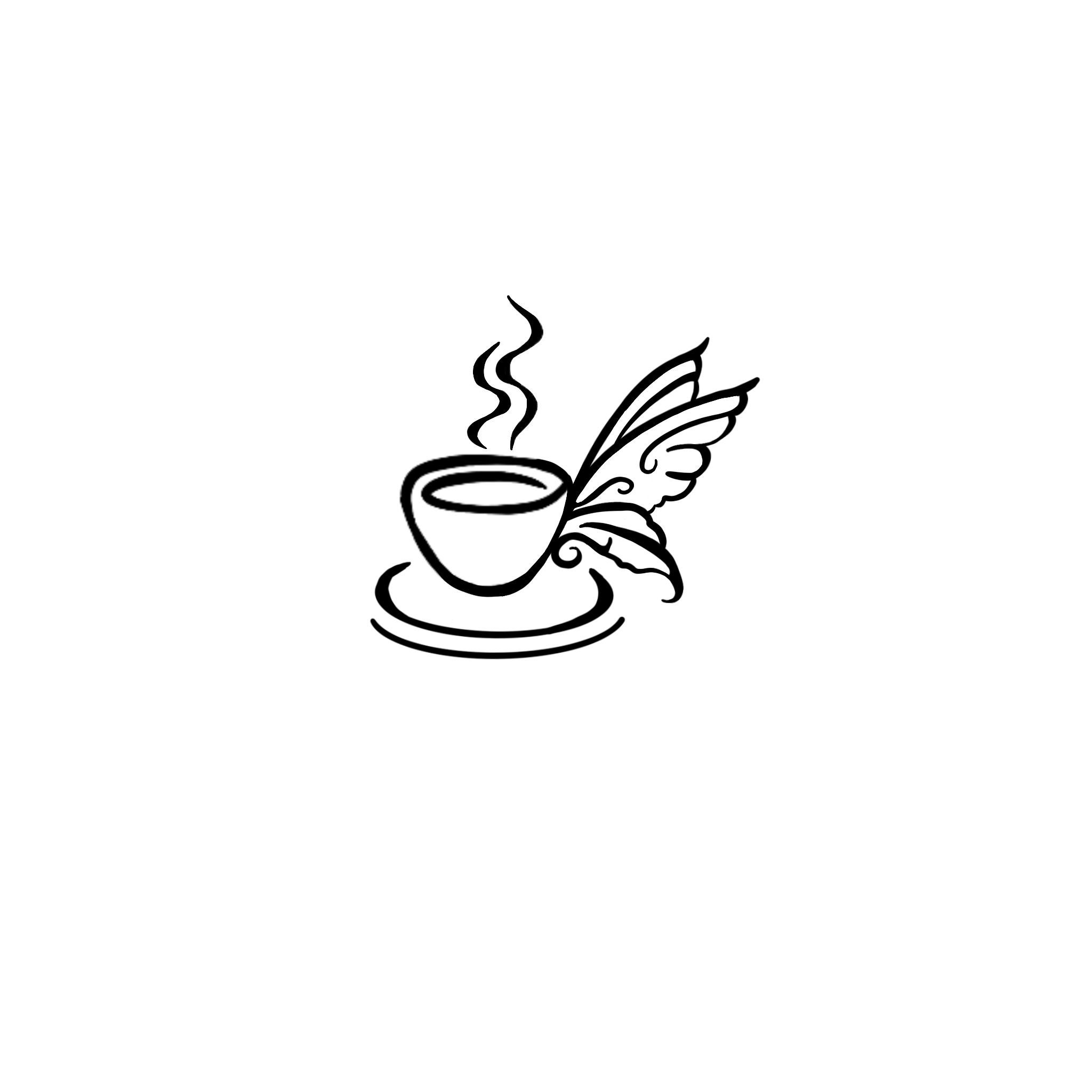 With more brainstorming, I was lead to these two design edits. I still incorporated the cup and the wings but I redesigned the complexity if the wings. I also removed the handle on the mug and replaced it with the wings.
With this edit I discovered that it no longer really looked like a coffee cup but instead a bowl of soup. In addition, having the two pair of wings felt more balanced for the design of the logo.
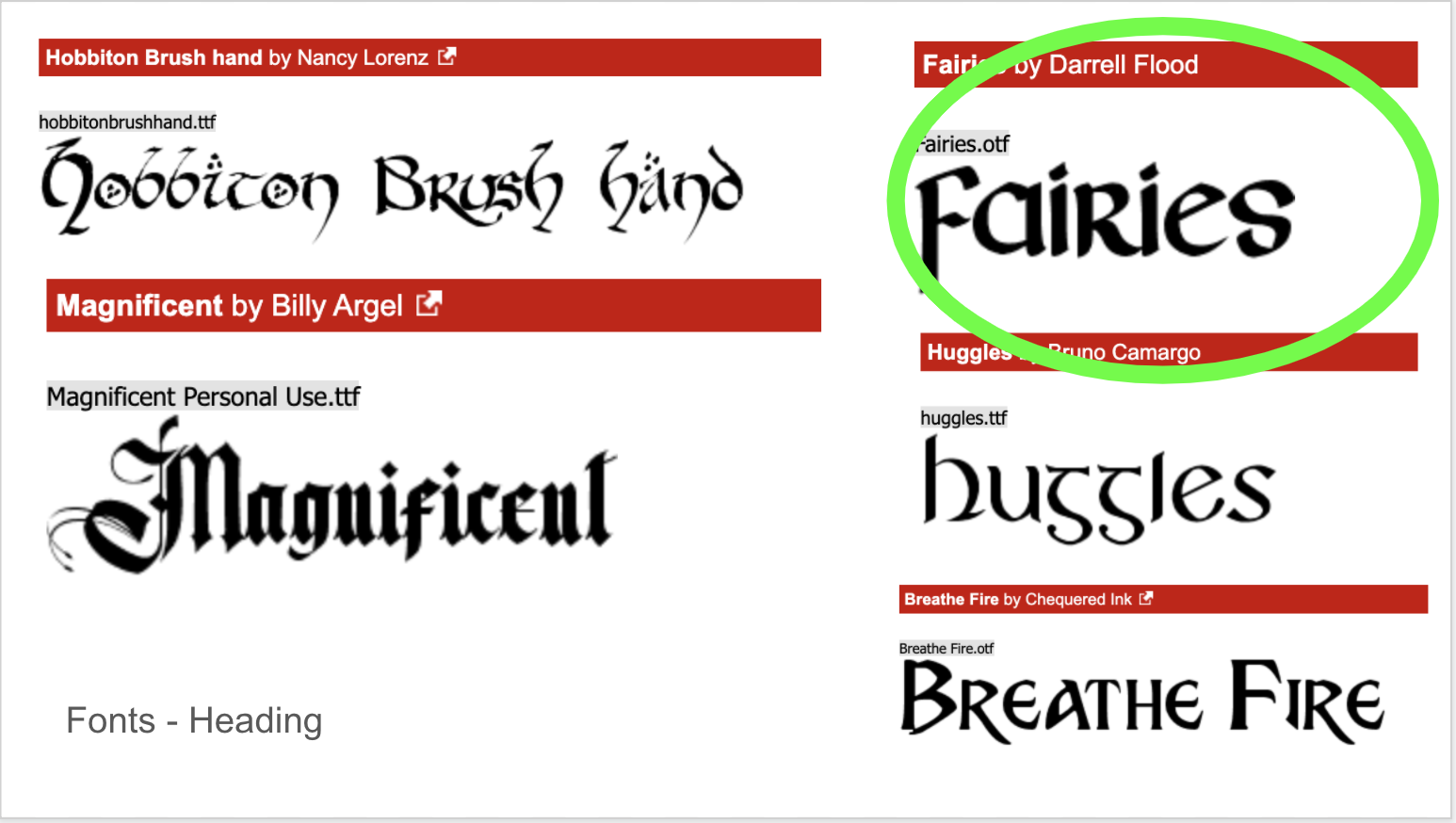
Also, I began looking at different fonts to incorporate into the design. I selected a few off of dafont that I believed matched the aesthetic I was going towards. After adding all of them to the logo, I found… ironically… that the Fairies font worked best for the design.
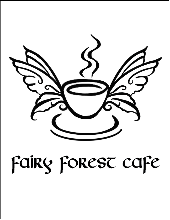
I received some more feedback and It was decided that the logo needs the handle on the cup to truly represent coffee. Here is the mock up of the design.

Next steps:
- Finalize the logo design in illustrator
- Separate the title into sections – “fairy forest” + “cafe”
- Find a complimentary font for Fairies that will pair really well
- Finalize the color scheme.