Training: History of Design
Assignment: Replicate a famous art style from the past
Chosen Art Style: Art Nouveau
For this assignment, I was tasked with creating an image that replicates the famous Art Nouveau art style. I decided to create a digital painting that mimics this style with a bit of a flare of my own art style as well. As it turns out, there is much more to the Art Nouveau style than meets the eye, per se. 
Step-By-Step:
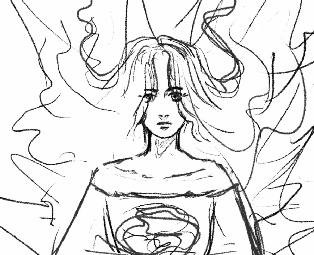
1.) Sketch
This was certainly the easiest step. I wasn’t entirely sure where to go with this drawing, so I looked at a bunch of Alphonse Mucha drawings and tried to get a feel for the style of work he did. I decided to draw a woman with elaborate hair, because that is always a good idea. As you can potentially tell with the background strokes, I wanted to have an ornate background, but wasn’t certain where I was going to go with it yet. I often leave painting sketches vague and then implement more details with lines later on.
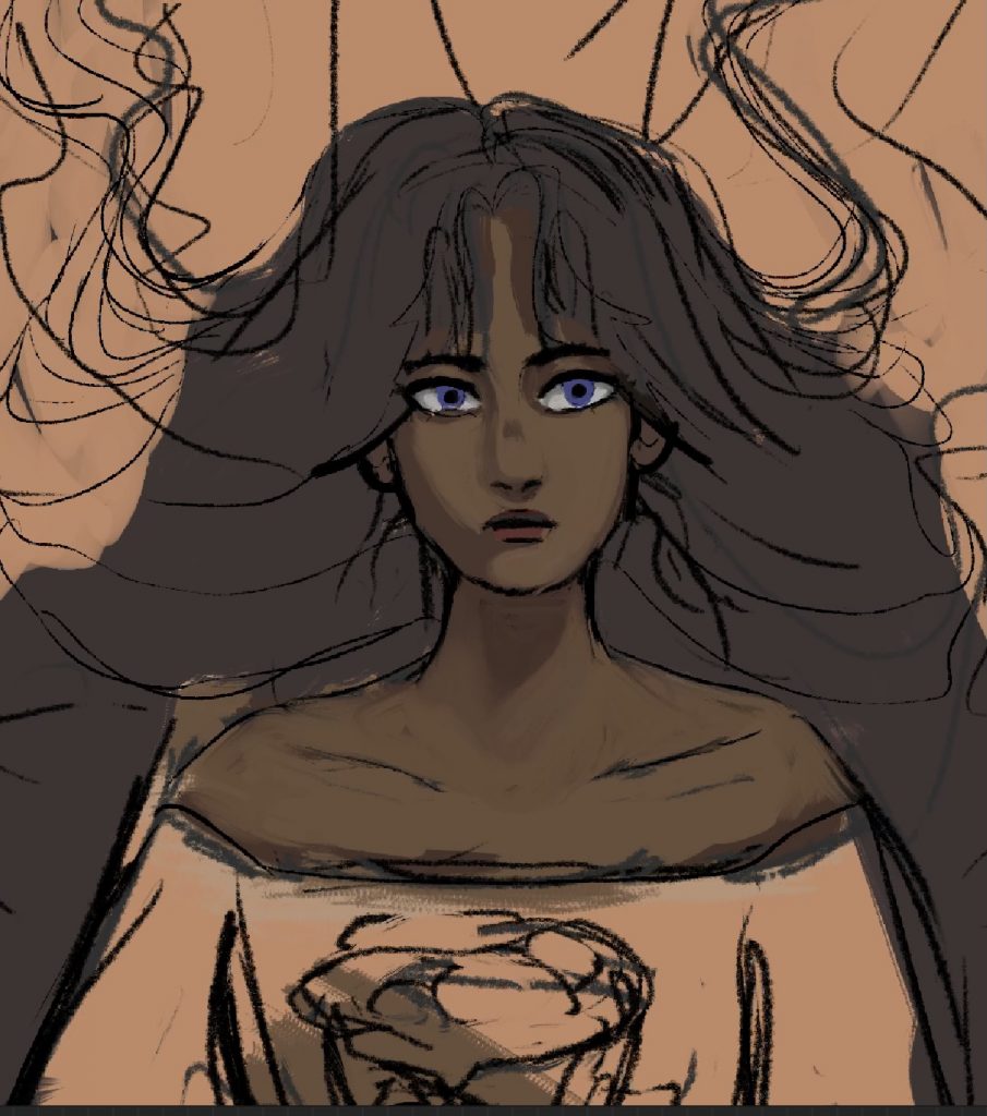
2.) Colors and Basic Rendering
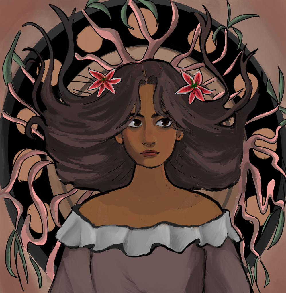
Here are the base colors with some shading on her face. I altered her eyes quite a bit during this section of the process, and also made her face more of the centerpiece of the image as well. I decided to go with something different with her hair about halfway through, which will be shown in the next image.
As I worked on rendering her face, I realized that I didn’t like her hair being quite as gigantic as I had initially drawn it. This is a common issue of mine: as an animator, I tend to draw very exaggerated and flowy shapes that don’t work quite as well when rendering things in a painting form. From this painting, I’ve realized that I may need to consider how realistic things are if I want to render it in a more realistic, painterly style.
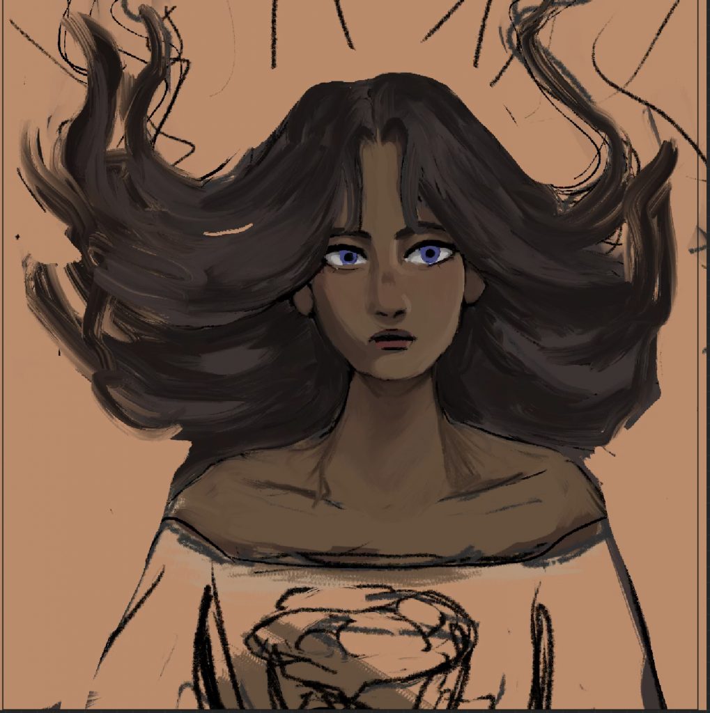
3.) More Rendering
After about an hour of rendering, I ended up with something like this:
At this point the face and hair were mostly done, but I was struggling with maintaining an art nouveau style in the drawing. I had decided to add more dark lines around everything to imitate it better, but I was a bit lost on the background. Hence: the random paisley brush thrown aghast everywhere. I was successful in deciding to add flowers to her hair, though. Fortunately, Valerie was extremely helpful in giving me advice regarding making it more “nouveau-esque.” Valerie also suggested giving the woman a more whimsical or pleased expression to fit with the style of woman portrayed in nouveau.
Step 4: Background, even more rendering on the clothes and face
Here is a more complete version of the drawing, although it is not entirely done.
Things I did between steps 3 and 4:
- Changed the facial expression to be more whimsical
- Went for a more peach, warm-toned vintage color
- Rendered out vines and more of a background
- Rendered out flowers and a shirt
- Flattened the shading on some areas to fit with the more flat art style of Mucha
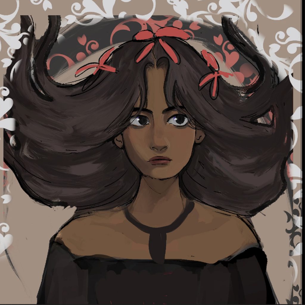
Step 5: Further fixes
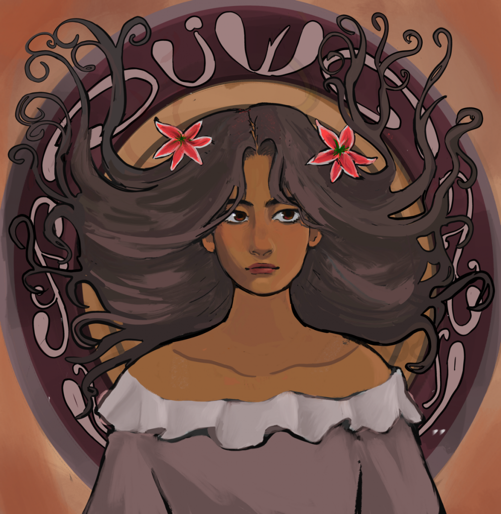
In this final rendering, I edited her facial features to push a more realistic art-nouveau look. Art-nouveau women tend to have quite goddess-like, strong proportions, so I wanted to mimic that more with this drawing. I also changed the background to have more patterns, and outlined the patterning to match the paisley look. Furthermore, I added some warmer color tones to appear more vintage. After this, I was done with the piece!
To give a brief summary of what I have learned during this assignment:
– Art nouveau is highly patterned and busy, but also relies partially on the negative space achieved by these patterns. It’s good to include lots of details, but not so much as to make it hard to read.
– Use light colors that appear vintage and dated, specifically use jewel tones
– Art nouveau has more realistic/hyper-realistic proportions (I’ll need to work on this more in the future). Specifically, larger jaws and necks seem to be a common trait.
-Facial expressions are more whimsical and dreamy, not too serious but not so happy that they seem too grounded. Basically, the women generally look like they’re zoned out in a happy place.
– Use black/very dark lines that are on the thicker side to outline pretty much everything except certain internal structures
– Most items, except maybe the face and hair, should be very lightly shaded or not shaded at all, with just a gradient and nothing else
