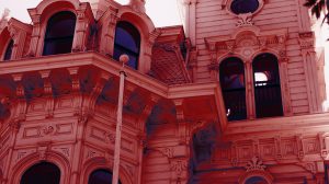
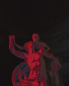
I completed the Photo Sourcing and Color Grading training, which taught me how to use gradient maps and color matching to create a coherent aesthetic or style for images. I found this training super fun and easy, and thought I’d share my results below —
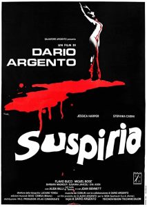
For the gradient map part I was asked to choose my favorite film as a starting point. I don’t exactly know if I have a favorite film, to be honest, but Suspiria (1977) is definitely one of my favorites, so I went with it. It’s a stunning movie that I recommend to anyone who hasn’t seen it!
I used the following screencap as a source for colors:
Here were the resultant images:
