Intro to Typography
The typography training was more information with a short two question reflection at the end of it. Here were my answer:
- On Basecamp, share 2-3 font pairings you like and why you think they work. They can be from the resources linked, a pairing you saw in the wild, or a pairing you made yourself.
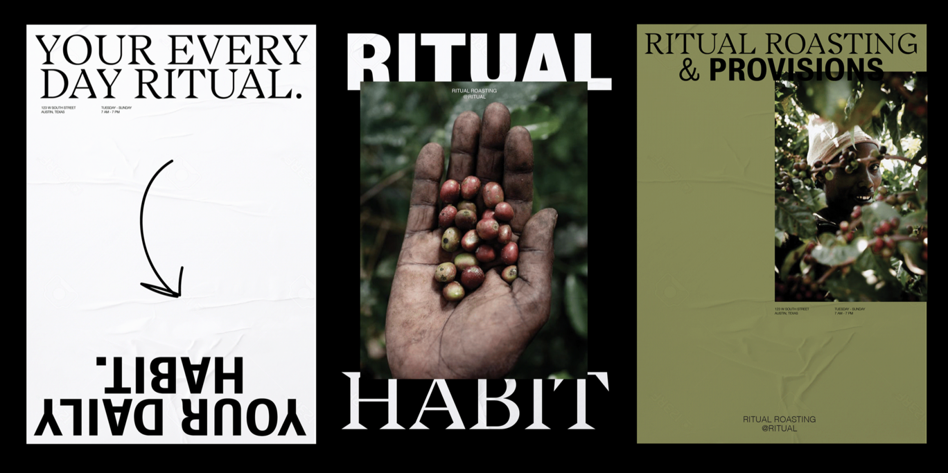
I liked this font pairing. I couldn’t source what fonts they use but I like the combination of sans-serif with a slab-serif. In my own design work I have a particularly difficult time trying to pair my sans/bolded text with a serif font and end up usually with two sans-serif fonts. This one is an example of where I think they are working really well together despite being very different. It could be due to the fact that they are using two fonts for a primary text and then one other front for a secondary instead of only one for each.
- Share a font for each typeface outside of the required list. Why did you pick them, and what kind of ~ vibe ~ do they give off? Maybe you have a project in mind that they’d work well for? Let us know!
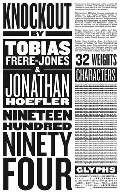
For display font I tend to find myself liking really bold, tight, and almost western 60s groovy font. It feels really inviting and like a hug of a font.
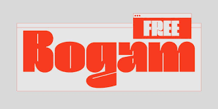
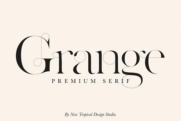
For a serif font I love when they get really delicate and elegant with curves and thin lines:
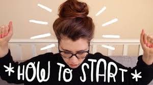
For script fonts, I kinda hate these but the one that I saw was from a youtuber “Fran” who is an illustrator and she handwrites onto her youtube thumbnails and I found it to be really cute:

