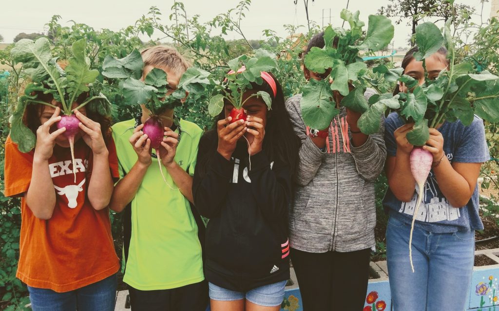
Hello bloog, today we received a request to create a TA monitor for a course I had worked on A YEAR AGO! So crazy that I’ve been working here for over a year :,) So the original design used this image:
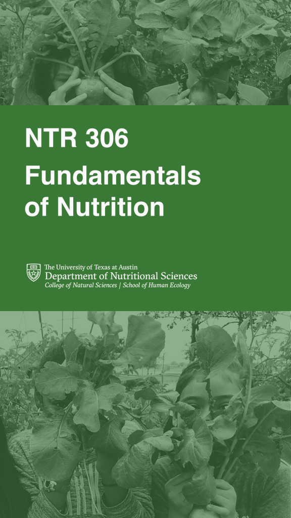
But that image didn’t work too well for a vertical design…I tried duplicating the image and putting two kids on the top and bottom: 
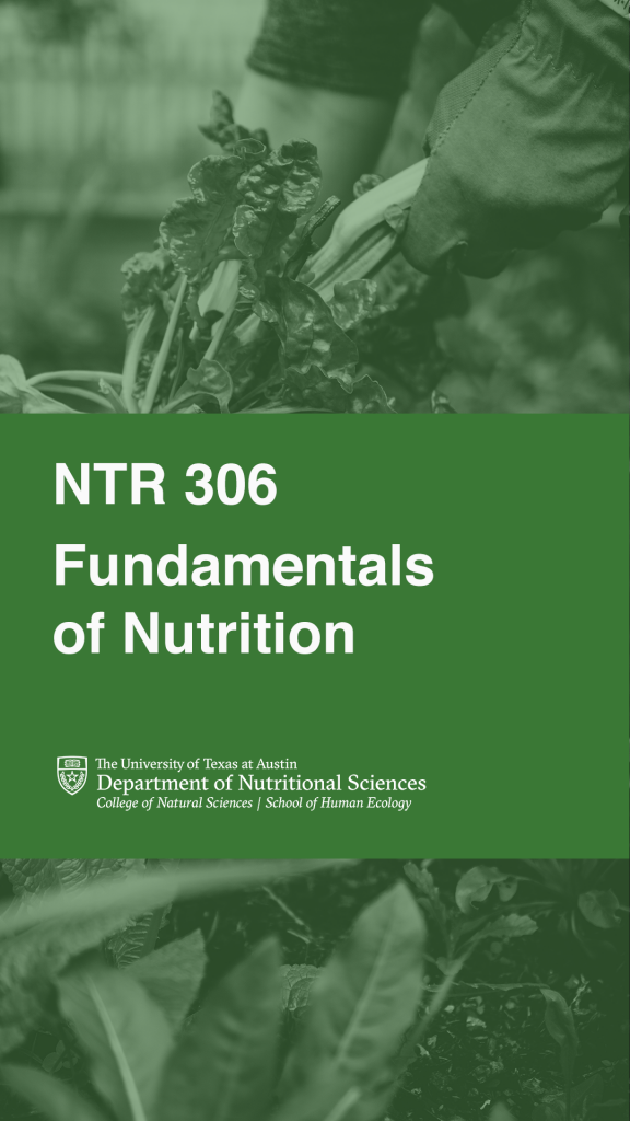
But I think that turned out a bit funky. So THEN I spent a loooong time searching keywords like “vegetable” “garden” “hold vegetable” “plant” “nutrition” “nutrition garden” etc etc and came up with these designs:
We’re hoping they use the first design, but provided the second as a backup in case the text positioning is weird.
Fun assignment, I’ve always loved working on course graphics! They require a level of precision that I love to succumb to. Also this is the second course graphic I did EVER so it feels very full circle for it to be my last :,) (probably not my last I still have three weeks and professors be requesting)


