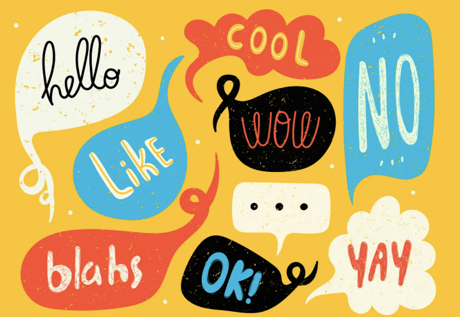
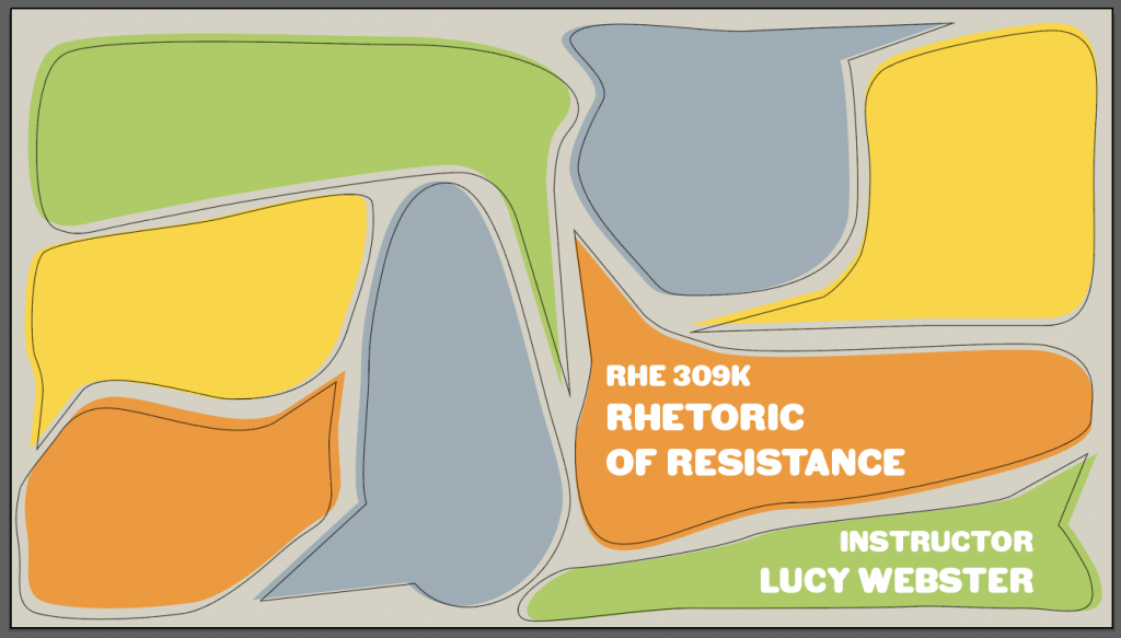
Hello bl˚g this week I’ve been working on designing a title slide for a powerpoint template that will be used for RHE 309K, Rhetoric of Resistance. I started with an idea of using different sized speech bubbles, based off this image, to demonstrate the idea of rhetoric:
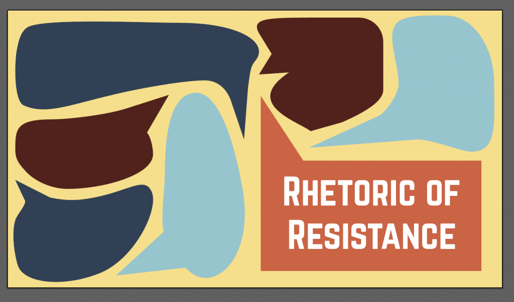
I started off with a color scheme that included the colors below, but Valerie brought up that dark colors can weigh down design:
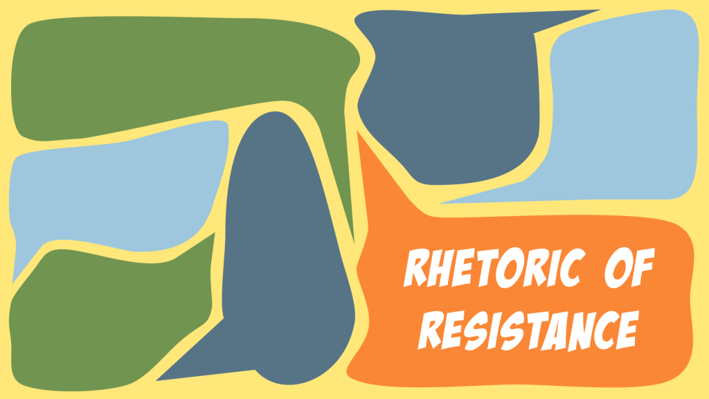
From here, Sheryl created a template that mimicked UT’s secondary palette, and I made two versions of the title slide based off of this, one with her palette and one using UT’s palette. In the second, I added in some off-center black outlines to add more depth to the graphic (was also playing around with fonts at this stage lol)
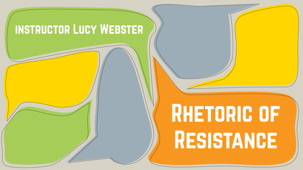
From here, Valerie asked me to make a version with two stacked speech bubbles in the bottom right corner to place the course title and instructor’s name. My most recent draft, which I’ll need to tweak a bit next week:
