More Course Graphics BT
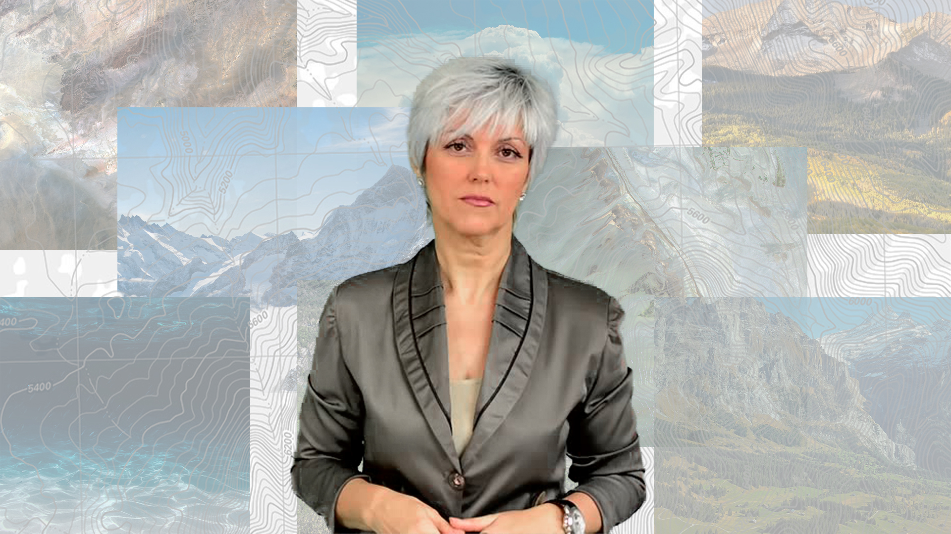
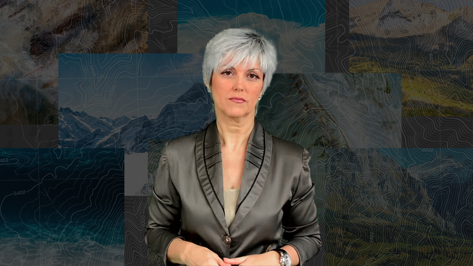
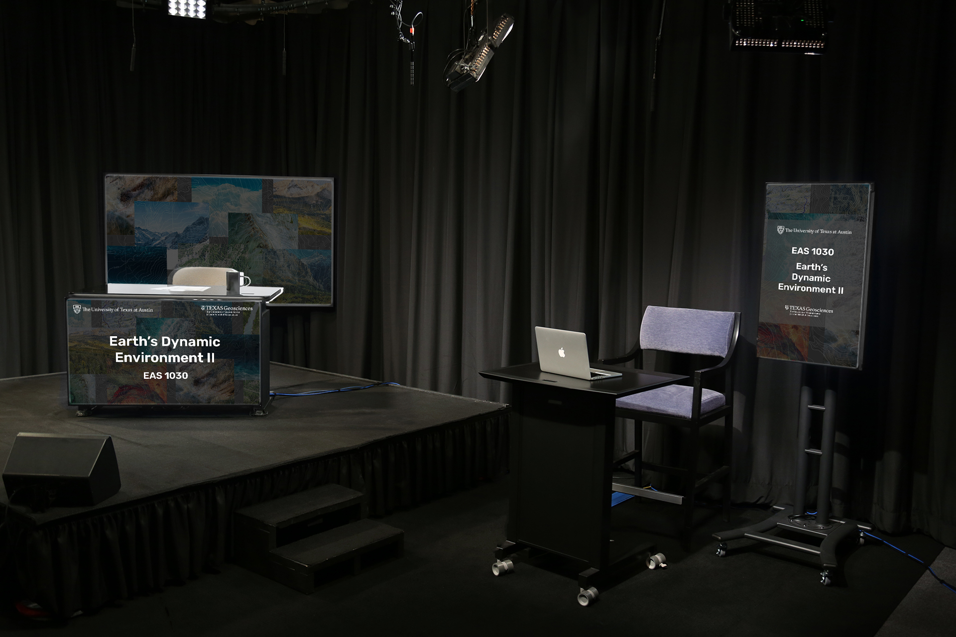
Through the first part of this last week, I continued to develop a clearer design style for the Course Graphics I have been making for Earth’s Dynamic Systems II. After several design iterations and with feedback from Maddy, I narrowed down a style guide that uses darker overlays on the mosaic layout, complemented by white Rubik font text. Here are some assets that were made in the process:
Here are some mockups using the Dark Mode style with Rubik:
Lesson 1: Intro to Design History
Below is some information I have researched to cover some of the most important eras and movements that defined graphic design throughout history. This info will eventually be compiled into a slide layout and will be the first section of the Lessons for STA’s.
1925-1940: Art Deco
https://www.theartstory.org/movement/art-deco/
https://designshack.net/articles/trends/art-deco-graphic-design/
https://www.theatlantic.com/entertainment/archive/2014/05/art-decos-nearly-forgotten-quietly-feminist-master/361495/
https://www.metmuseum.org/toah/hd/frdc/hd_frdc.htm
Info Section:
The Art Deco style originated in Paris during the 1920’s, with the greatest popularity of the style lasting for about 15 years. Art deco took off in part due to a culture where advertising was gaining popularity. It is a modern art style that attempts to infuse functional objects with artistic touches. This movement is different from the fine arts (painting and sculpture) where the art object has no practical purpose or use beyond providing interesting viewing.
Practitioners of Art Deco utilized parallel lines and tapering forms that suggest symmetry and streamlining. Typography was affected by the international influence of Art Deco and the typefaces Bifur, Broadway, and Peignot immediately call the style to mind. In terms of imagery, simple forms and large areas of solid color are reminiscent of Japanese woodblock prints.
Art and Artists:
Robert Bonfils. Poster for the Paris Expo. 1925
Heinz Schulz-Neudamm. Poster for Metropolis. 1926
Paul Colin. Tabarin. 1928
Jean Chassaing. La Ligne/Aurore est inimitable. 1930
A.M. Cassandre. L’Atlantique. 1931
Glen C. Sheffer. Poster for the 1933 Chicago World’s Fair. 1933
Marie Hildreth. Mural for the Medicine and Public Health Building. 1935
Characteristics:
Strong use of geometric shapes, particularly triangles
Large areas of unused space
Strong lines, often with thick strokes and even zigzags
Strong color palettes with one or two saturated hues
Typography with thick strokes or strong ornamentation (additional strokes rather than flourishes
Anna, Bifur, Broadway, Cormier, Coquette, Mostra Nuova
Hard edges and rectangular shapes
Chevron patterns
Mosaic styles and stylized florals
Images with an almost flattened look that more artistic and less realism
Bauhaus, 1920s
https://www.theartstory.org/movement/bauhaus/#nav
https://eyeondesign.aiga.org/5-examples-of-bauhaus-graphic-design-that-shaped-the-movement/#:~:text=Bauhaus%20design’s%20impact%20on%20today’s%20graphics%20is%20hard%20to%20overestimate.&text=Its%20simplicity%20supported%20the%20ideals,should%20be%20accessible%20to%20all.
https://harvardartmuseums.org/tour/the-bauhaus/stop/1075
https://harvardartmuseums.org/tour/the-bauhaus/slide/6338
https://99designs.com/blog/design-history-movements/bauhaus-infographic/
Info Section:
The Bauhaus, named after a German word meaning “house of building”, was founded in 1919 in Weimar, Germany by the architect Walter Gropius. It was influenced by 19th and early-20th-century artistic directions such as the Arts and Crafts Movement, as well as Art Nouveau. Its aim was to reunite fine art and functional design, creating practical objects with the soul of artworks.
Bauhaus design’s impact on today’s graphics is hard to overestimate. Associated with primary colors, thick straight lines slashing across white space, and that emphatically modern trilogy of circle, triangle and square, the movement’s legacy has now become easier to trace due to an online tool via Harvard Art Museums.
Art and Artists:
Herbert Bayer. Last Dance invitation. 1925
Herbert Bayer. Research in Development of Universal Type. 1927
Joost Schmidt. Pamphlet for City of Dessau. 1930
Bertrand Goldberg. Analysis of Rotogravure Page. 1932-33
Andor Weininger. Design for Adler Automobile Showroom. 1933
Characteristics:
minimalist
geometrical
hand crafted (but looks like it is mass produced)
anti-ornament
apolitical
Swiss Design (The International Typographic Style) – 1950s
http://www.designishistory.com/home/swiss/
https://medium.com/@mason_weis/what-is-swiss-design-2c97088c3f20
Swiss (International) Style Of Design: The Guiding Principles That Influence Flat Design
Info Section:
Often referred to as the International Typographic Style or the International Style, the style of design that originated in Switzerland in the 1940s and 50s was the basis of much of the development of graphic design during the mid 20th century. The style emerged from earlier design styles like De Stijl, Constructivism, Bauhaus, and The New Typography, though without the political and historical contexts of those movements.
They saw designers as communicators, not artists, and believed that design should be grounded in rational universal principles discovered through a scientific approach. Their ideal of design was to achieve clarity and order and they saw no room for eccentricity or personal expression. They also saw design as something socially worthwhile and a serious profession to pursue. Their attitude toward design was to make it socially useful, universal, and scientific.
Art and Artists:
Josep Müller-Brockmann. Auto Club of Switzerland Poster. 1955
Ernst Keller. Museum Rietberg Zurich. 1955
Eugene and Max Lenz. Sports Poster. 1958
Armin Hofmann. Stadttheater Basel. 1961
Max Bill. Neues Denken Neues Wohnen Neues Bauen. 1977
Characteristics:
simplicity, minimalism
order, clarity, grids
geometric, abstraction
typography, legibility
Sans Serif: Akzidenz-Grotesk, Univers, Helvetica,
rational, objective
universal, unity
Pop Art – 1960’s
https://www.theartstory.org/movement/pop-art/
https://medium.com/@codingdudecom/pop-art-artists-3153d33cd2bf
https://www.moma.org/learn/moma_learning/themes/pop-art/
https://www.thoughtco.com/pop-art-art-history-183310
Info Section:
By creating paintings or sculptures of mass culture objects and media stars, the Pop art movement aimed to blur the boundaries between “high” art and “low” culture. The concept that there is no hierarchy of culture and that art may borrow from any source has been one of the most influential characteristics of Pop art.
Some critics have cited the Pop Art choice of imagery as an enthusiastic endorsement of the capitalist market and the goods it circulated, while others have noted an element of cultural critique in the Pop artists’ elevation of the everyday to high art: tying the commodity status of the goods represented to the status of the art object itself, emphasizing art’s place as, at base, a commodity.
Art and Artists:
Eduardo Paolozzi. I was a Rich Man’s Plaything. 1947
Richard Hamilton. Just What Is It That Makes Today’s Homes So Different, So Appealing?. 1956
Andy Warhol. Campbell’s Soup Cans. 1962
Roy Lichtenstein. Wham!. 1963
Keith Haring. Radiant Baby. 1982
Characteristics:
Recognizable imagery
Bright colors
Irony and satire
Innovative techniques
Mixed media and collage
Postmodernism
https://www.theartstory.org/definition/postmodernism/
https://www.thecollector.com/postmodern-art/
Info Section:
Postmodernism is an umbrella term for many visual styles that came about after the 1980s. This movement is distinguished as a movement that questioned, or reacted against, common notions of the modern period: the notion that all technology and progress is positive, the idea of artistic development as goal-oriented, the notion that only men are artistic geniuses, and the colonialist assumption that non-white races are inferior.
Postmodernism overturned the idea that there was one inherent meaning to a work of art or that this meaning was determined by the artist at the time of creation. Instead, the viewer became an important determiner of meaning, even allowed by some artists to participate in the work as in the case of some performance pieces. Other artists went further by creating works that required viewer intervention to create and/or complete the work.
New Typography – 1920-30’s
https://www.moma.org/calendar/exhibitions/1013
Info Section:
The New Typography movement brought graphics and information design to the forefront of the artistic avant-garde in Central Europe. Rejecting traditional arrangement of type in symmetrical columns, modernist designers organized the printed page or poster as a blank field in which blocks of type and illustration (frequently photomontage) could be arranged in harmonious, strikingly asymmetrical compositions.
Almost overnight, typographers and printers adapted this way of working for a huge range of printed matter, from business cards and brochures to magazines, books, and advertisements.
Art and Artists:
Theo H. Ballmer. Büro (Office). 1928
Herbert Bayer. Promotional design for glass painter Ernst Kraus. 1923
Max Burchartz. Rheinlandfahrt des BDG. 1926
Wilhelm Deffke. Manoli Gold. 1929
Walter Dexel. Die Sport Ausstellung (The Sport Exhibition). 1929
The Isotype Movement – 1930’s
https://www.brainpickings.org/2011/03/08/the-transformer-isotype/
http://www.designhistory.org/Symbols_pages/isotype.html
https://informationisbeautiful.net/2011/vintage-infoporn-no-1/
https://www.johngrimwade.com/blog/2017/02/13/the-isotype-revolution/
Info Section:
In the 1930s, Austrian sociologist, philosopher, and curator Otto Neurath and his wife Marie pioneered ISOTYPE — the International System Of Typographic Picture Education, a new visual language for capturing quantitative information in pictograms, sparking the golden age of infographics in print.
“The Transformer: Principles of Making Isotype Charts” is the first English-language volume to capture the story of Isotype, an essential foundation for our modern visual language dominated by pictograms in everything from bathroom signage to computer interfaces.
The Information Visualization Movement
https://www.interaction-design.org/literature/article/information-visualization-a-brief-20th-and-21st-century-history
https://www.datavis.ca/papers/hbook.pdf
Info Section:
The development of information technology in the latter half of the 20th century created a boom in information visualization which is still continuing to this very day. Many forms of statistical representation would emerge in the early 1970s, including: the Fourier function plot, Chernoff faces, start plots, clustering and representations and biplots using multi-dimensional scaling.
Lesson 3: Typography
The following is a snippet of a section I will be working on that talks about how to make a customized wordmark in Illustrator using Bezier Curves. I am really enjoying this section because I’m very familiar with this tool and I know that it can be a powerful and easy way to make accurate curved shapes.
Create a custom wordmark by editing type in AI: using Bézier Curves (In Progress)
Articles:
https://www.webucator.com/how-to/how-work-with-bezier-curves-adobe-illustrator.cfm
https://www.tutorialspoint.com/computer_graphics/computer_graphics_curves.htm
Tutorials:
What are Bézier Curves?
The concept of a Bézier Curves was coined by the French engineer Pierre Bézier. These curves can be generated by the manipulation of at least three points: two endpoints that are called “anchor points,” which define the span of the line segment, and at least one additional point called a handle to control the bend of the curve.
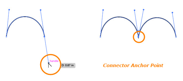
Bézier Curves can be used in Adobe Illustrator to accurately create and/or trace curved shapes with the Pen Tool to create paths. The shape of a path is controlled with Anchor Points, which define line segments within the path. There are three types of anchor points:
1. Corner Points: Connect straight-line segments to straight-line segments and do not need Bezier handles.

2. Smooth Points: Create line segments that join in smooth, continuous curves.

3. Connector Points: Connect straight line segments to curved ones, or connect curved line segments that meet at an angle.
Turning Text into a Path
(in progress)
