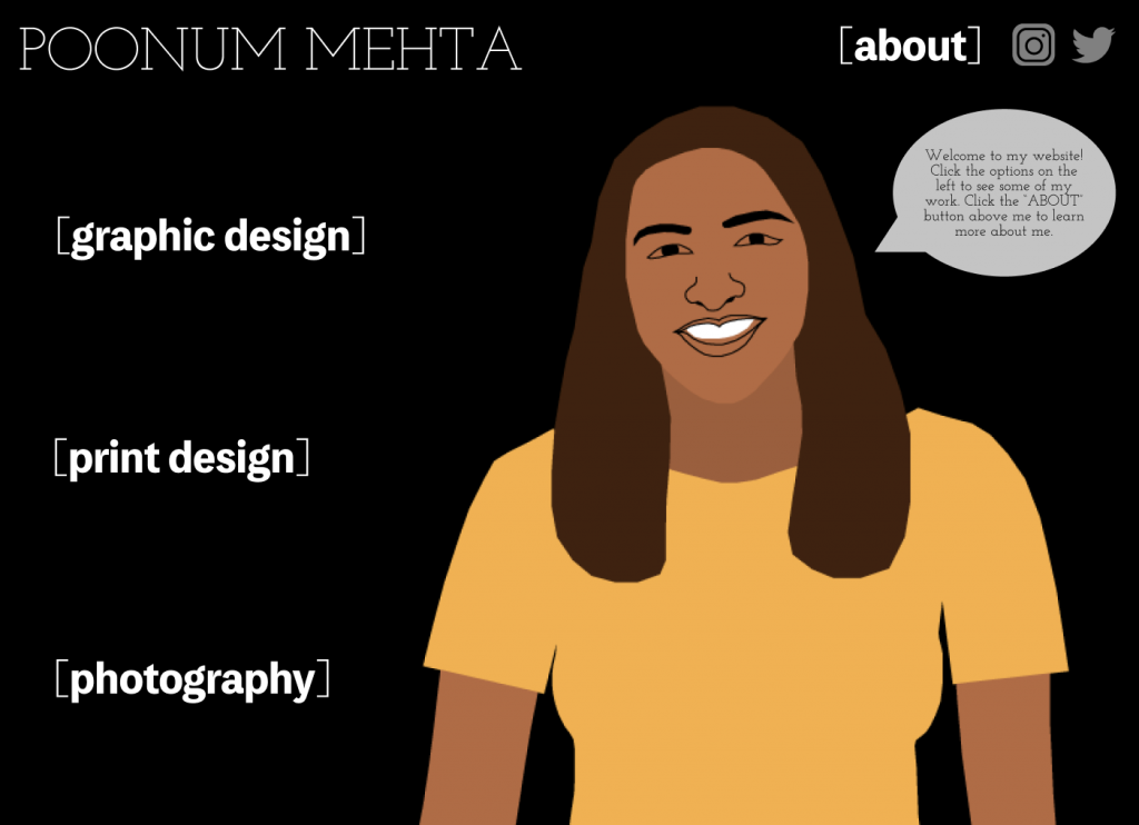
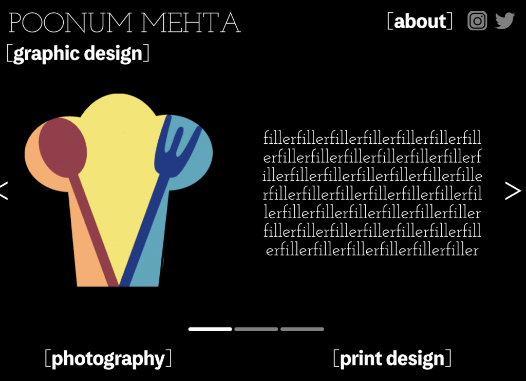
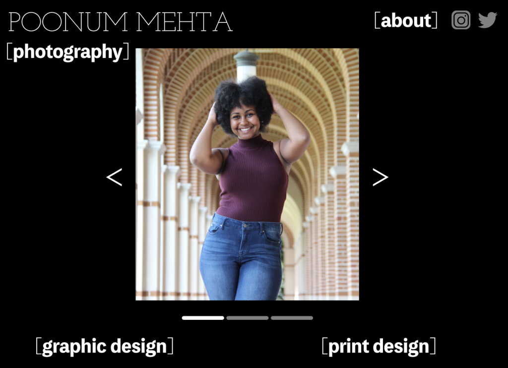
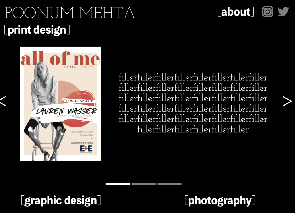
This Monday I finished up the UI/UX figma training. My initial sketch on this is two posts below this one. Here’s how that was executed on figma.
I created a homepage with links to four separate pages: three showcasing my design work, and one (“[about]”) explaining my interests, hobbies, and work experience.
Each design page has a large image of the graphic work, and filler text to explain the creative process. I used the accent keys (< >) to create arrows on either side, and made a bar in photoshop to tell viewers what page they are on (this is below the graphic / filler text, above the other buttons).
Pretty fun training, I think it taught me a lot about consistency. I tend to get carried away with customizing individual components of larger projects which takes away from the general theme, but because in this assignment I wanted to keep minimalist website vibes, I had to sacrifice customizing every little thing. Consistency is hard!


