Basic Training: Studio Course Graphics
Howdy, friends! I hope y’all are doing great. Just wanted start this post by saying that I’m pretty sure a few days ago I passed my 100th day of work as an STA… so here’s to that! (ノ^▽^)ノ woohoo!
Anyhow, in today’s installment of this blog I’ll be going over my experience with the Studio Course Graphics training. So here’s the brief: “One of the main services LAITS provides is online course production […] Courses taught in the LAITS Studios require stage set design. Our design team creates a cohesive design package for each course, from the studio set design monitor graphics, to the graphics for the Canvas web interface platform.” Basically, I had to create a cohesive and thoughtful design packet of multiple graphics for a studio based course. For this I had to keep in mind factors like color correction adjustments (because of the nature of the projections in the studio set) and how the graphics must properly reflect the vibe of the course. After understanding this and reviewing a bunch of examples from Maddy and other STAs, I was ready to start working. So, let me explain how things went down.
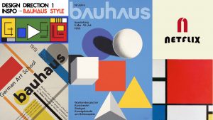
First things first, I had to chose one of two sample courses predetermined for the purposes of this task. The first option was an environmental class called EAS1030: Earth’s Dynamic Environment II (Atmospheres and Oceans). The second option was called ARTH3800: Twentieth Century Art. I decided to go with the second option because I felt like the professor’s design requests (of considering the Bauhaus style of the 20s-30s) and syllabus (highlighting that the class usually goes on a field-trip to a renowned museum) were going to be easier to work with and make for a more intriguing and complex experience with the training.
With that in mind, the next step was to brainstorm 2-3 design directions I could take this project on, so I created a small mood-board of style inspiration for each design direction. taking into account the course’s subject, tone, mood and personality. These were my pitches:At this point I had two ideas in mind. If I went with design direction 1 or 3, I was thinking it would be cool to do an illustrative wall monitor. On the other hand, if I went with design direction 2, I was thinking the puzzle style would look cool. With that in mind, Maddy gave me the go ahead for the illustrative design. So I set my mind to do something along the lines of design direction 3. Once I settled on a direction for the project, I was tasked to continue with the next step of the training.
Step 3 was to start creating my studio assets. My main idea for the wall monitor at this point was to build a scenario that looked like a museum, considering that there’s a museum visit planned in the syllabus. I also decided to make the art in the walls of the museum reflective of twentieth century art specifically from art pieces exhibited at the museum they would visit. To top it all off, I was going to style the whole wall monitor in a cubist-inspired manner.
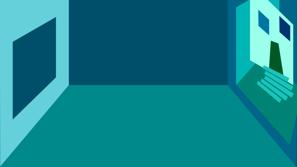
As follows, you can see the two original art pieces from the museum in the syllabus that I planned to take inspiration from to reflect in the wall art, and also an image of progress from my first draft:
At this point I got feedback for my progress and, though I was going in a good direction, there were some details I needed to figure out before continuing. So, Maddy gave me some tools for that.
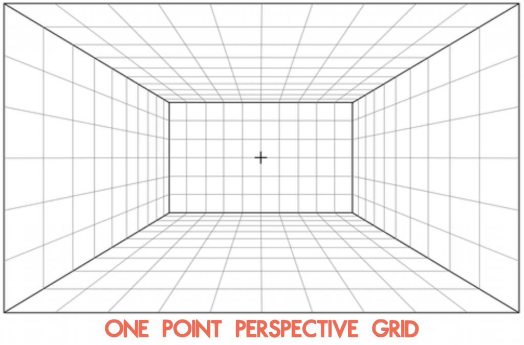
First, she suggested that I use a one-point perspective grid to define the limitations of the background. This way the museum setting could get a more natural perspective than the one I was using.
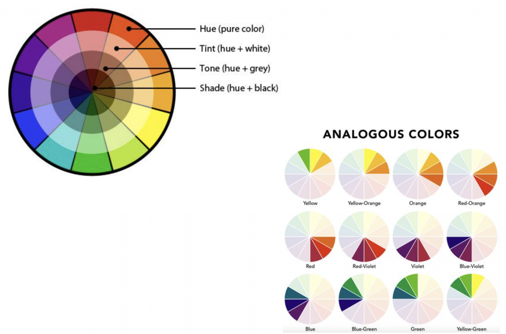 She also gave me these tools on color to better define a color palette, because at this point I was starting to get a bit insecure that the background I was designing would be too distracting for the class.
Afterwards, this is the color palette I ended up settling on to limit the amount of distraction for the eye:
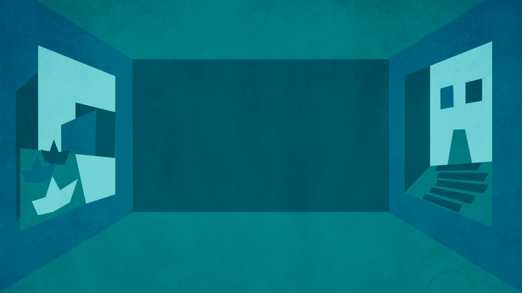
Once I had a better grasp of my tools, I got to work on new drafts fixing the perspective and colors for the design and constantly getting feedback throughout this process. I also added texture to the design. Once I was done with the wall monitor, I also got down to working on the desk skirt and the wall monitor.
Step 4 was then to test how my studio assets would look like in real life. For this step I was tasked to insert my designs into different mockup templates to make sure my studio assets would look good and serve their purpose in different scenarios. This is what mine looked like:
Afterwards, I started working on Step 5 – storyboarding an intro. This is how mine turned out (and pardon my very basic stick-person character):
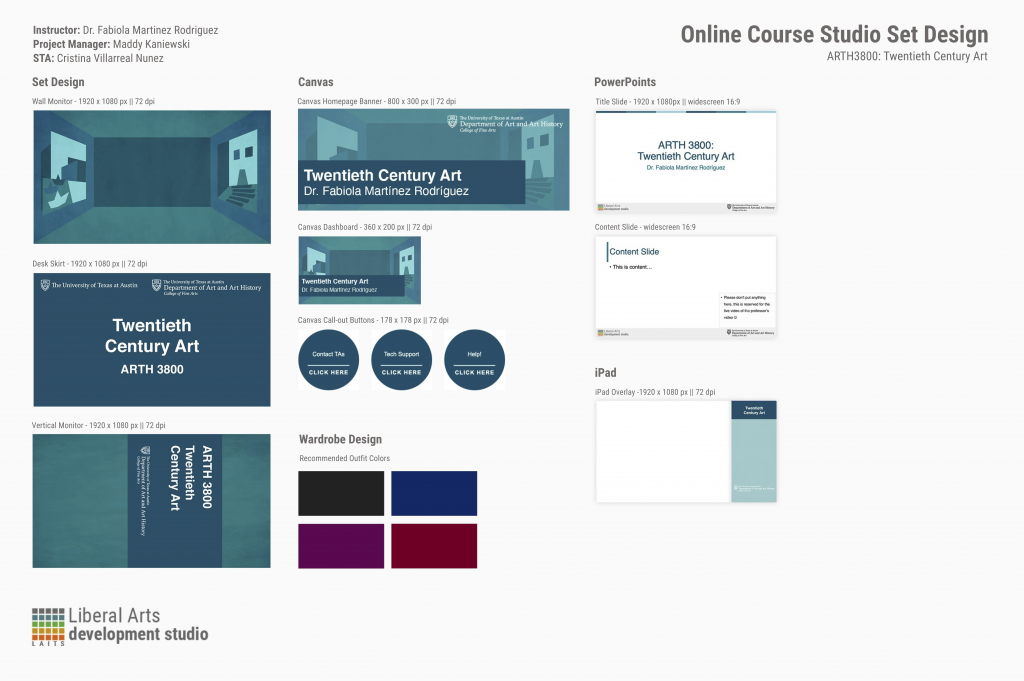
Moving on to Step 6, I began working on the Canvas graphics for this course, including: the dashboard, the homepage banner, the callout buttons and the iPad overlay. I stumbled upon some trouble with the iPad overlay and the homepage banner, if I’m being fully honest. But I got very helpful feedback on these Canvas assets, I was able to come up with some really good designs. (Images for these will be available at the end of this post on the design menu).
Moving on, I started working on Step 7: creating a Powerpoint Template. I took into account the example provided from PSY 352, and based on that I started designing something that was different yet inspired by the example to go with the course I have been working on. (Images for these will be available at the end of this post on the design menu).
Finally, I landed on Step 8 – creating a final Design Menu. So here’s how that looked like:
All in all, this was a very complex project that took me a while to work on (though the time between when I started working on this compared to when I was done was largely influenced by other time sensitive projects that I had to prioritize over this one). Nonetheless, I learned a lot from this experience. I had never before created something like this, so it was very interesting for me to brainstorm, plan and carry-out something like this, and I am so grateful for all the feedback I got. In brief, I would highlight learning how to set a more cohesive color palette to reduce distraction from the focal point and learning a lot about building a perspective; not to mention the overall ‘how to design the graphics for studio courses specific to LAITS’.

