More UI Updates on Chatter
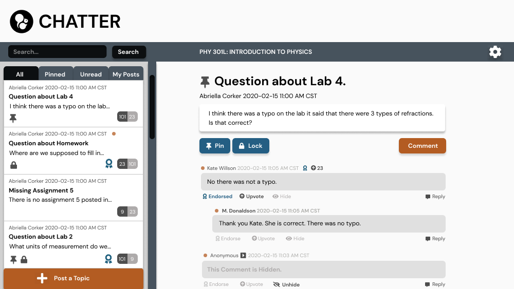
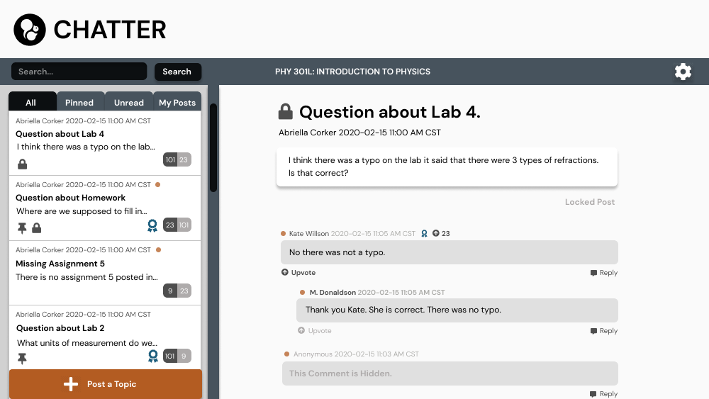
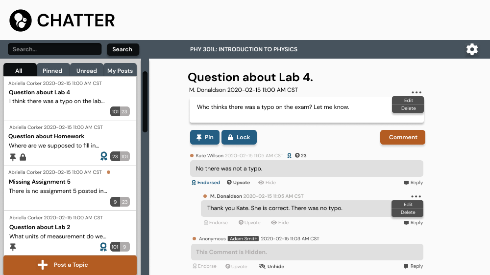
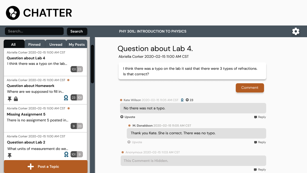
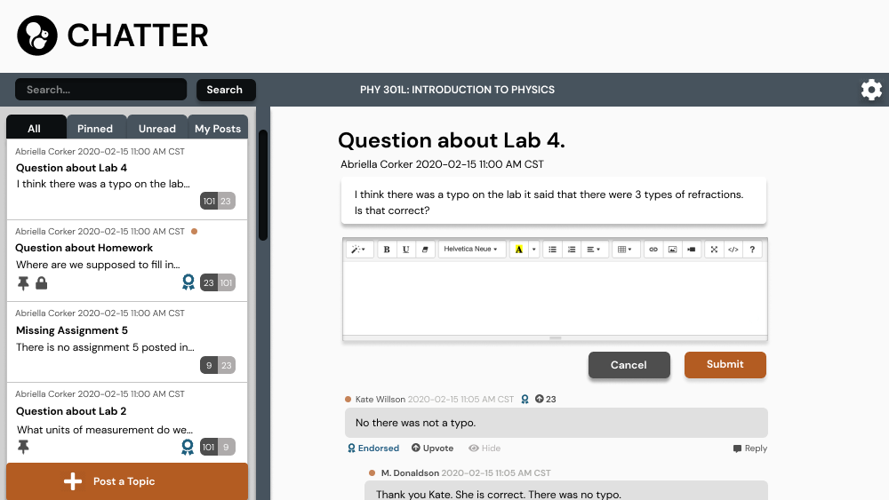
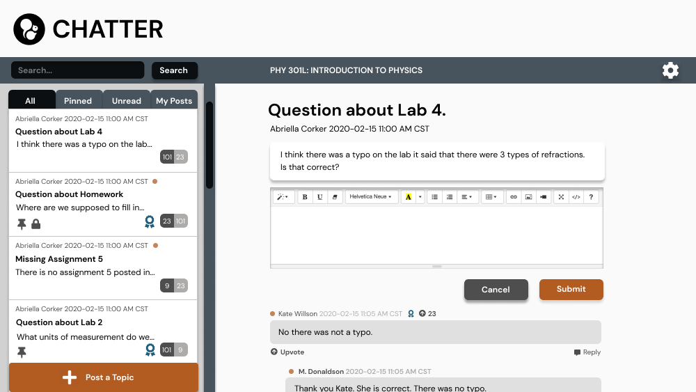
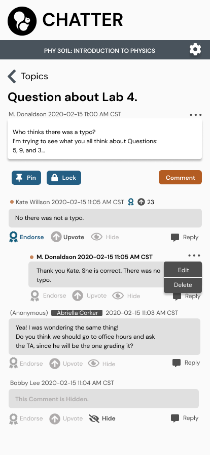
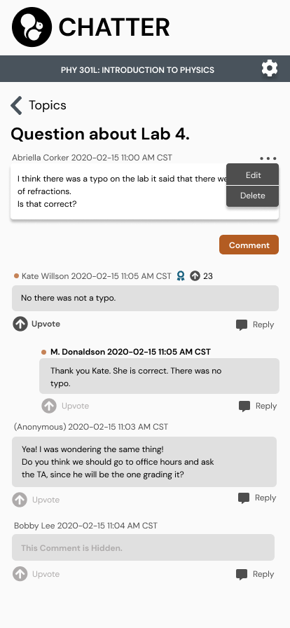
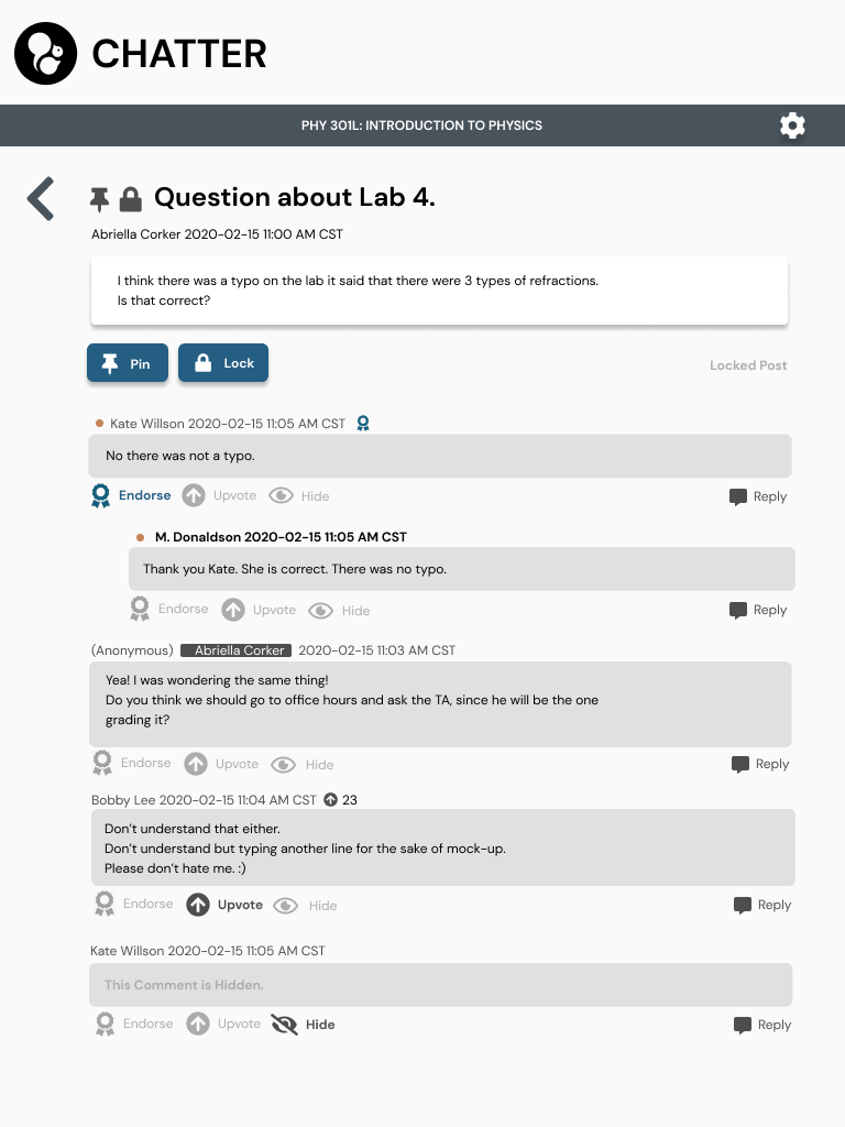
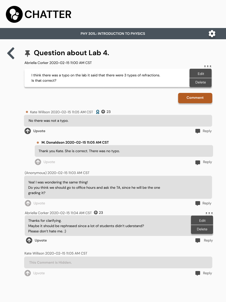
There were more detailed features that needed to be developed such as an upvote option for students and an edit delete option for students to edit comments and posts they create. The same features are added for professors as well. As for the anon and hidden features, professors can slide to view a student’s name and hide unwanted comments.
We needed a better top-down approach to standardize how to view the information in posts and comments. Chris suggested metadata information at the top, then the comments or post itself, and at the bottom the ability to take action to the posts. It is similar to Reddit threads.
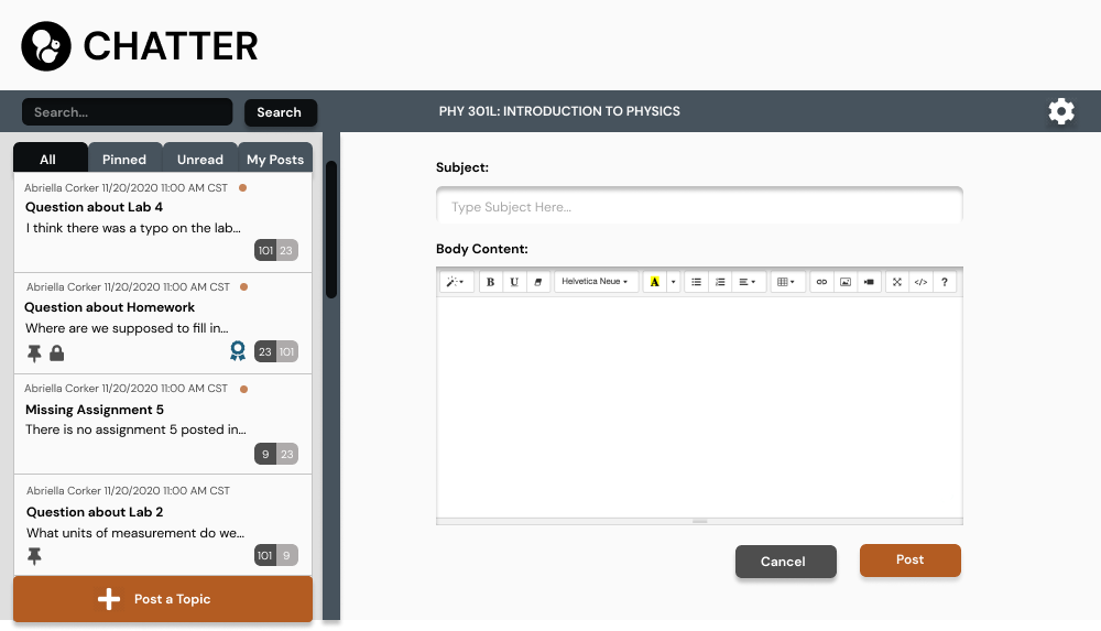
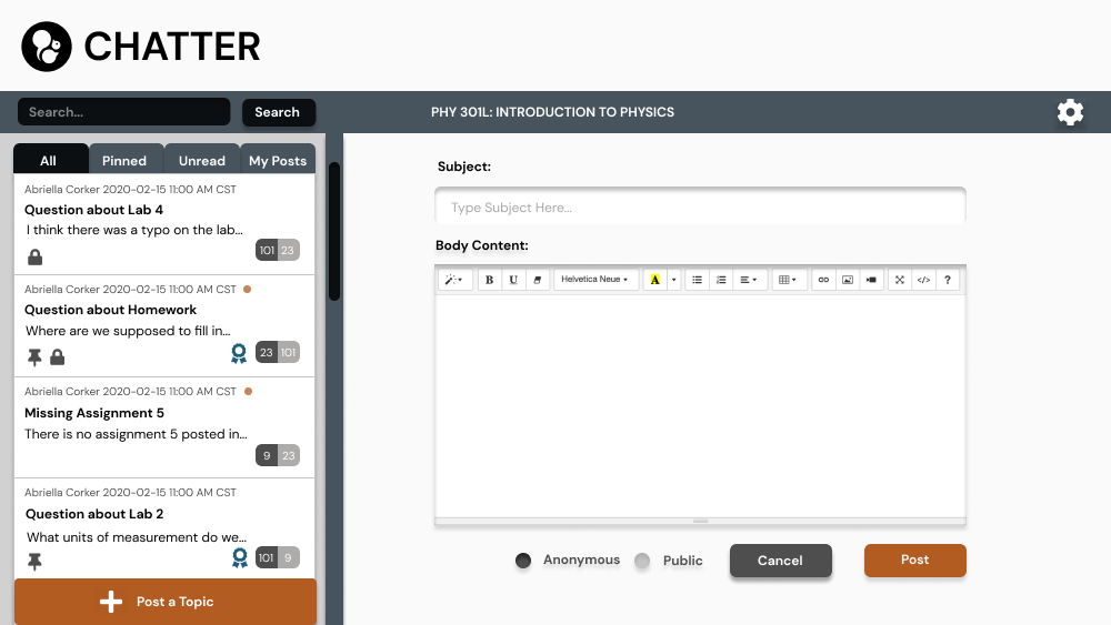
Here are the desktop images the left side is professor view and the right is student view:
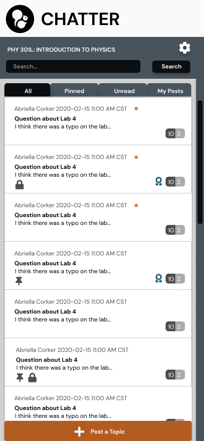
Here are the mobile drafts with identical dashboards then the instructor view and students respectively:
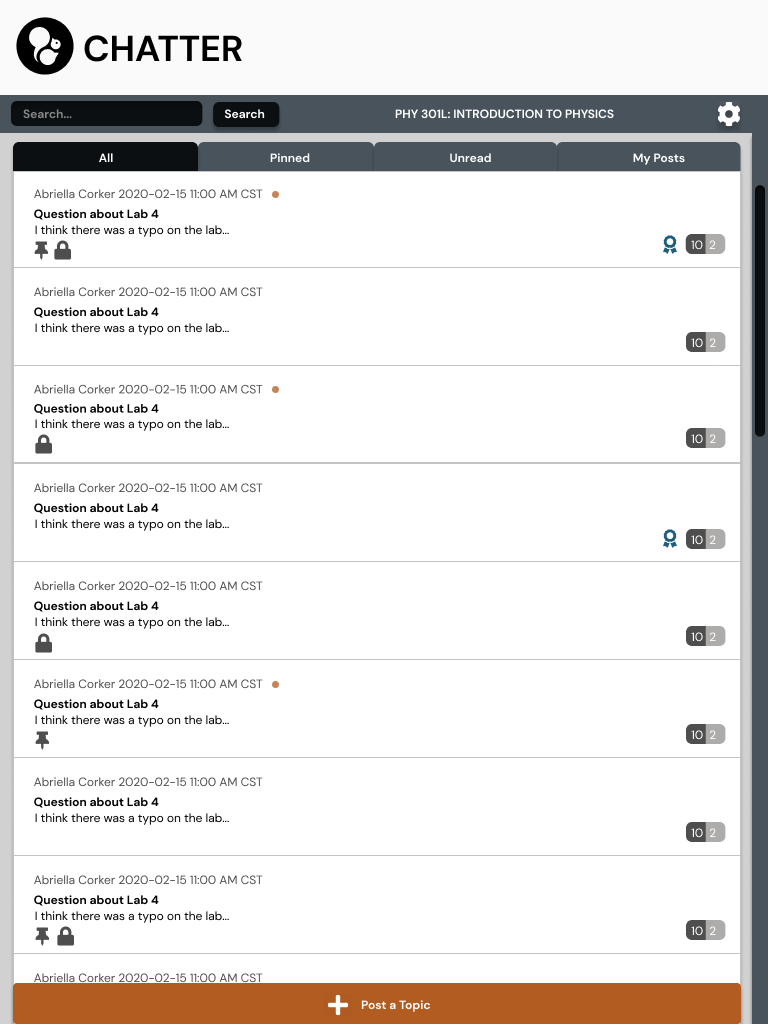
Here is the tablet view in the same order as the mobile phone view above:

