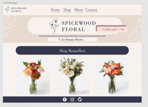
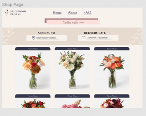
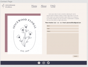
This week I worked on finishing the UI/UX with Figma Training as well as the Pixel Art training. Here are images of the final design of the website. I really liked working on this project. It made me think more about User Interaction and it really helped with the Think Aloud test I did with Thuy to notice some changes that I needed to make. One of them is adding a Shop button on the navigation bar as well as a search bar so that clients could look up specific bouquets they would want. You definitely have to think about things in a different way, and not just what makes something “aesthetic”.
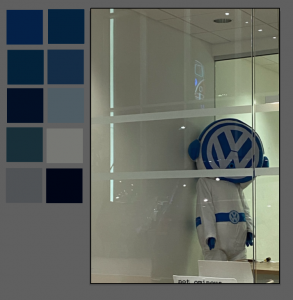
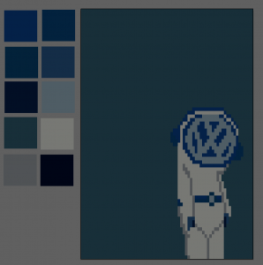
Here are the images for the Pixel Art training. I decided to make my image off of what I am assuming is a Volkswagen character that I saw at a dealership. This was a lot of fun! I definitely will be making more Pixel Art in the future.
