Course Graphic
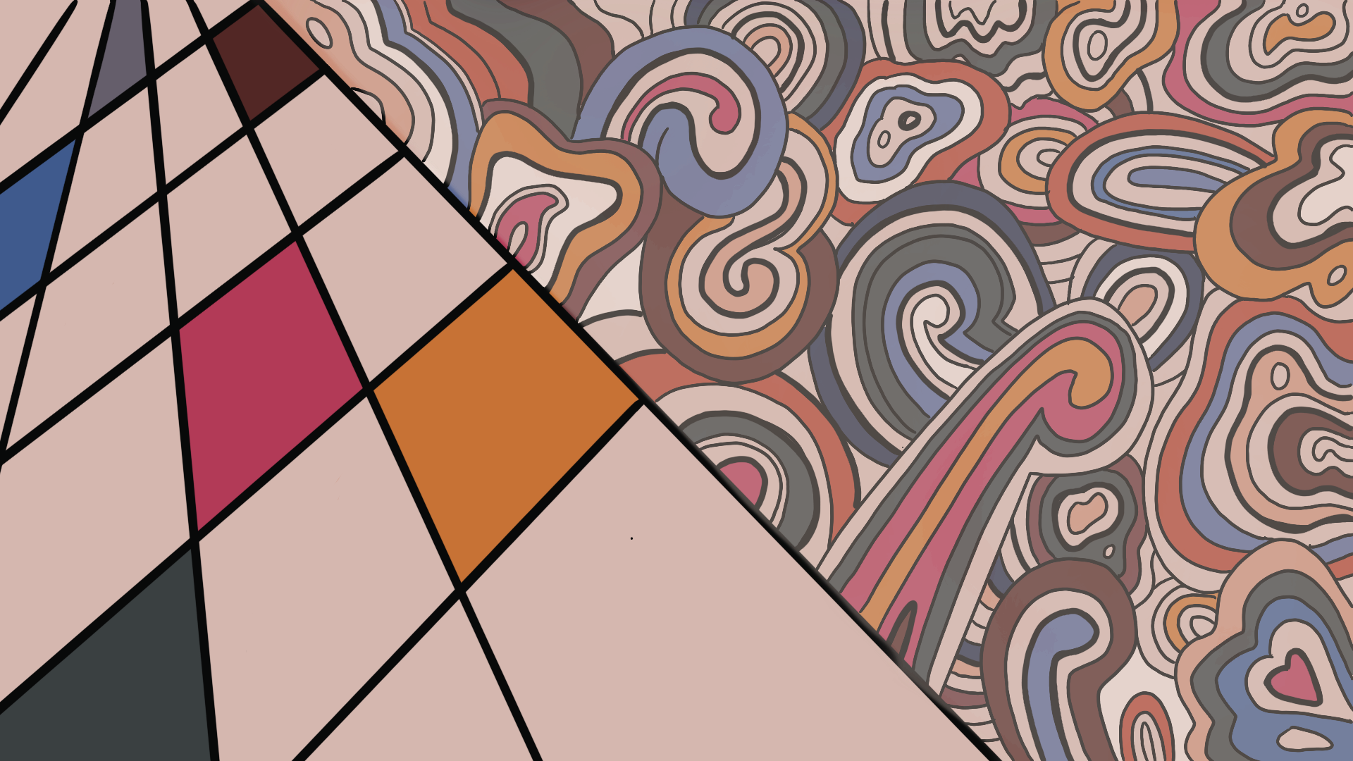
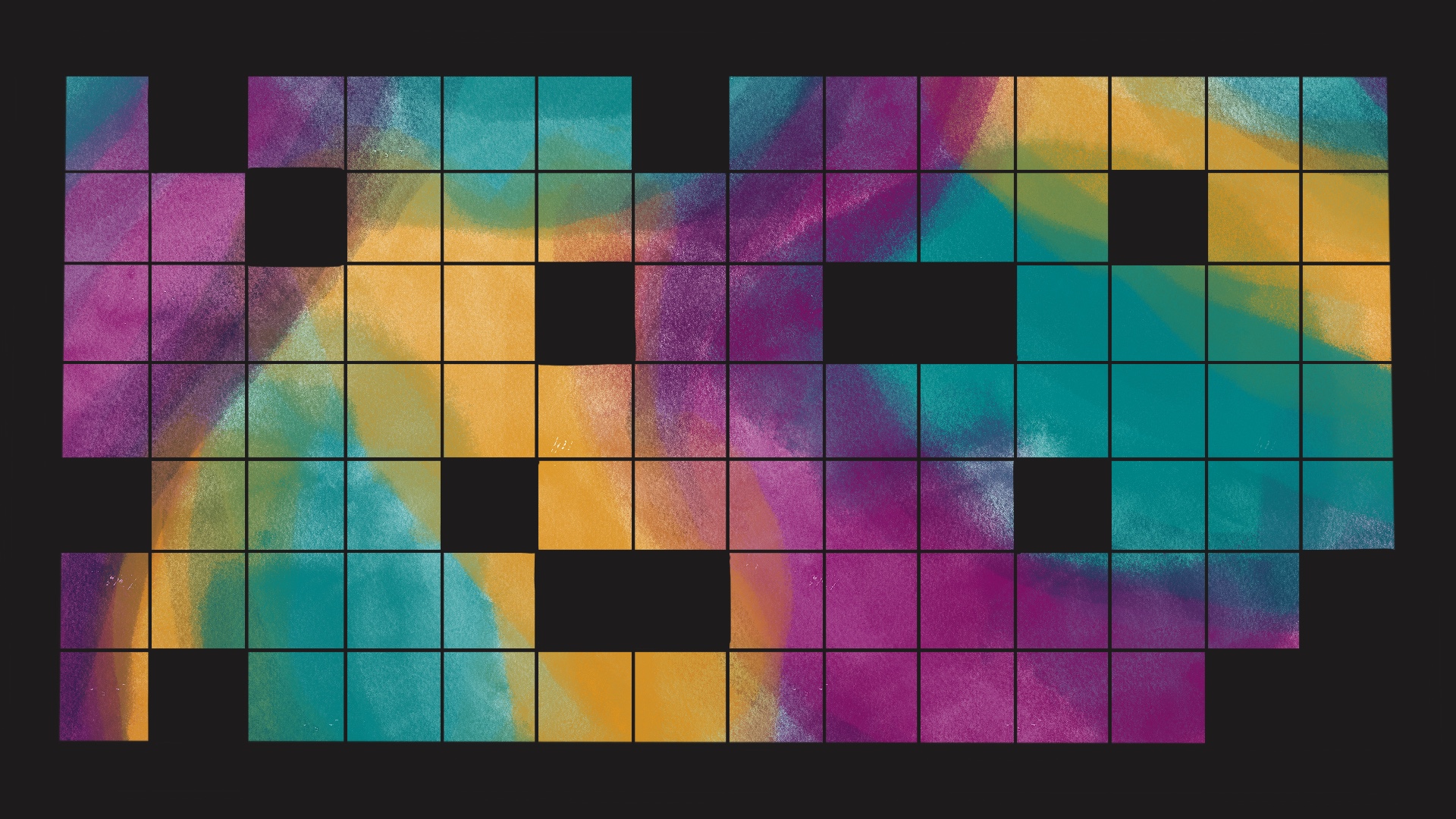
For the past couple of weeks I have been working on the course graphics training. I started off with two designs.
They both were visually appealing designs, but there was still something missing to make it a design that will capture the students attend, but wouldn’t distract them from the professor.
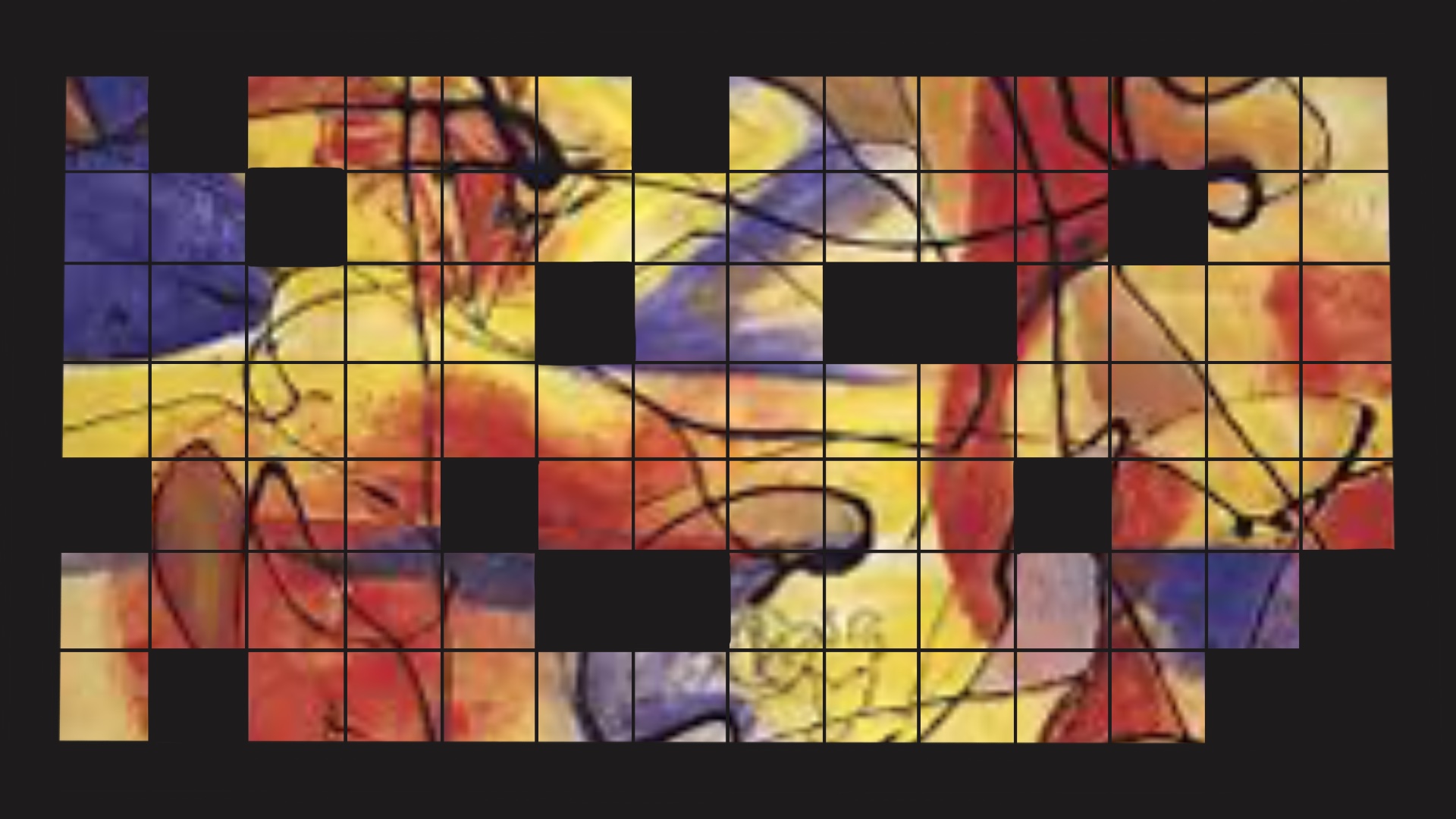
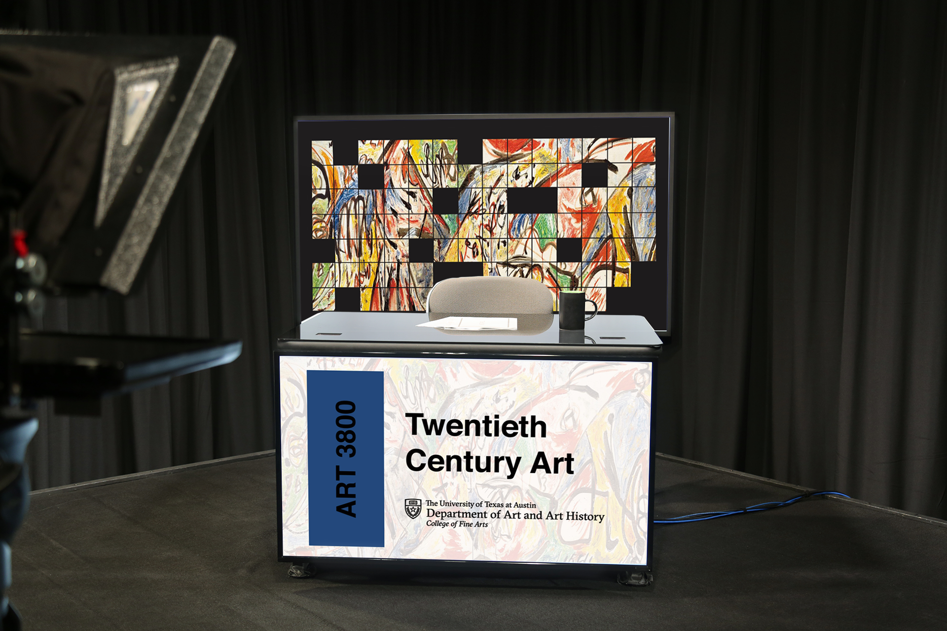
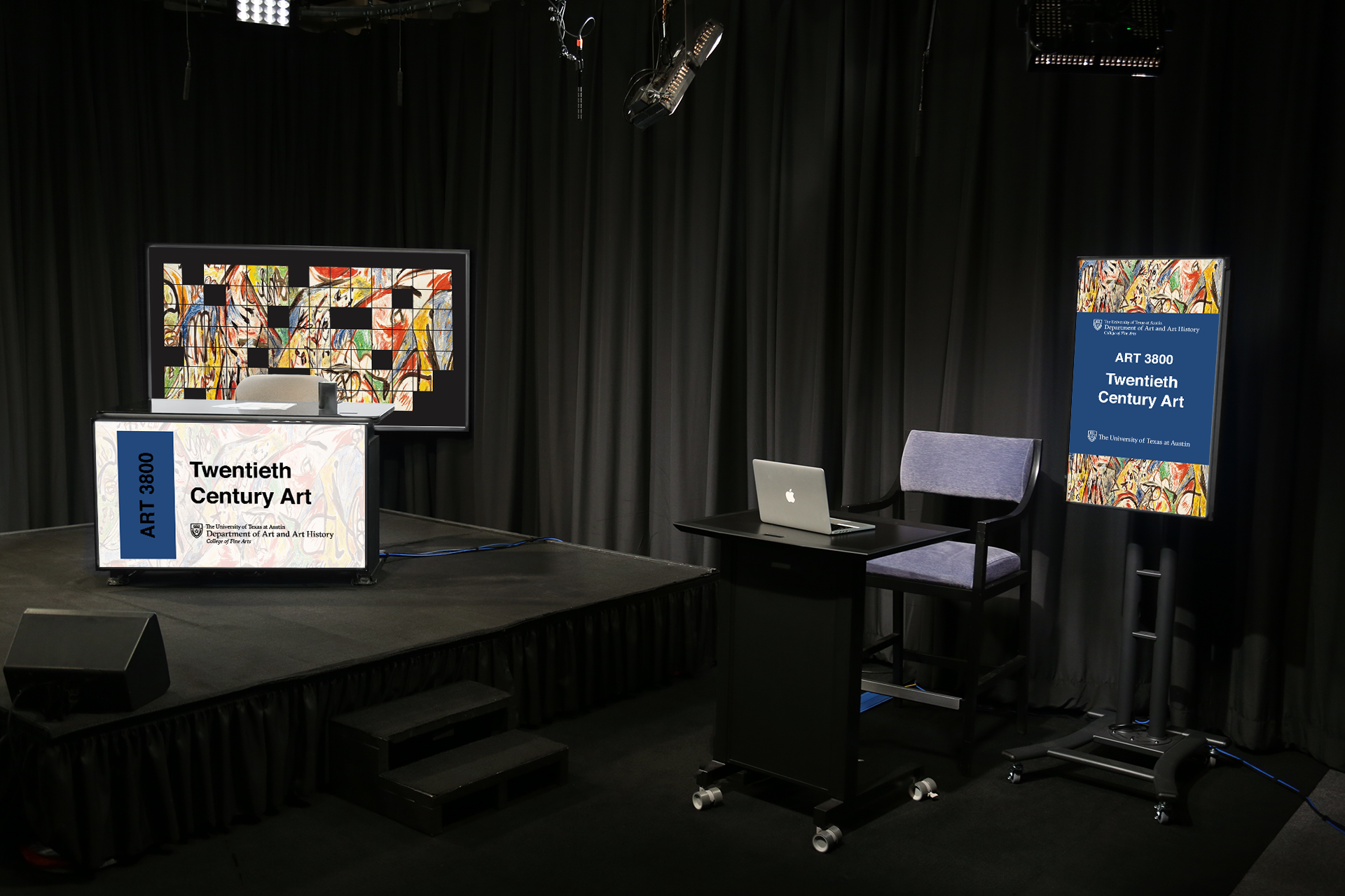
I decided to continue with the grid design, but add in the original painting as the background.
This was the path I wanted to go in for this course graphic. I felt that it was a perfect balance between simple and complex. However, the resolution of the image was really blurry and I was unable to find a larger size of this image.
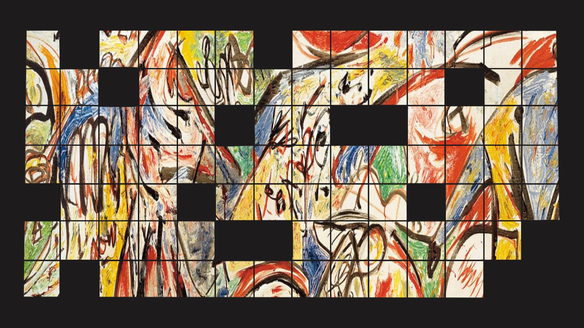
As a result, I decided to research other paintings by the artist and come across a colorful master piece that would be the focus for the course graphic.
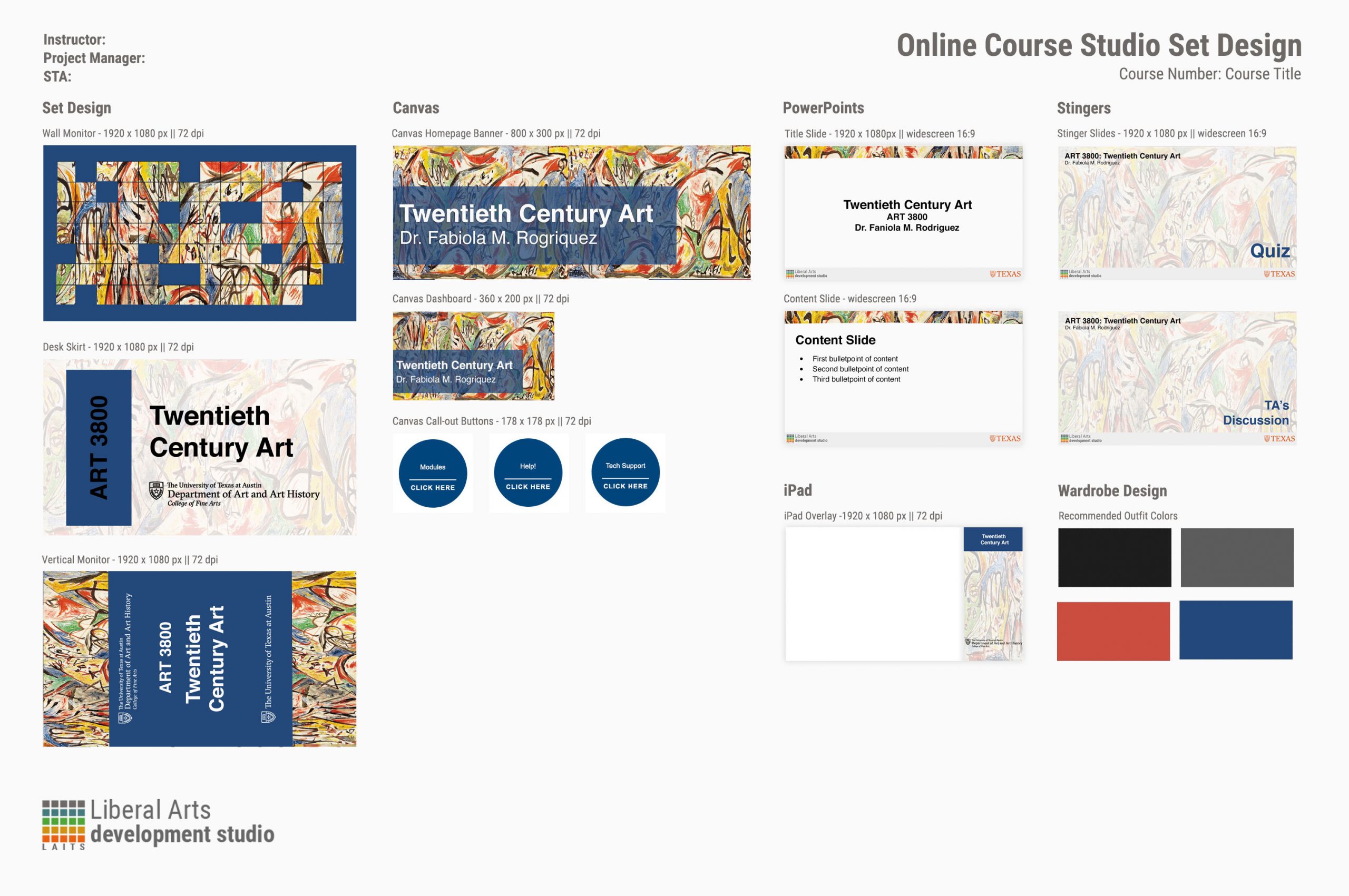
I began working on the additional assets that would be included in the course graphic package. I decided to have the based color to be a navy blue color.
The graphics were turning out great. However, the black border for the grid was contradicting the light colors of the other graphic. As a result, I ended up changing the black to the same navy blue color to make everything more in sync.
Overall, I believe I created a successful course graphic that is both visually appealing and applies well to the theme of the course.
