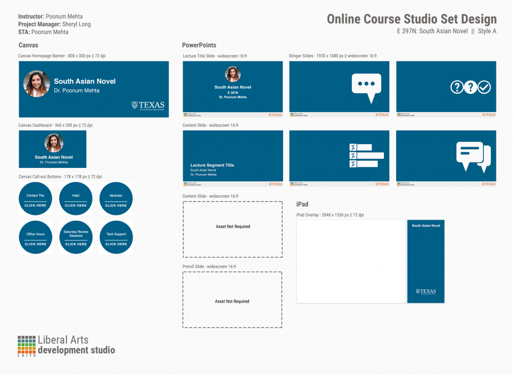
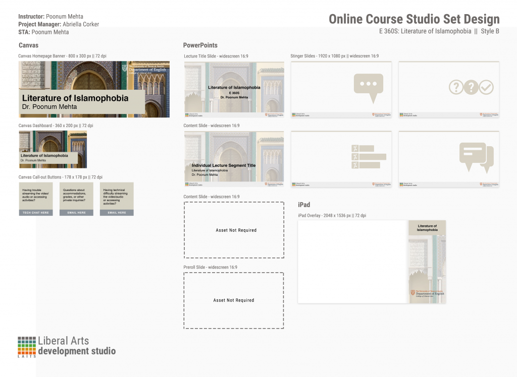
Honestly, didn’t think I needed to do a course graphic training when I’d already completed an entire course graphic set for a real course, but it turned out to be good practice adjusting colors and seeing what works best for legibility with the provided assets.
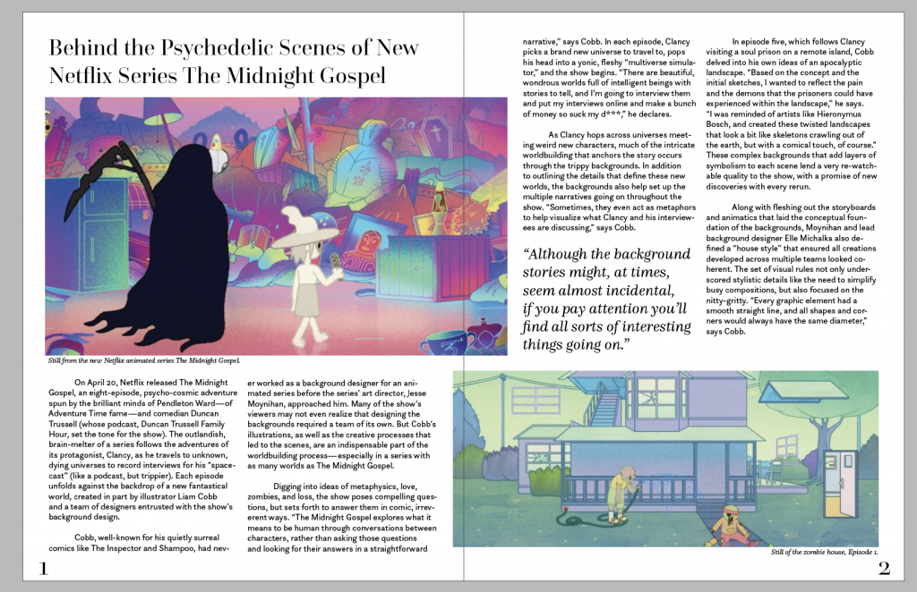
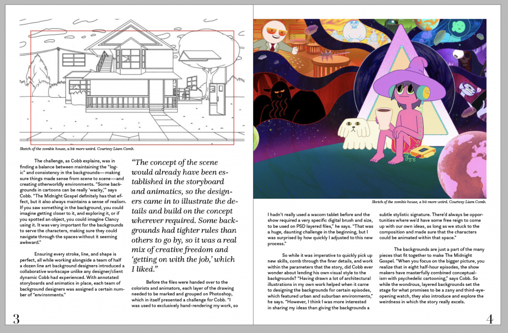
Here’s my indesign spread, waiting for feedback on this before checking the to-do off but I’m pretty proud of it! I used the same fonts that I picked for my senior yearbook because ~nostalgia~ (fun anecdote: I had to present a case to my district board to justify spending $300 on the entire font set and now they’re all free on creative cloud lmaoooo)
I think I’m ready to start on CLIO training…wish me luck. Website design softwares do not seem to like me very much.


