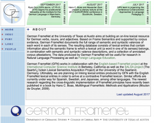
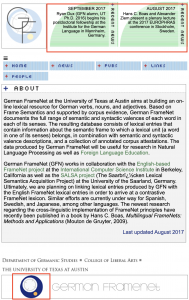
After meeting with Stacy, he suggested a few more improvements to the German FrameNet website. The “recent news” section hides some segments when the page width is reduced, in order to make the remaining segments more readable. Also, I created another version of the logo that has a white background which is used when the page responds. Lastly, I evened out the left-hand margins so that all the content starts at the same place.

