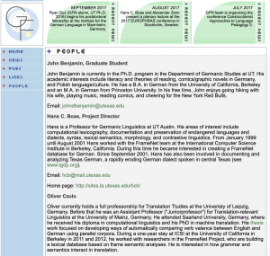
I’ve added the last few touches to the German FrameNet site. The site now has a collapsible menu that displays the list items horizontally. The menu items wrap as the page width shrinks. I’ve also hidden the menu background to allow the body to start from the far left of the page which gives more space for the content to display. I applied these changes to each page within the site. Creating the responsive menu was particularly challenging because the original menu is actually one image. In order to create a horizontal menu, I made the menu items into singular components. Then, I wrapped the items into one div that highlights each link when they’re hovered over. Overall, this site gave me a lot of practice with working my way around problems that arise when faced with older web design practices.
Above 800 pixels vs. Below 800 pixels:

