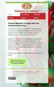
I had the latest design approved by Nathalie so it is the final style of the responsive website. Now, the focus is to maintain functionality across all of the pages within the site because the content varies from the home page to the other pages. Also, to ensure responsiveness on significantly small screens.
To accommodate screen sizes in the width range of 800 to 400 pixels, I added a second media query that restyles the logo and site title. The additional media query reduces the font size, places the logo above the site title, and centers both of the items. Before adding the second media query, the style wouldn’t fit on screens at 500 pixels but now the content works well at this size.


