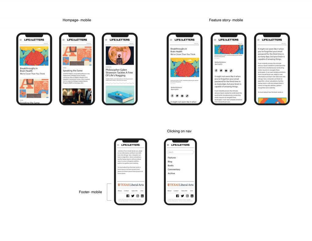
Life & Letters Mobile Prototype
project: Life & Letters Mobile Prototype
Client /Prof: Allen Quigley
completion status: Started Oct. 3
staff guidance: Stacy, Suloni
STA team members: Kevin!
description/plans: create an Adobe Xd prototype for the Life & Letter Allen’s Illustrator mockups for Stacy and Kevin to use for development
To be completed:
Allen’s Design:
Here is the link for the prototype/mockup: https://xd.adobe.com/view/394a2a17-75d1-40ec-4ae8-d0fde51866df-4f7b/
And the link for development: https://xd.adobe.com/spec/8970dc6d-3601-4b49-5a6a-dbef6d2b4271-ff41/
I attempted minor edits to the main nav and footer for an overall cohesive and sleek feel.
University Writing Center Site Redesign
project: University Writing Center Site Redesign
Client /Prof: Rachel Forsyth and Vicente Lozano–UWC folks
completion status: Started Oct. 3
staff guidance: Stacy, Valerie
STA team members: n/a
description/plans: work with Stacy to develop a new design system for the UWC site that best meets undergrad student, grad student, faculty, and consultant needs while remaining inviting. This can be done through better university affiliation, simplified navigation, concise and helpful copy, visual interest, and people-centered design. (Really excited about this one!)
To be completed:
Part of Dept. of Rhetoric and Writing
Updated by Rachel currently, need for styles to be defined/something to pass down to maintain site.need an updated site map, some pages are out of commission or can be compiledStyle: More university affiliation, while up-keeping a conversational, friendly tone
Users:
- Writing Center Consultants
- Students
- both undergrad + grad (grads have additional resources, what the undergrads have + extras)
- return users vs. new
- Faculty
- Appointments
- Presentations
- Policies
- Handouts (used by consultants to then give out physical copies of to students)
- Rethinking navigational organization (perhaps additional menu(s))
- Problems in the past with finding information/difficulty navigating the site with the main nav.
- cohesive styles
- making it more attractive for grad students (fairly newly added as a resource)–letting them know that the UWC serves them, too!
- need to keep in mind the need for faculty to recognize this as a service for the entire campus (be careful about including department logos; don’t want to demotivate)
- don’t like all the accordions
- needs to be able to be easily maintained
- homepage as ad for service
- where it can be obvious this service is for grad students, too!
- produce a style guide and page templates for easier project handoff and application
- more visual interest!
- possibly another menu for main/general uses
- “Make an Appointment” definitely needs to be a menu item
