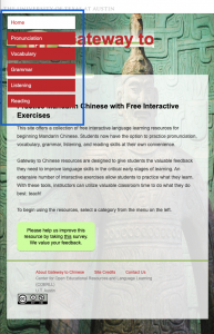
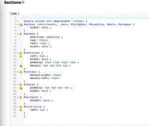
I’m learning webpage responsiveness so I can update older UT sites to be compatible on various screen sizes. The problem is that when the site is viewed on a smaller screen, the content is cut off instead of resizing to adapt to the smaller screen. I’ve started learning responsiveness by using a Google extension called Stylish to apply css to one of the unresponsive webpages. So far, I’ve made most of the elements on the home page responsive by adding media queries that tell the page to adjust the content when the screen size is less than 1000 pixels wide. The next element I’ll work on is the navigation menu which either needs to be changed to a hamburger menu so that the contents are collapsed, or the menu items need to be listed horizontally. Once I make all the elements on the homepage responsive, I’ll move on to apply media queries to the rest of the site.


