Immigration History Website
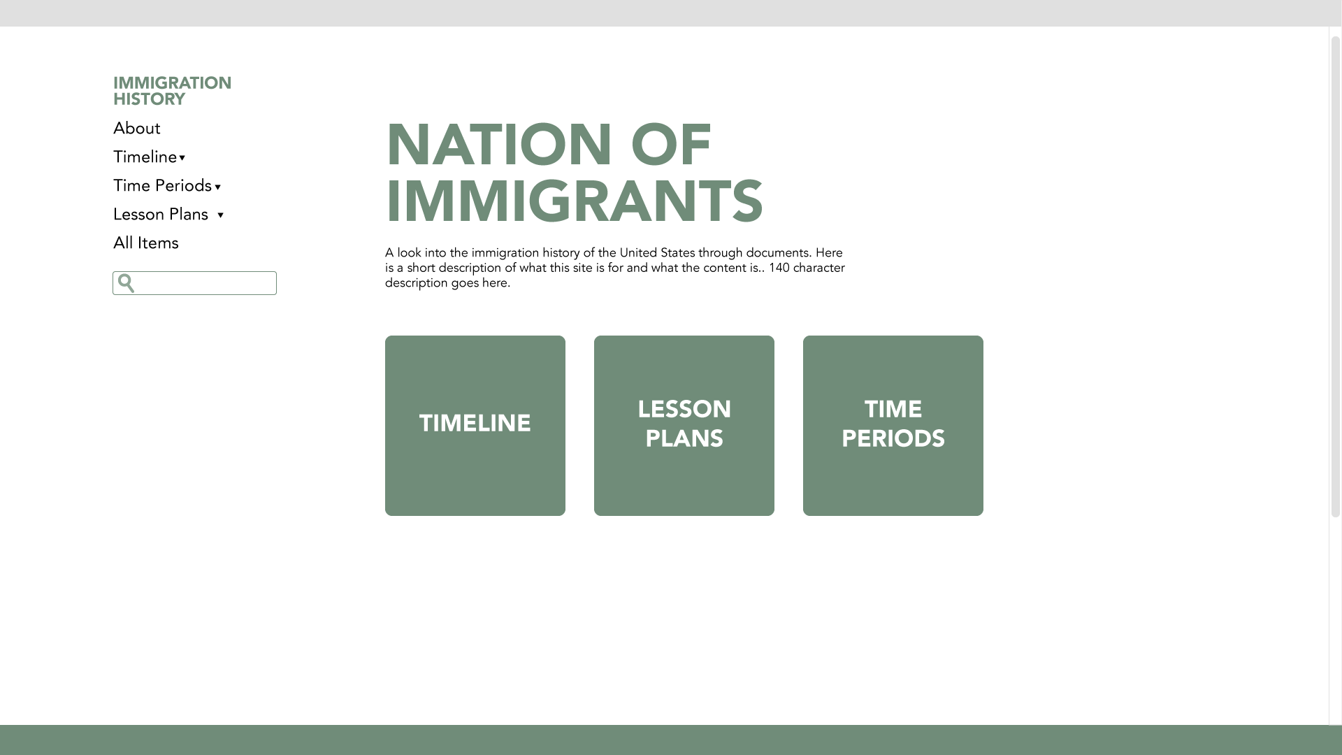
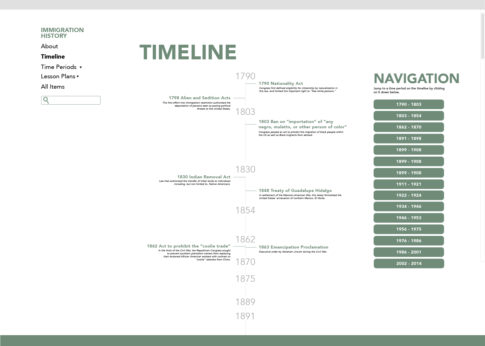
I am still doing WordPress websites, for most of this semester I’ve been focusing most of my time in a specific site: Immigration History. It’s a website designed to help people learn and teach about the history of immigrants and immigration policies in the United States. It has info on all events and developments over the country’s history. It then has lesson plans that group the info of several related events. Throughout these last months the site has undergone a few major transformations all created by Stacy, our designers and myself. These were the original designs:
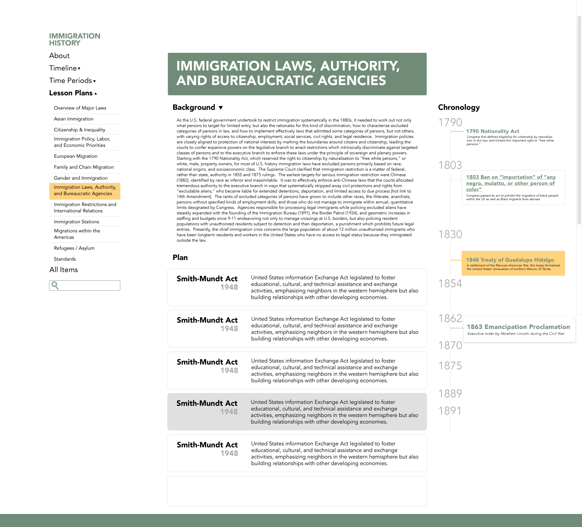
Later, a design for a Lesson Plan page was added. I worked on making it using a tab design like the one that I did for RBTL, where one tab would open a section and so on. However, the page was redesigned in a way that included all the content at the same time.
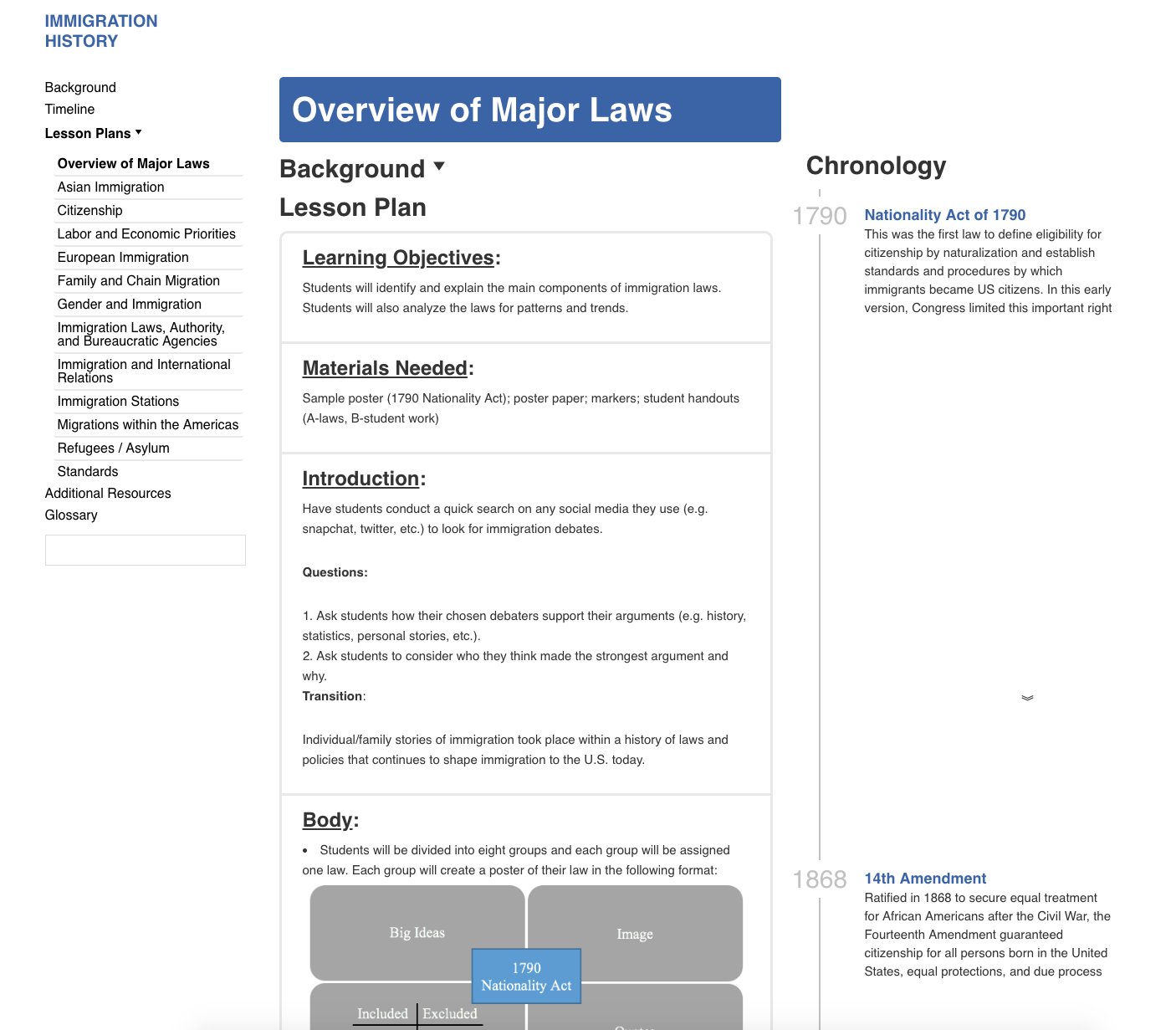
This is what the new design looks like.
One of the challenges with this design were getting the spacing to look just right on the page, it shouldn’t look too crowded. I spent a long time playing around with the margin and padding of every element.
Another challenge was getting the left sidebar to work right, all elements are supposed to be centered and the names of the sections you were currently at need to be bold. This meant I needed to use selectors pre-defined by WordPress on my CSS.
This left sidebar then became the primary navigation for the page, I overwrote the default behavior of the “Lesson Plans” button so that instead it displayed the sub-menu and let you choose a plan to visit. This way we got rid of the original Lesson Plans landing page from the original designs.
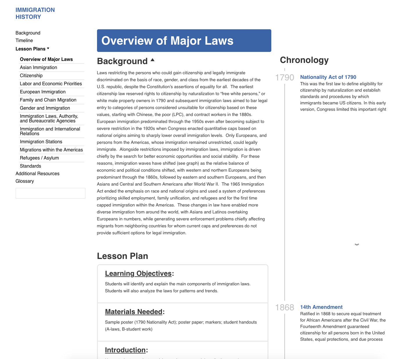
The timeline was, and is, the biggest challenge. We’ve been wrestling on how to display the events and dates. Eventually we got rid of the hover effect on them because it added no real functionality. We also decided to get rid of the big year markers, which displayed every 25 years and instead replaced them with the year of the current event. If more than one event lands in the same year then we display a line that “joins them up”.
We also decided to add space in between events to reflect the passage of time. This way 2 events that are 100 years apart will have more white space in between than 2 that are just a couple of years apart. I also added an elegant down arrow marker if there’s too much space in between, just to let the user know that there’s more events below.
We then completely changed the colors of the page to make it look less boring. This is what it looks like now:
I still need to work on the timeline a bit on the timeline but the page is about done. I’m excited about the next challenge that Stacy might have for me now.
