Week of 8/6
Like last week, I mostly worked on animations/illustrations for RUS412. For illustrations, I finished my second illustration of Oleg counting sheep:
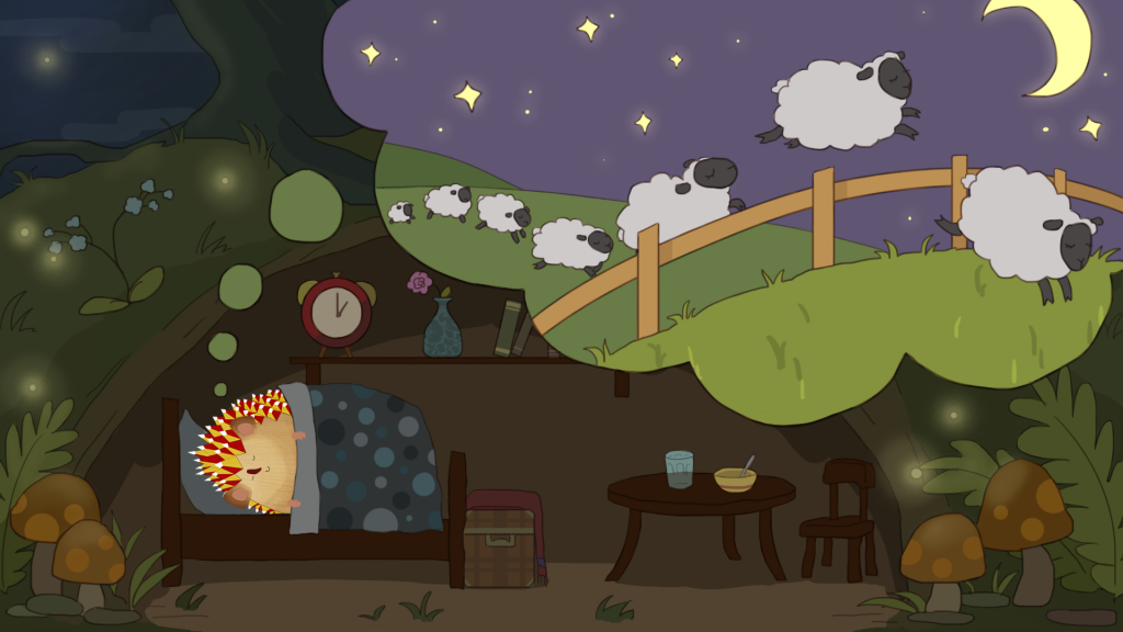
I briefly looked up the origin of “counting sheep” and it apparently comes from a Spanish/Islamic story, Disciplina Clericalis and Don Quixote. Interesting to know that it’s now known in both the U.S. and in Russia!
__________________
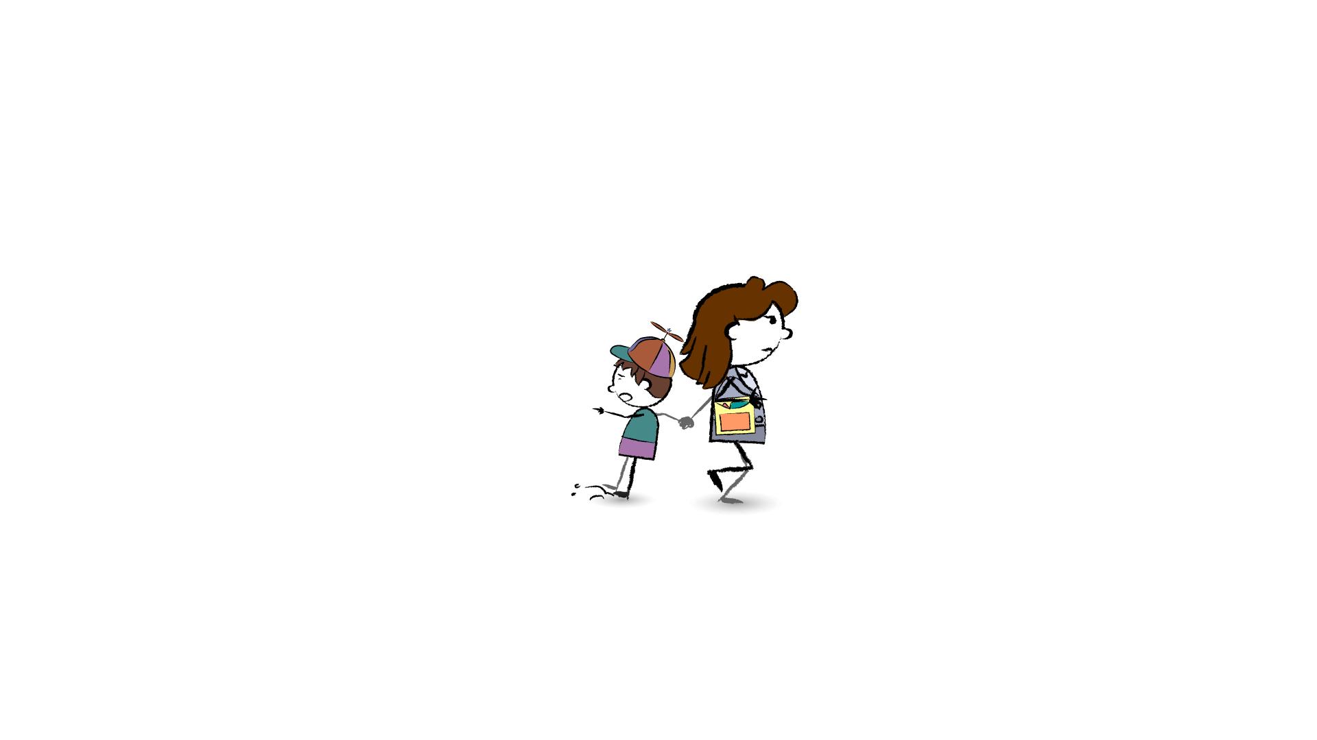
Here are the animations I did over the past week; the first is the mother/child walk cycle that I touched up:
He is now being dragged instead of walking backwards, his arm is pointing futilely, and there’s a dirt cloud spreading under his feet. Poor kid.
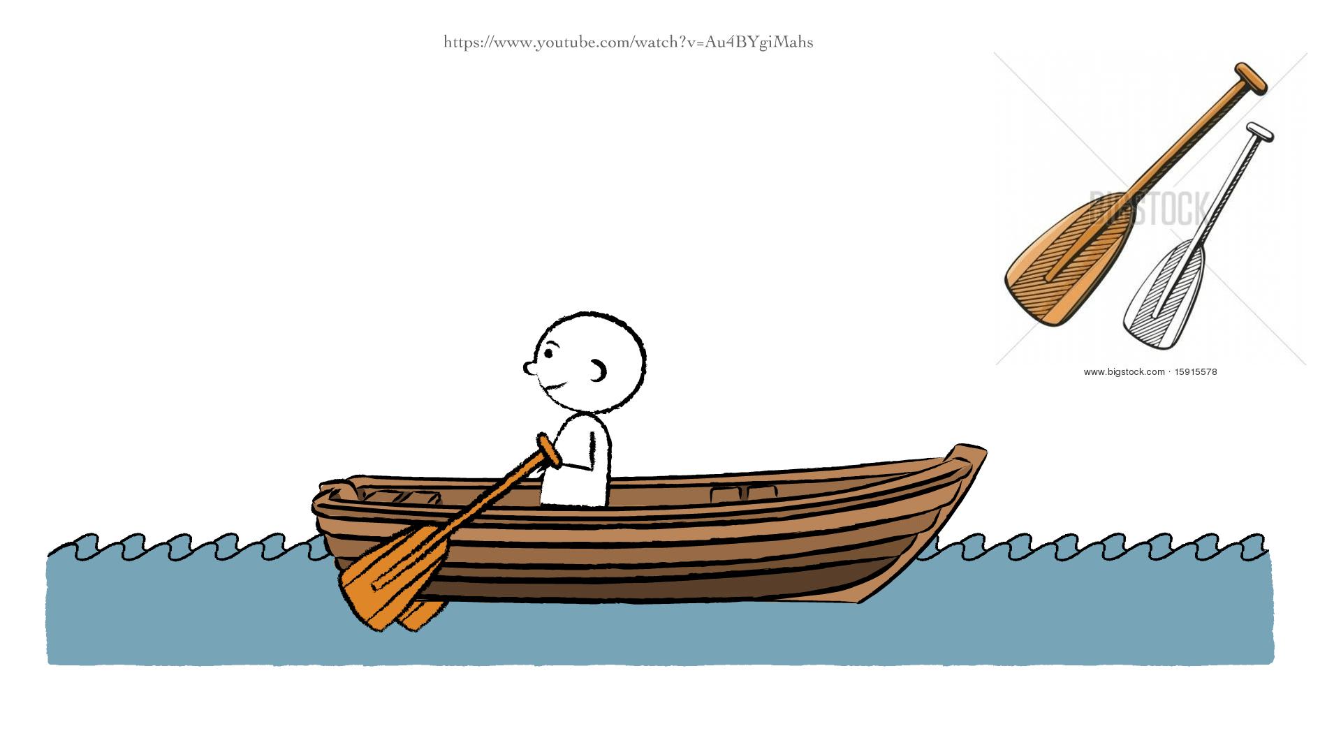
The second animation I did was this man rowing a boat.
I traced frames like these from a rowing animation video that Tate linked. I just screenshotted 8 moments, making sure I got all the extreme poses to use as keyframes.
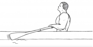
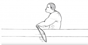
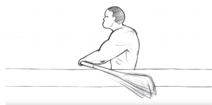
At first I did it in only 8 frames, but the rowing motion was too fast so I had to add 4 more frames to slow it down. This is probably the most complex animation I’ve done for RUS412 so far!
____________________
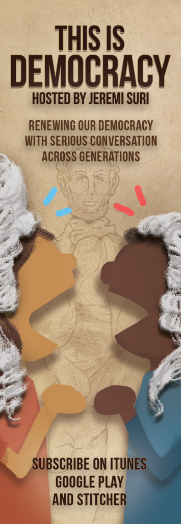
I also worked on a few things for This is Democracy, such as a favicon for the podcast site and a bookmark. It’s been fun trying to incorporate my initial design into different formats!
![]()
____________________________
And finally, here are some designs I’ve been working on.
For the STA patch, I made these three drafts. My favorite one is the teardrop design!
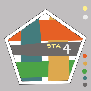

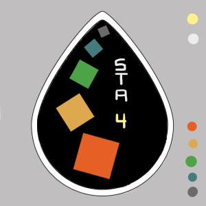
I started with a pentagonal shape because I wanted it to be 5 points/5 sides for the 5 LAITS colors. But then I saw the teardrop-looking graphic for the Liberal Arts Honors on the cabinet at the back of the lab, so I tried to make a drop-shape with the LAITS squares spiraling down. The rotation of the squares was somehow very hard to manipulate because they kept looking weird and didn’t fit the space well, but I think I eventually got it to an aesthetically-pleasing layout.
And just for fun and because I was hungry, I wanted to try the NWAV49 design but with that last tomato/potato idea that Suloni put on the design brief.
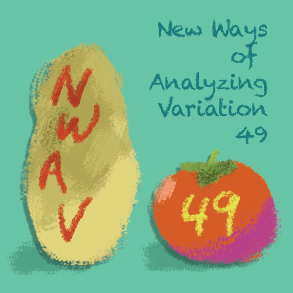
I’ve been playing around with fonts, but I keep wanting to default to Bebas Neue!! I feel like I should find a homey font that looks like it belongs in a cookbook or something. After all, this design is more organic than one with a soundwave or spectrogram, which would be more technological and digital.
