Update on ARH301 display
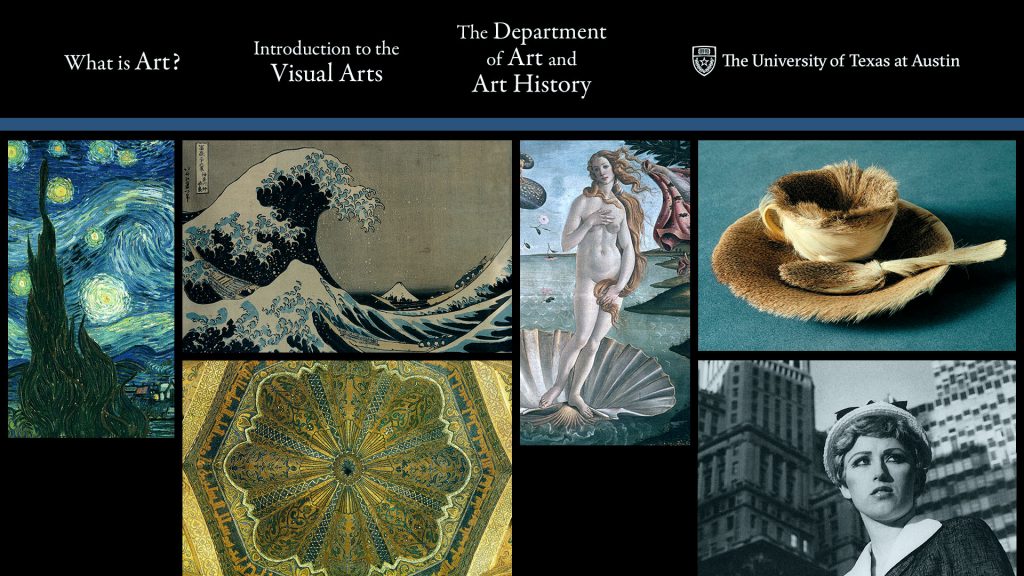
Last week some screen tests were done with the art history graphic for Professor Johns to see what it will look like during her lectures. There are two monitors in the space, one behind the desk (which will show in the picture-in-picture video/powerpoint lecture) and another down below and in front of the desk. We agreed that the graphic would look best on the desk monitor because on the back one it would be too distracting during her powerpoint lectures.
I made some adjustments to the design so it would work for the new screen. The main issue was that all the text needed to be moved as far up as possible so it could still be read in case the bottom of the screen got cut off, and also there was a red cast on the screen so I created a color balance layer on top of everything to slightly tint it cyan. The images I enlarged in a more uniform grid pattern, with equally spaced margins. The negative space below Starry Night and Venus will be filled in with images soon.
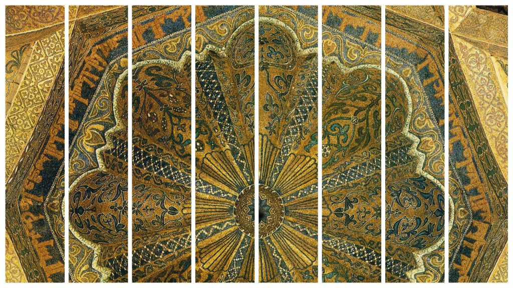
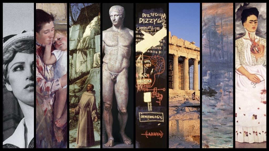
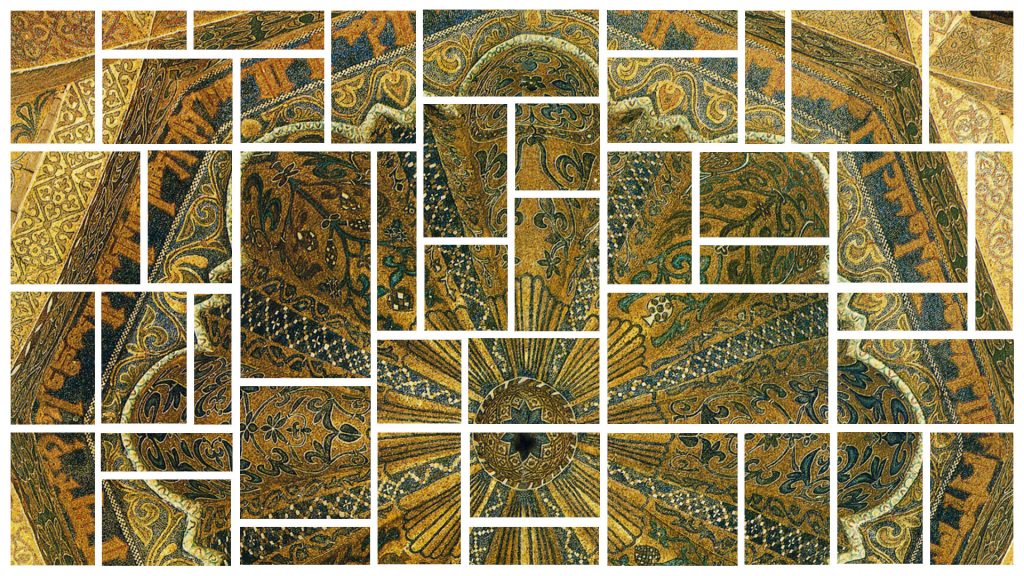
For the back monitor we decided that something not too busy would be best, and Suloni and I discussed options including a grid, triptych or multi-panelled image, and large graphic letters spelling ART. Professor Johns will send us a list of artwork she uses on her exams for use in the display (also, I’m downloading the pictures from UT’s Digital Archive Services, DASe, and they are unaffected by copyright laws because they being used only for educational purposes and not outside of an educational setting); in the meantime I made a grid design and an eight-panel design as clipping masks so that I can easily add the images later.
Update on Russian animation/illustration
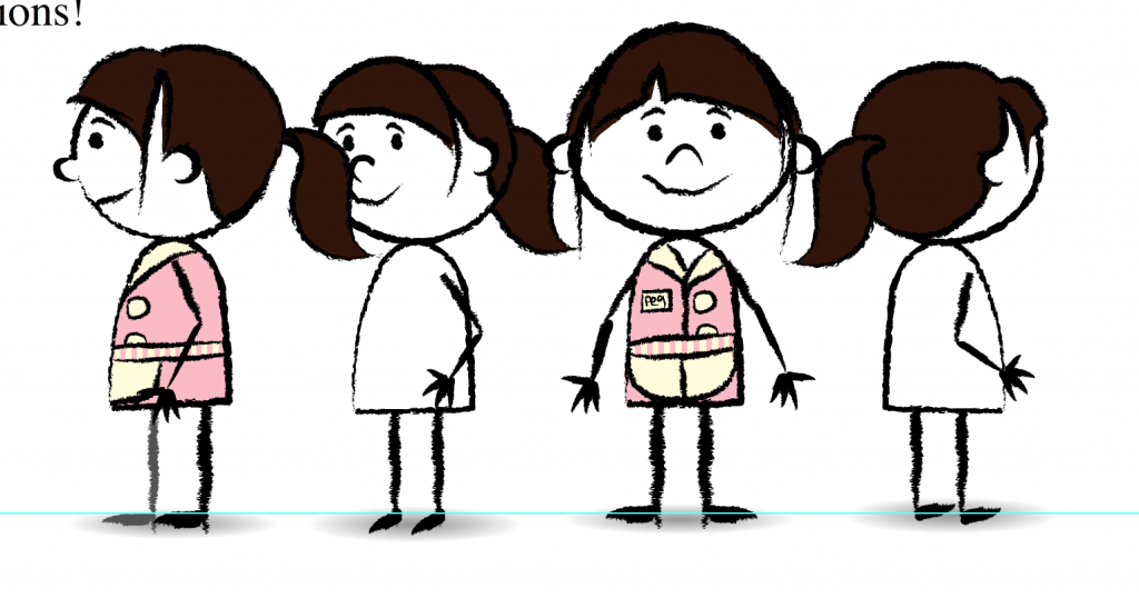
The two other views of Waitress 2, completed. Today I’ll begin a tutorial on symbol creation and make some phone symbols.
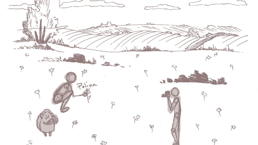
My first Russian illustration assignment, which I’ve sketched out. The scene is Oleg and Polina picking flowers in a field while Grigory takes their photograph. It looks a little pixelated because it was a drawing that I scanned in and then had to change the line color to this mauveish-rose color from the original black, but I don’t think it matters because the line work is going on a new layer on top of this.
