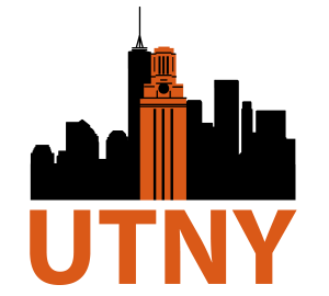
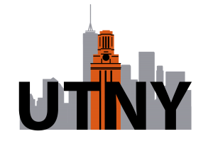
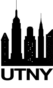
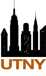
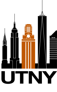
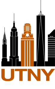
Today I began working on a logo rough draft for the new UTNY program using Adobe Illustrator. The client envisioned the logo to include “the Tower in the Manhattan skyline with UTNY figuring prominently below.” At the time being, there is no set font–the type used in the roughs is acting as a placeholder. I wanted to include Texas orange to add contrast and further distinguish the tower. Additionally, I created a version featuring grey to provide an alternative. Below are 2 versions of my first rough draft.
I am looking forward to this design evolving as I receive critique and continue familiarizing myself with illustrator.
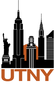
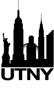
And here are the second round of drafts after feedback from UTNY clients.
More feedback from the client ensured a third round of drafts; this time with the Flatiron building replacing the Statue of Liberty, lighted windows, and a larger (and more prominent) Tower.
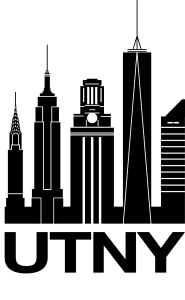
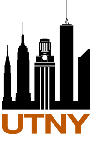
And now a fourth edit. Utilizing suggestions of the clients, the Tower was centered, Flatiron building replaced by the One World Trade Center, and architectural detailing.
