Also for the Journalism course, I made these two graphics for the course’s “Graphics” module:
The first graphic is intentionally difficult to read to show an example of a “bad graphic”:
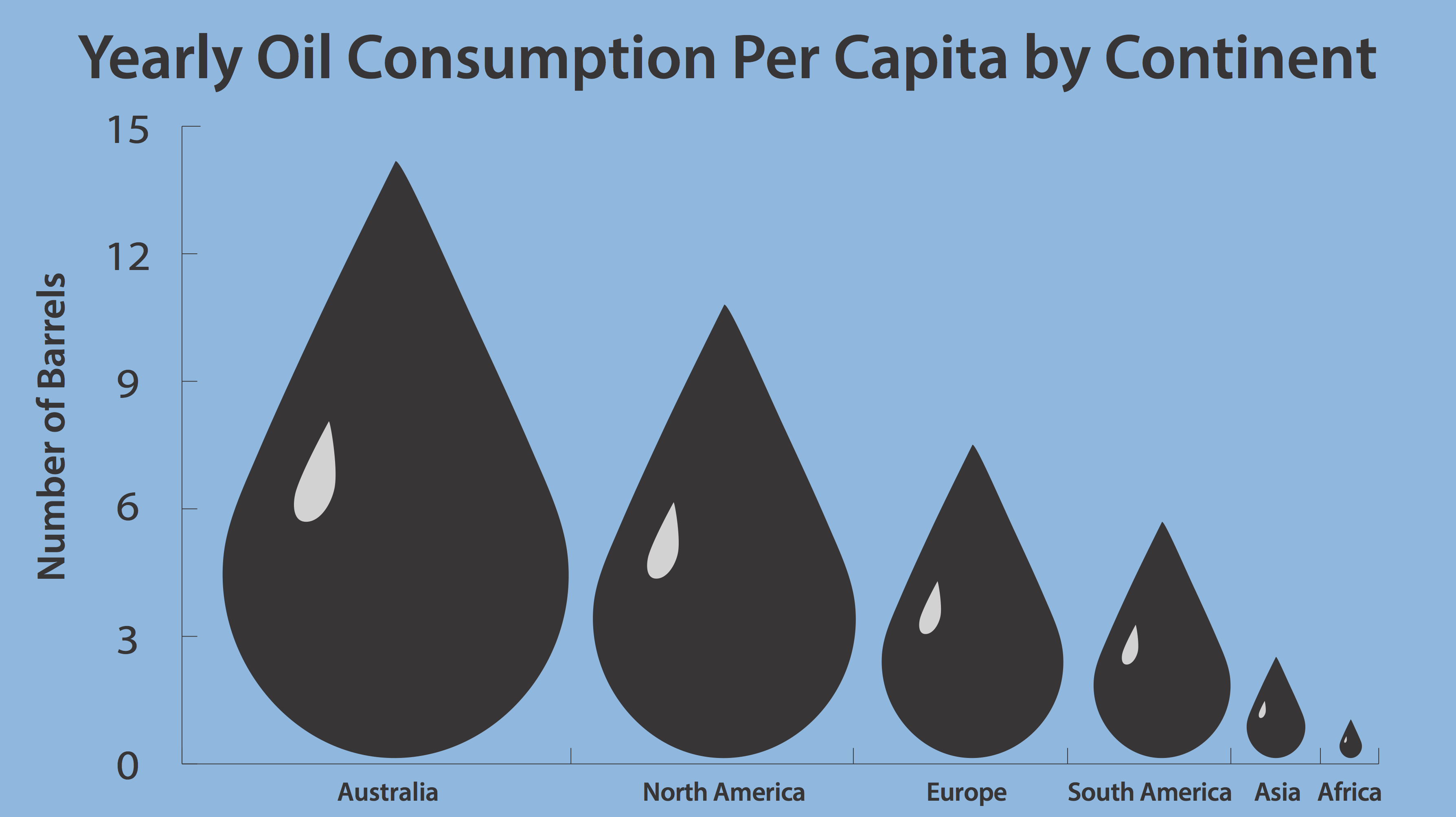
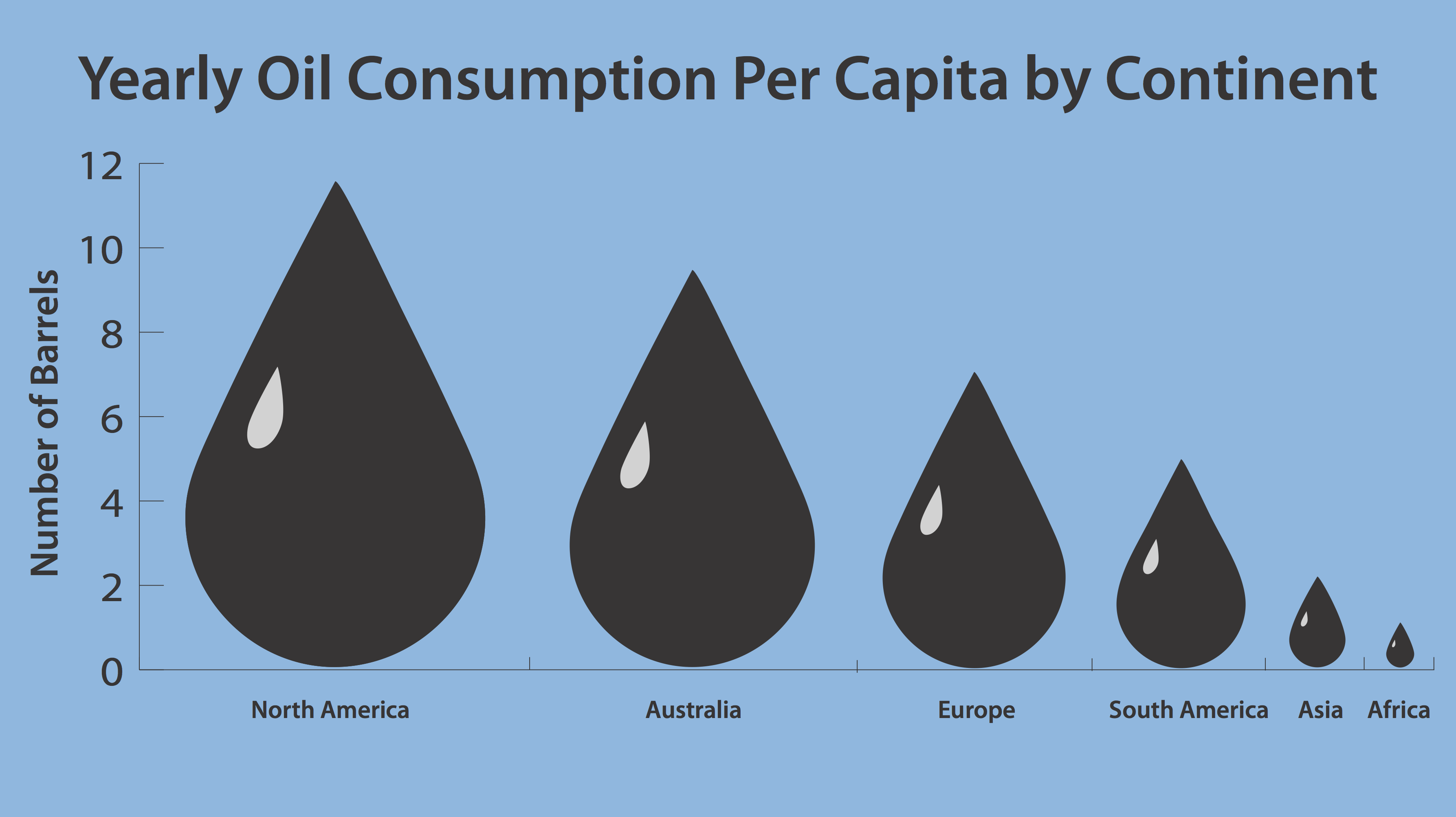
 These next graphics are depicting yearly oil consumption of each continent using oil drops rather than a bar graph:
 And this is the updated version with the correct barrel number for Australia: