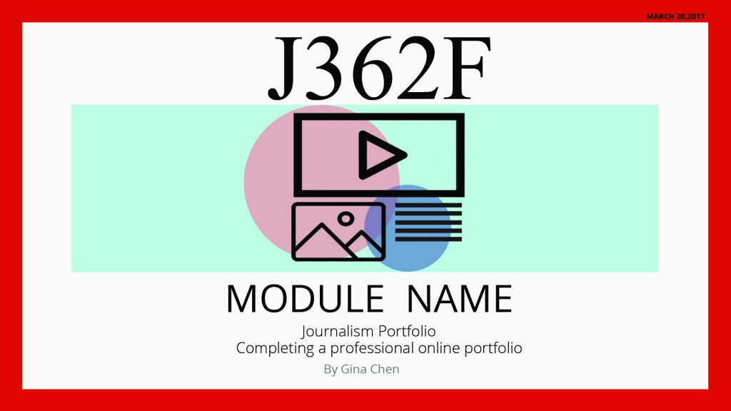
This week Lauren, Bethany and I were each responsible for producing one mockup of a graphic to be used in an online course in journalism. The professor wanted to convey the central idea of her class with one image, expressed either in the form of a social media newsfeed, newspaper, or magazine. Given some specifications, I first came up with the design below:
 I wanted to color the icon in an interesting way, but with the many elements on there it just ended up looking messy. Here are some later designs.
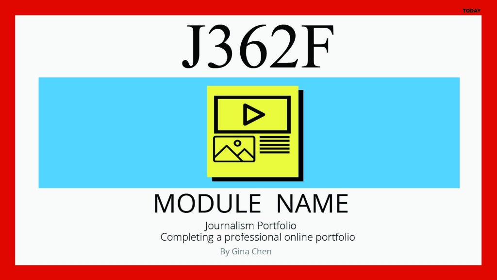
This one didn’t have the right colors
The design I submitted as final was the one above, with the hard drop shadow.
