Logo Tutorial Redesign
I redesigned the template for the symmetrical logo tutorial. I used illustrator to create a horizontally symmetrical badge. The color version of the logo was limited to a max of 3 colors. Suloni also requested to see the B&W logo on a black background. I created two versions of this: one with the original B&W logo on a black background and one where I inverted the B&W logo on a black background.
Previous Drafts
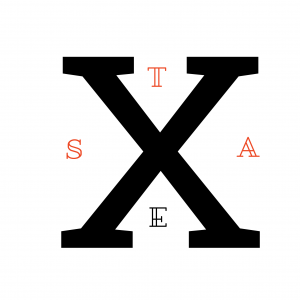
For the sunset logo, I originally thought to create a camping or nature badge, something like what a boy scout would receive. After I created the 3-step gradient semi-circle, I didn’t know what I could add to it without surpassing the 3-color limit. I ended up discarding this draft after running into creators’ block. The Texas logo was one of the first logos I created. I wanted to use the word STA for the STA training template and noticed that you can spell Texas with STA. I also noticed that X was both horizontally and vertically symmetrical (and diagonally symmetrical, though that depends on the font), so I decided to use the X as the main feature in my symmetrical logo. Then I inserted the letters in the spaces of the “X”. I wanted to make “STA” stand out so I used a different color for those letters. I realize that the logo isn’t truly symmetrical because of the letters, but it loosely adheres to a horizontal and vertical symmetry.
