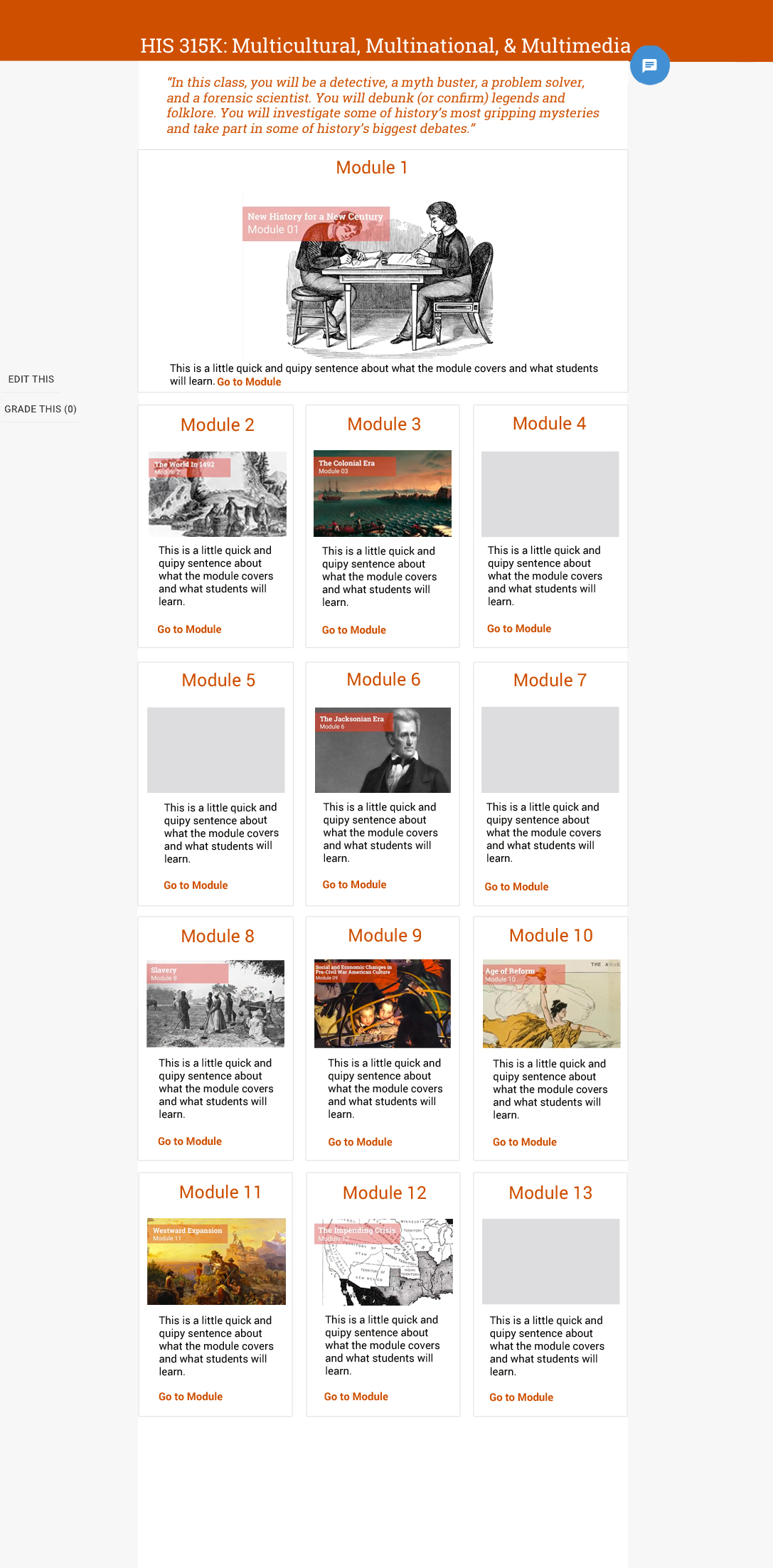
I am assisting Ashley and her team with designing Dr. Mintz’s Canvas site. At the moment, I’ve been putting together some mockups of what the homepage for his online site might look like.
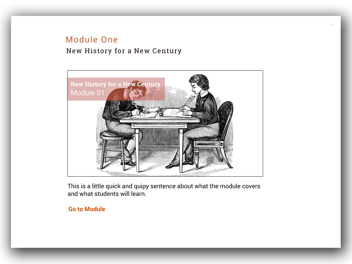
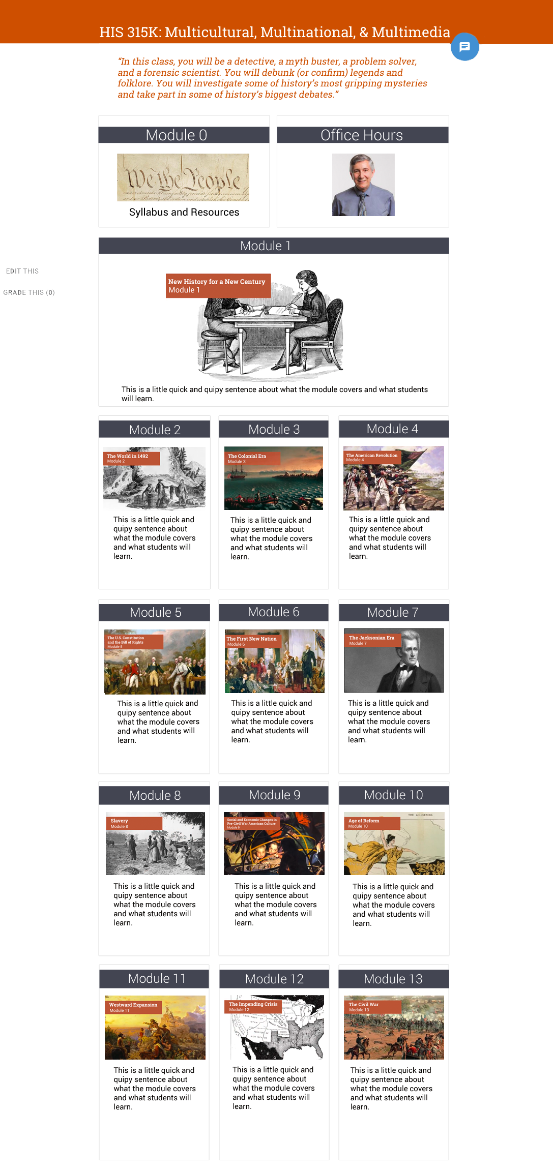
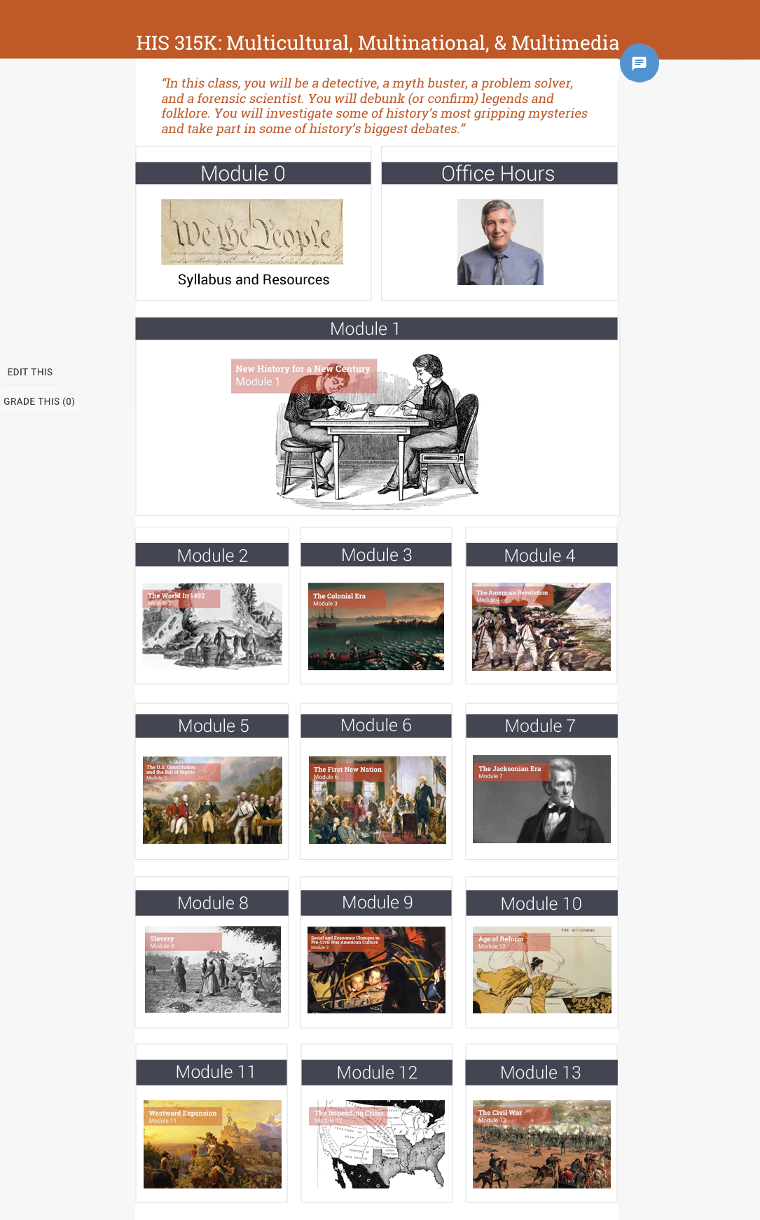
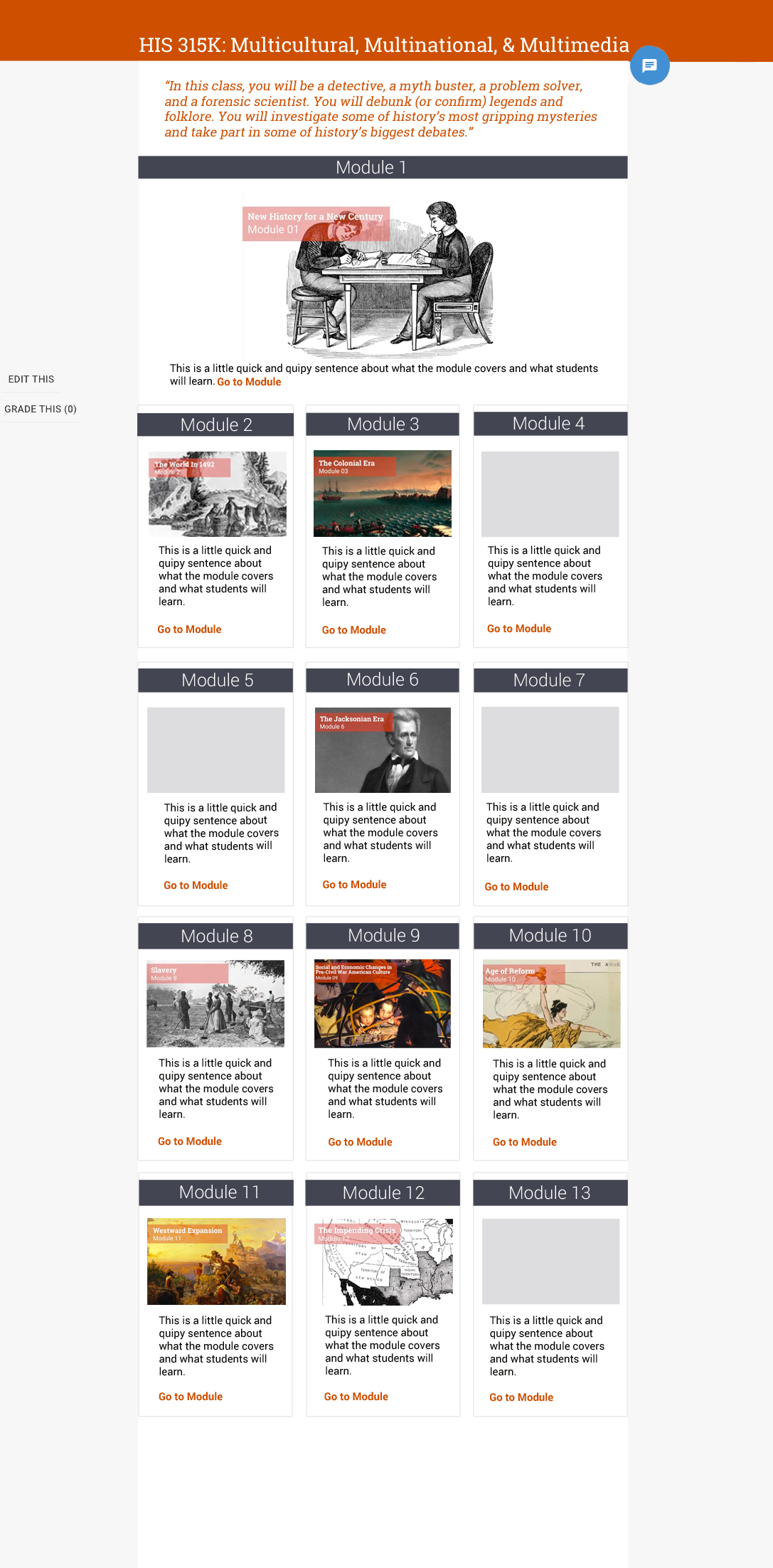
We found a basic design that everyone liked, but had some details we wanted to try out. Here are two drafts of that. One made all of the module cards have the same color strip of orange and the other removed the text below the title cards. I also added two new modules at the top.
Here are the two drafts original I’ve put together:
