For this project, I was assigned to design and eventually code the new STA Wiki page. The new wiki page will be in WordPress (it is currently in Drupal). The kind of design that I had in mind was to make it simple and minimal. I looked at websites like Medium, and minimalist blogs to understand their use of white space and typography.
I carefully selected the fonts because I want it to be easy to read. The simplicity also helps for maintaining the web page when more STA’s enter the program in the future. The homepage were to include the banner for the current STA’s and a small paragraph that summarizes the STA program. For the menu items, the Project Manager, Suloni Robertson wanted a navigation pop up screen to function and appear similar to the drop down menu in the college of liberal arts homepage: http://www.utexas.edu/cola/.
The left image shows the drop down menu without a testimonial from and a group image of the sta. The right image shows the drop down menu without the testimonial.
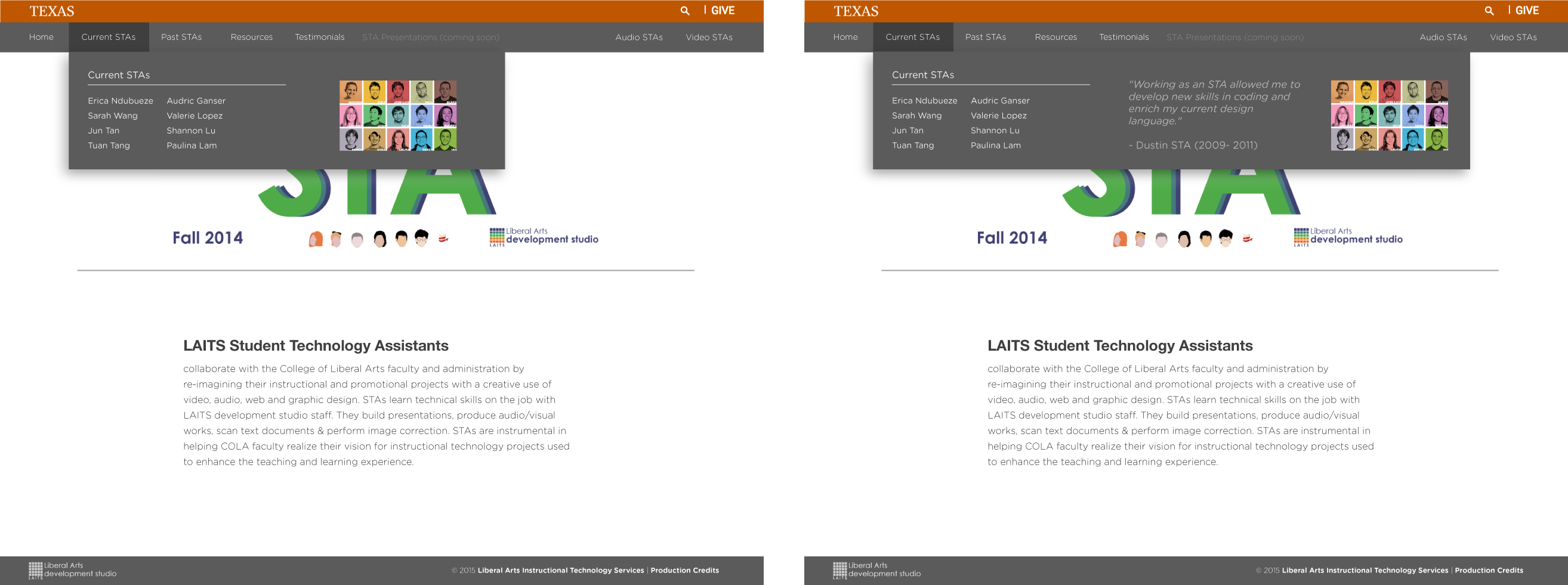
Here are the detailed images of the home page with the drop down menu. Out of all of the navigations, the current STA section is the only one without the drop down. Inside the navigation, there is a section for the past STA’s, testimonial, resources, and presentations. On the side, will include external links to the Video STA page and Audio STA page (the audio STA’s do not have their own web page so whether or not there will be a link for them is still uncertain).
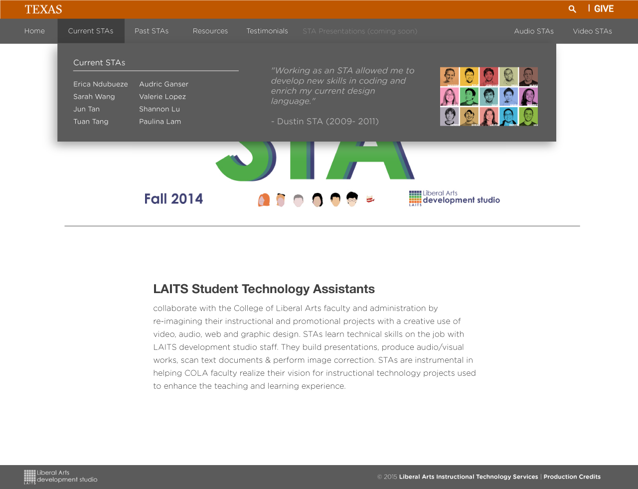
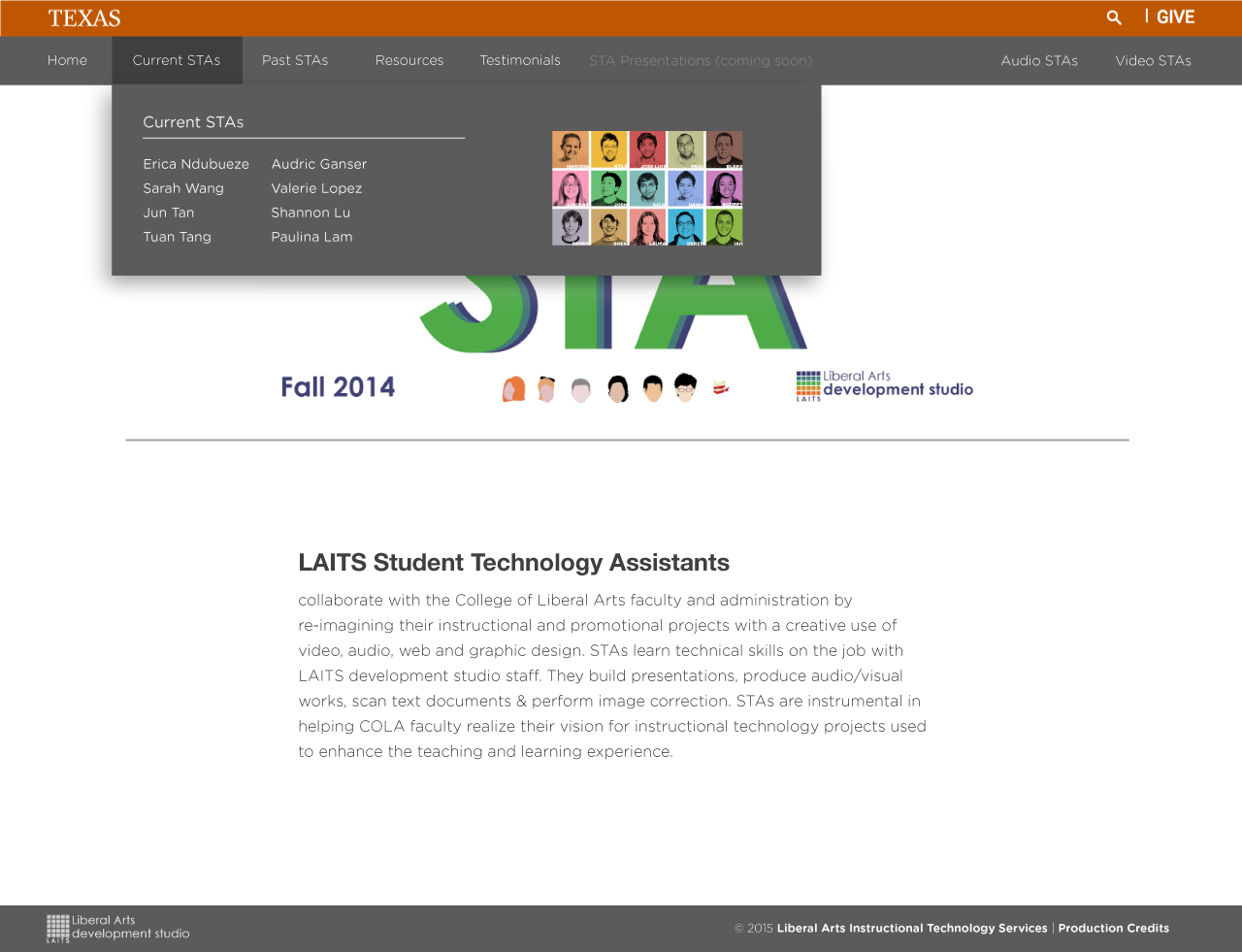
Out of all of the navigations, the current STA section is the only one without the drop down. Inside the navigation, there is a section for the past STA’s, testimonial, resources, and presentations. On the side, will include external links to the Video STA page and Audio STA page (the audio STA’s do not have their own web page so whether or not there will be a link for them is still uncertain).
The next page shows what the listing of blog posts will look like. When you click on any of the links of the current STA page, it will navigate to their blog post. At the top will include their name and banner when ever they navigate around their content. The problem for the current wiki is it doesn’t truncate the posts and the entire post is presented. This explains the long scrolling when trying to reach to the bottom. Because this is WordPress, this is not a problem.
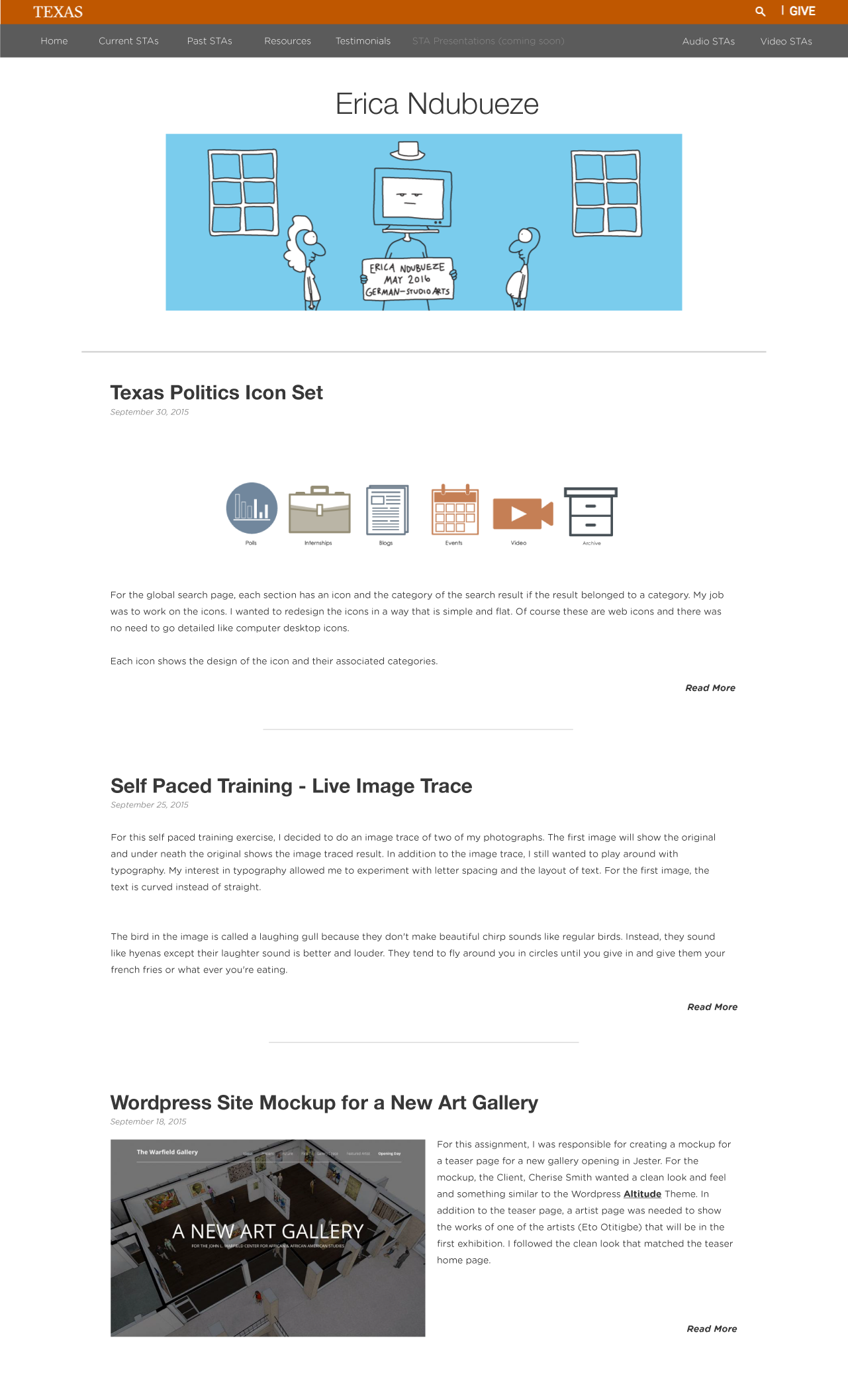
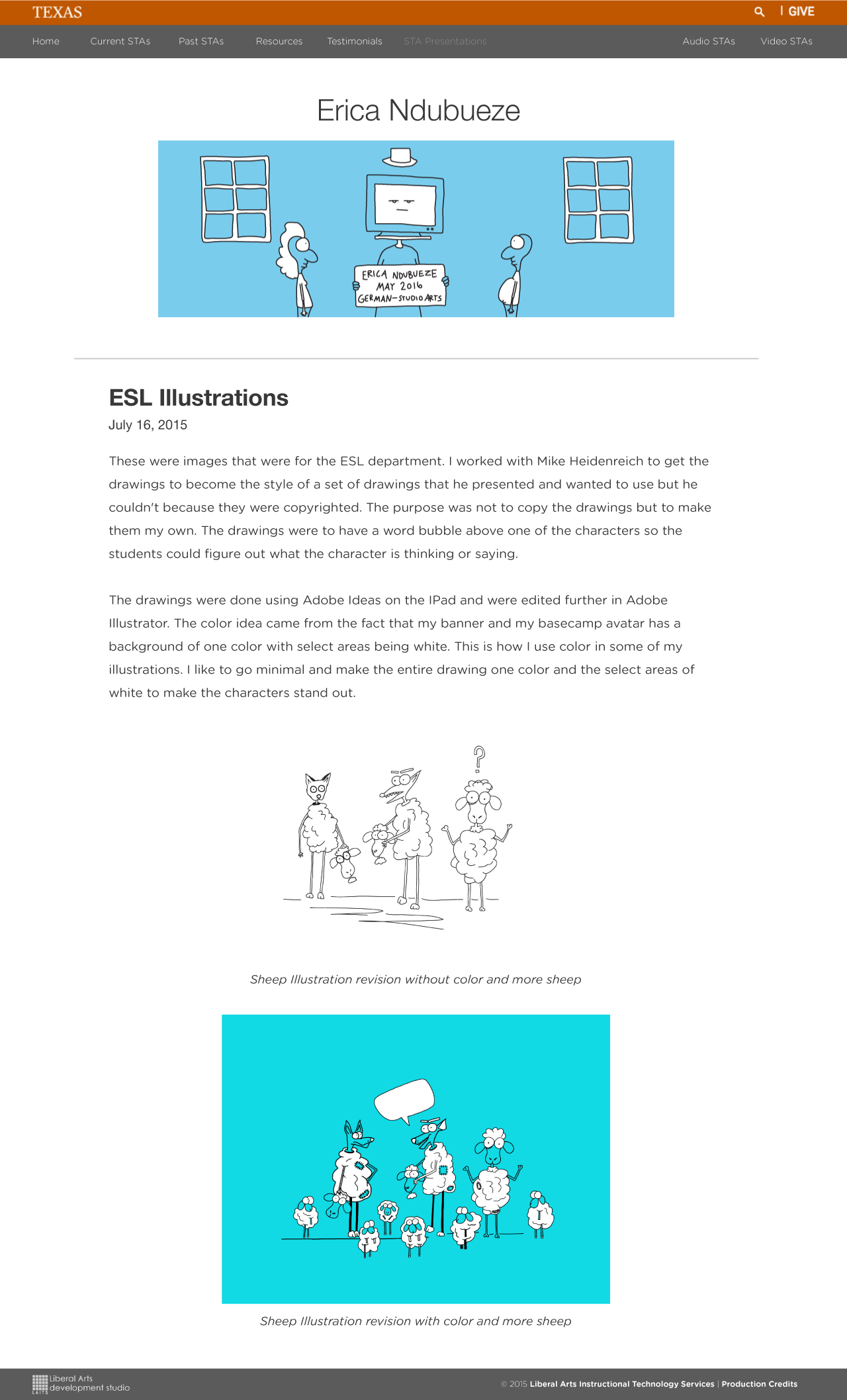
The individual blog post page. The leading or line height of the text is slightly increased (around 1.2 or 1.5 spacing). This allows for easy reading. If you notice, the color of all of the text is black. This is the same throughout the entire wiki. Pure black on pure white background makes reading small text especially in a blog harder to concentrate after awhile. For the images, the images are centered so it aligns with the banner on the top.
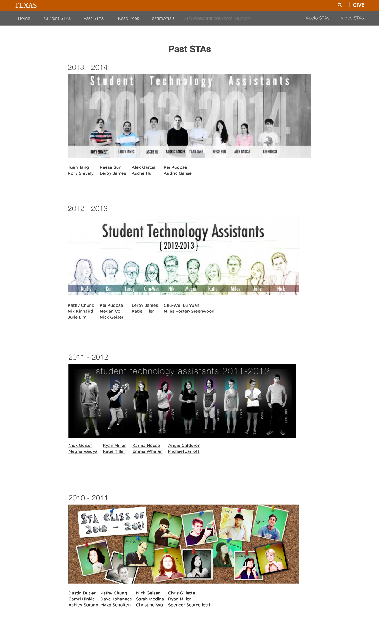
When you navigate to the past STA page, you’ll see a listing of the STA listed according to the most recent to the first set of STA (maybe the second set). For some of the years such as 2009 and 2010, some of STA blog pages were missing images. I have been working with Andre Leroux to find the images. We did the Wayback machine method from archive.org to retrieve some of the images but when the pages didn’t have any archive in the wayback machine, I had to go into the STA archive and dig through their folders. I managed to retrieve images this way for some of the students but some were hard to find because the students had their stuff scattered into multiple folders.
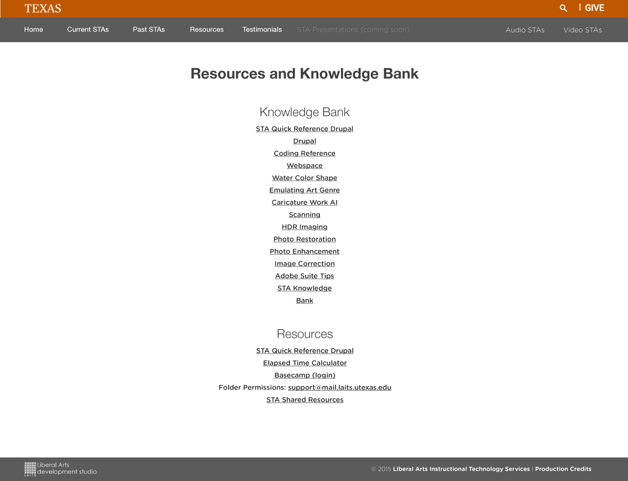
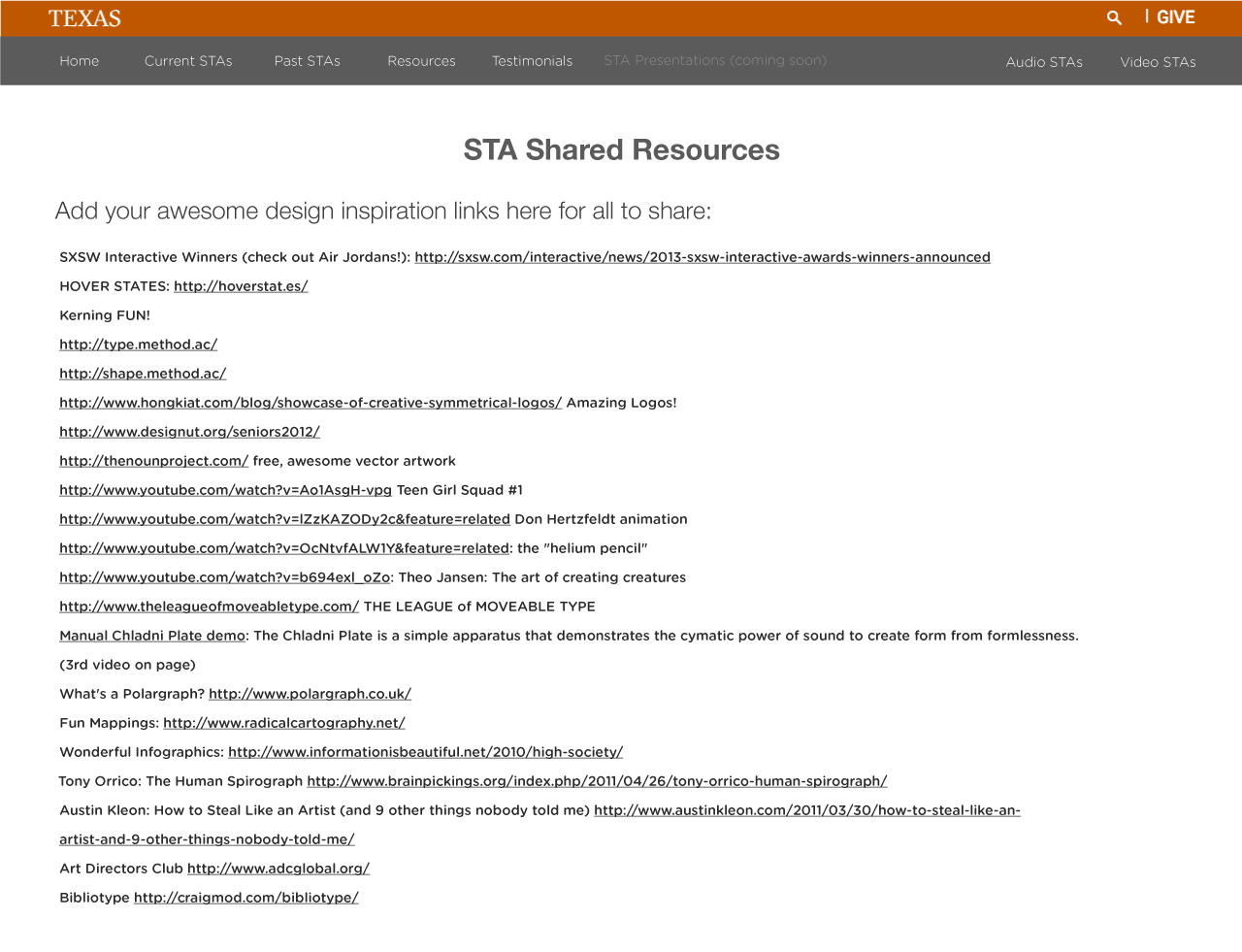
This is the knowledge page which can be found on the bottom near the area where you log in in the current wiki page. For the wiki redesign, I plan on making the list clearly defined and centered aligned. Also on the page of the current wiki, you’ll see a link called link links and you’ll see an interesting list of links curated by STAs of content that could be either inspirational or helpful to other STAs. On that page I made the styling consistent because if you notice on the current wiki, the link links are styled differently that sometimes doesn’t make sense.
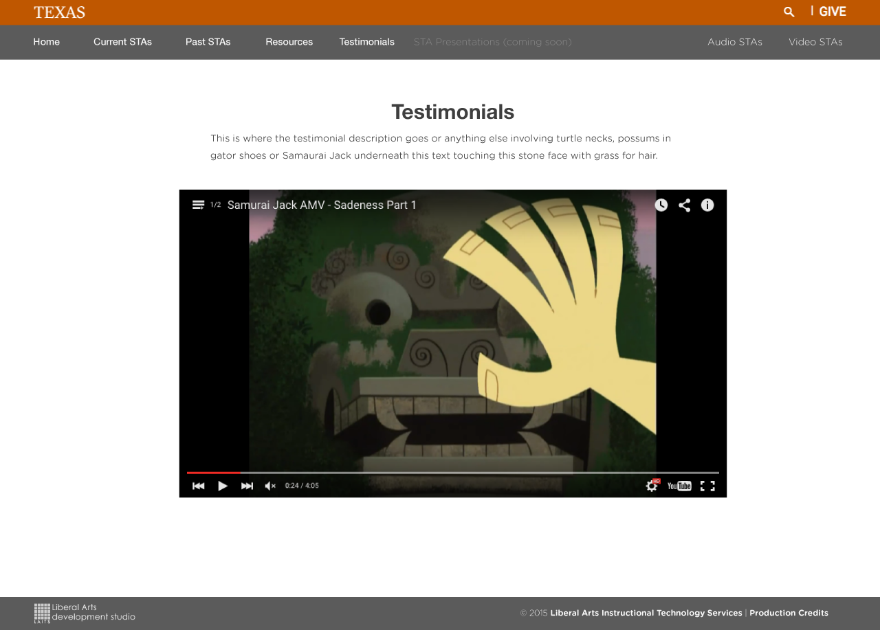
The testimonial page is holds the video testimonials. The videos will be hosted on youtube. Right now the video testimonials are in three different locations (vimeo, youtube, and on a server). I wanted to choose vimeo because it has a nice interface and it is less ‘loud’ than youtube. But because Suloni wanted a playlist on the side bar of the video so when the video was playing you can click on the hamburger (that is what is called) on the top left and the playlist will slide out. I couldn’t find that option for vimeo without finding paid wordpress video playlist plugins. It made more sense to go for youtube.
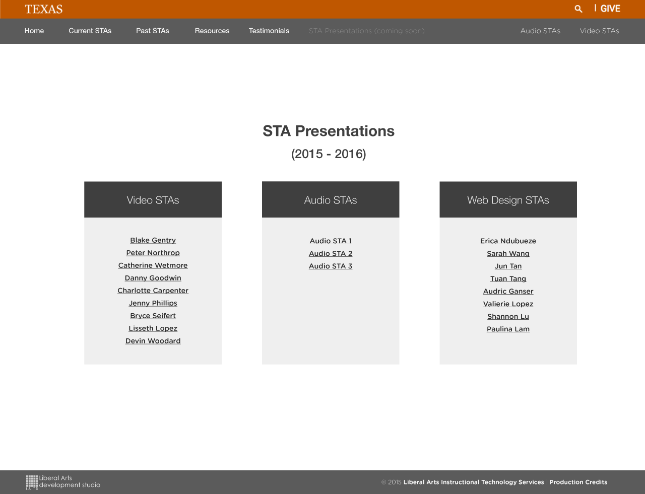
This is the STA presentation page. At the end of the school year, there will be a large STA presentation. Suloni wanted page where the students can go and only present their work from that page. Instead of clicking directly to your blog pages, and scrolling around through stuff to find what you are presenting, the Presentation page will serve as a page to host only items that will be presented. The Audio and Video STAs will do the same on this page instead of navigating to an external page.
If you notice on the navigation, the STA presentations link is on a lighter gray with coming soon written next to it. This year will be the first year to have a separate presentation page since the past year’s didn’t have such a layout. But after this year, this page will be similar to the past STA section where it will be archived and arranged in a chronological order.
I plan on rearranging the page. I’m not very satisfied with the page because the white space still looks a bit off. Maybe i’ll arrange the layout when I begin coding the page.
