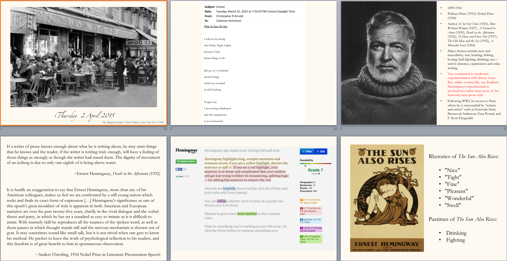
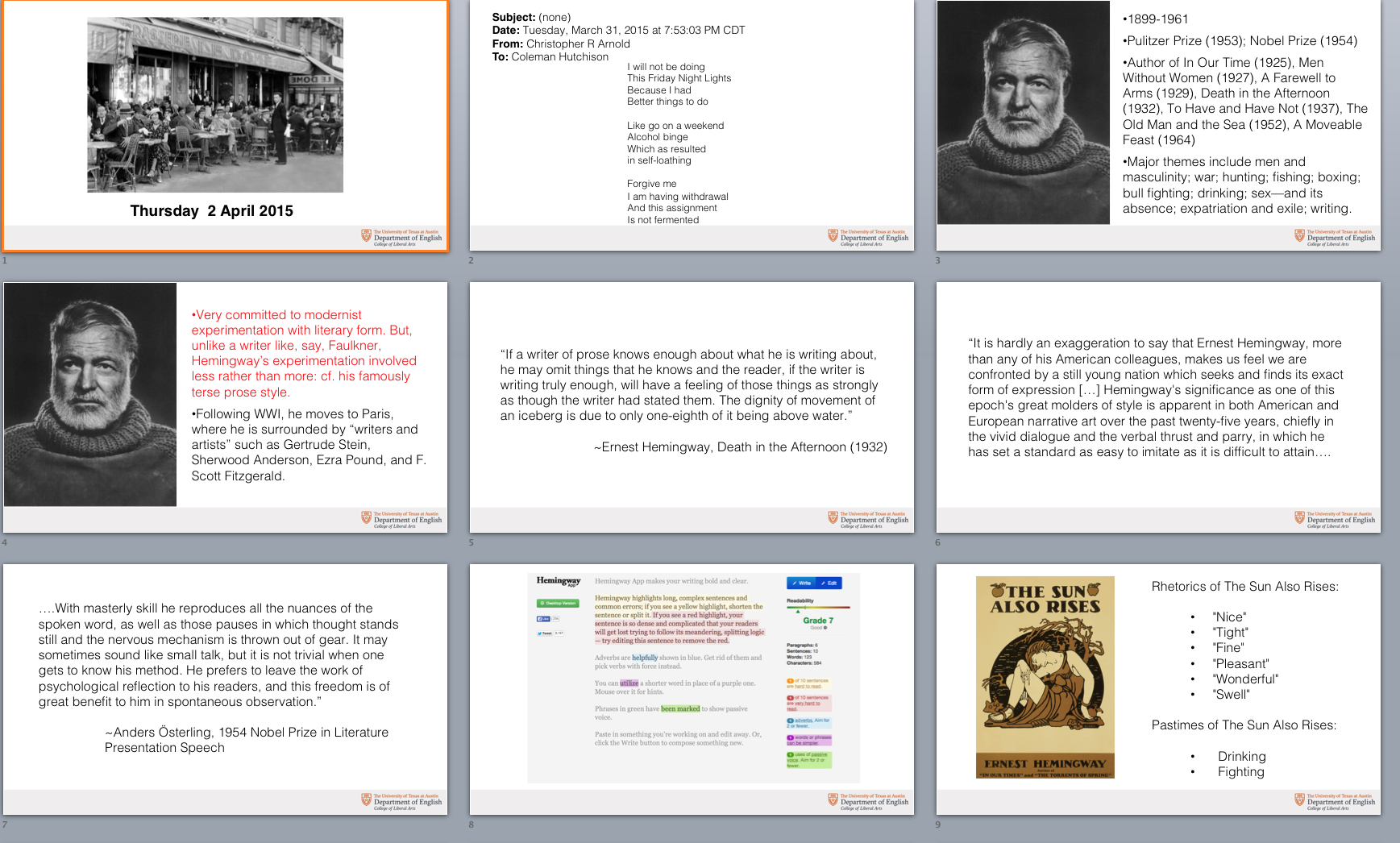
I assisted in helping two English professor’s redesign their PowerPoint slides for a new online class they will begin teaching in the fall. We wanted to make their slides easy to read, even on a teleprompter. The redesign was fairly simple I increased the font size, made it an easier to read font (Helvetica Light) and switched the design to a wide layout. Here is the before and after:

