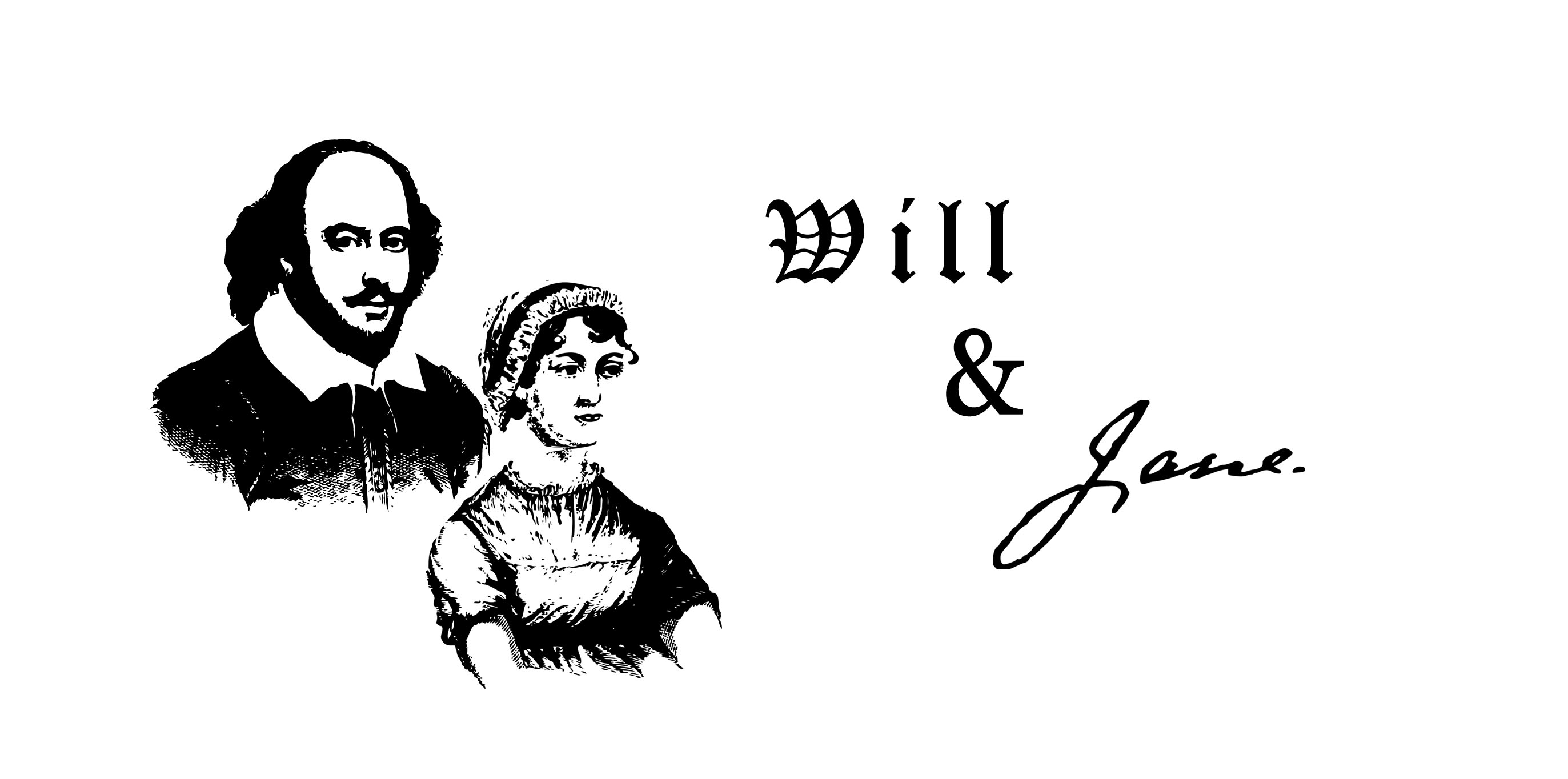
After getting feedback from my client on my first mockup (below), I created this second mockup. It definitely feels less modern and the figures are more recognizable. The images of Austen and Shakespeare were just quickly grabbed from the internet. If we choose to go forward with this design, I will spend more time creating better images of these figures.