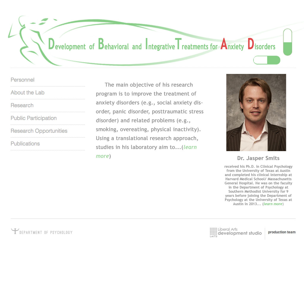
After some discussion over the last banner and reconsidering how to best visually represent Dr. Jasper Smits’s research, a second version of the banner was born. It is much more simple, both in terms of color scheme and composition, also taking into consideration for the text that will be appearing on the banner.
And a mockup for the site itself is also integrated to help better judge the banner. The banner used on the site mockup is slightly adjusted.

