Project: Portfolio Website
Completion status: In Progress – drafting different versions of the layout
Staff guidance: Suloni, Ryan, etc.
Description/plans: Design website mockup and eventually translate it into HTML/CSS as personal website displaying artistic work.

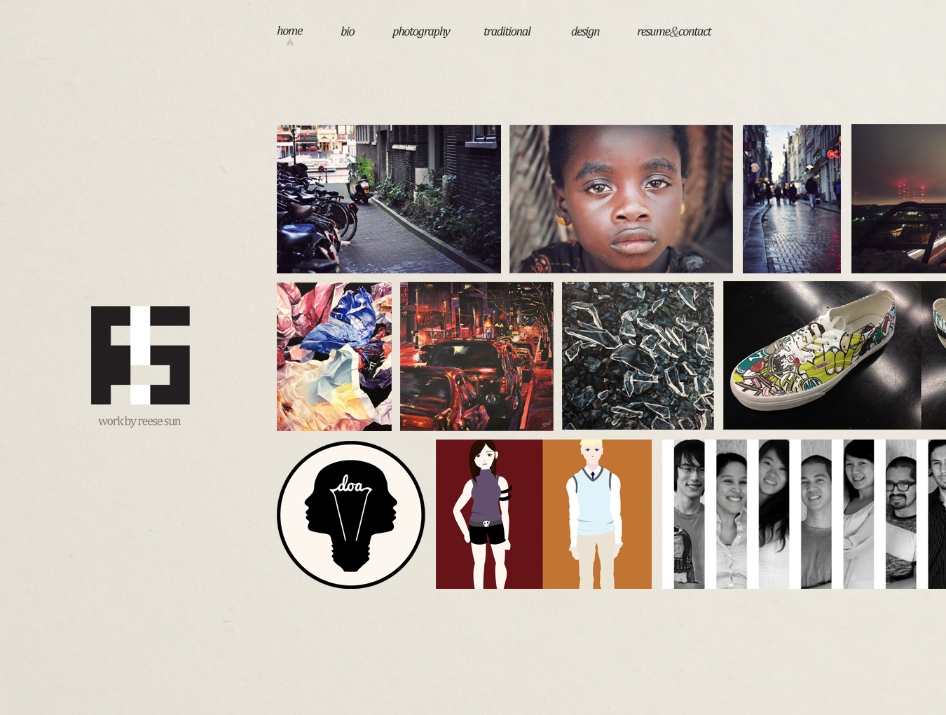
I got a little excited, but this would be my ideal layout. The top body row corresponds to and takes feed from “photography,” the middle row “traditional,” and the bottom row “design.” Hopefully, everything would have smooth transitions and each row would sidescroll depending on the mouse position over the row. The unbalanced nature is intentional.

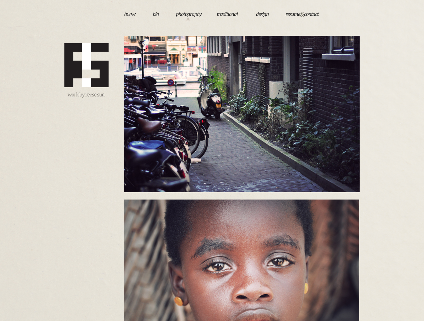
Each page would look similar to this – big pictures of each work in each category. When clicked, may lead to a page isolating artwork? Not sure yet.
Currently working on a simpler version that I could actually code within a reasonable time frame (and also fits the grid a little better) … also working on a circular logo.