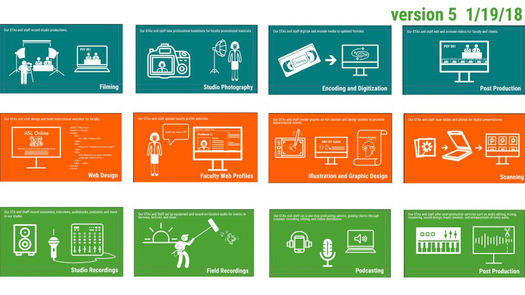
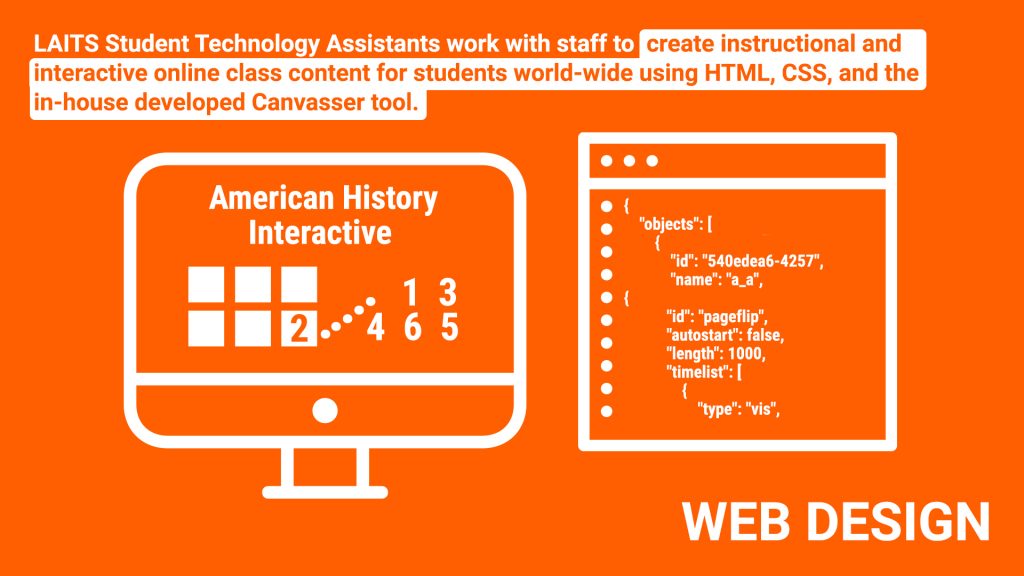
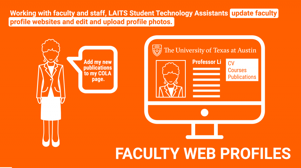
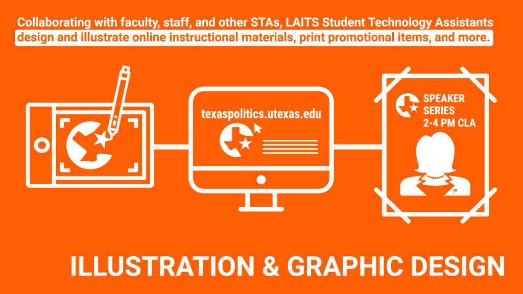
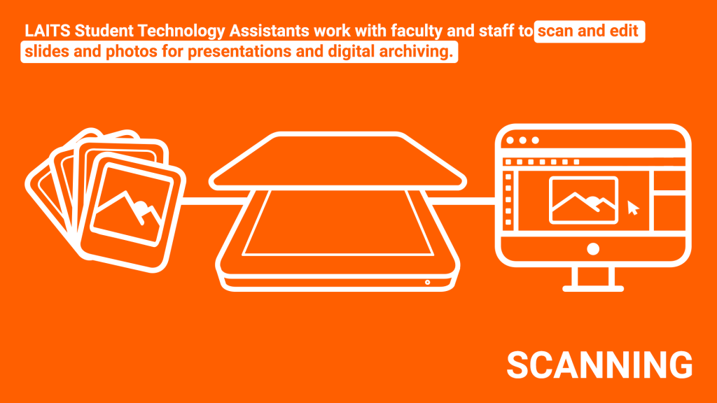
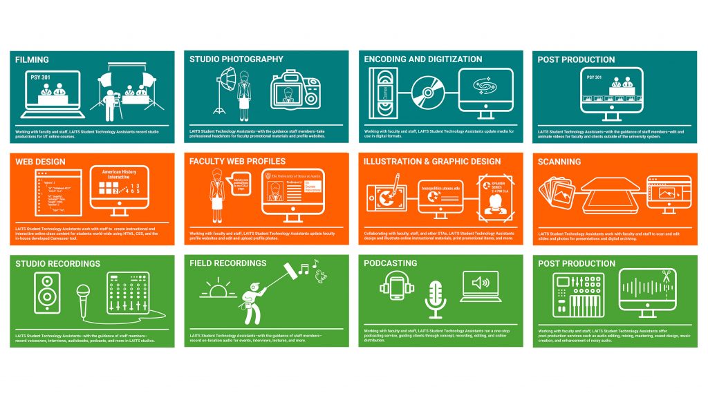
Currently, I am re-doing the graphics and copy that will be used on the door of the Dev. Lab as an advertisement of sorts for the STA program. I switched out some of the iconography for a more cohesive look, altered the font for increased legibility, and highlighted the action/activity portion of the copy.
Initial design:
Updates:
Next version of edits:
The title was moved to the top and description to the bottom to make the eye line/flow more smoothly. Additionally, a horizontal break/bar was included to keep the graphics and type tidy.
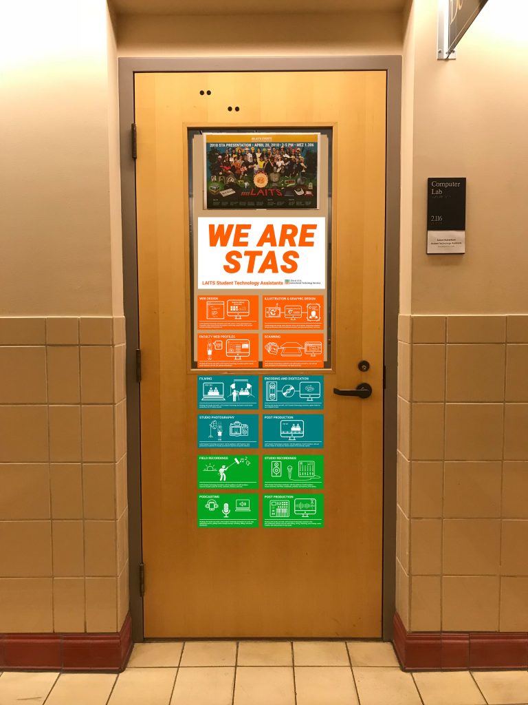
Additionally, I created a title card for this collection of cards.
Here is a mockup of how the graphics might look on the Dev. Lab door:
