Week 12
First week for Spring Semester 2023 :). So excited!!!
I’m setting up everything for the new semester and doing some correction tasks. I also decorated the white board with all STA schedules on it under the theme of “growth”. I put it in the context of garden and draw the vein as the broader and butterflies as the representation of us. I helped to recolor the CCI logo from Maroon to UT blue #005f86. Marianne updated the website with the new blue logo and changed the color palette for that site.
PSY365D’s new course button:
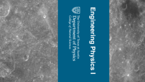
Changing the number into Roman numeral in the following file: (1) a title card; 2) a vertically oriented digital asset for in-studio use; 3) a banner for the Canvas homepage. I’m aware of how important it is to keep editable file in the shareable box file so now I can edit on it : 3
Project: Intro to Typography
Start: Jan 11th 2023
To be Completed: Jan 11th 2023
I have learned a lot in this typography intro training. I’m able to label each part of a letter and identify them due to distinct parts and aware of details and differences between each typeface. For example, I used to recognize all extensions at the end of a letter as brackets. However, there is actually an unbracketed serif since there is no curve or tapered block but only with a line extended. Typography is the visual component of written words so it has the magic to convey feeling and make the design memorable. I’ll be more careful with the font choice by noticing the details involved to match the most suitable one with the content.
I also find two font pairing that looks amazing for me.
- The first font sharing I’d like to share is DM serif display and DM sans. The typefaces belong to two categories: display and sans serif. The display typefaces contain brackets and designed to be bold and decorative. The sans serifs is clean and modern, have strong readability. Although they feature at different style, they have similar kerning and relatively same proportion on X height and Type Size, making them matching. It can to be used as any formal expression of documents with the feeling of modernity.
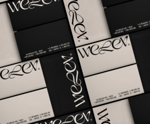
- The second example comes from a branding project. This brand emphasize on the utilization of typography without any use of image or illustration. The choice of two typography (display for title and sans serif for content) both showcase the feeling of elegant through the thin stroke. The extended vertical space of character in the content is clean and readable but still stylized.


