WEEK 3
Project: STA Design Team Poster
Start: September 13th 2022
To be Completed: September 29th 2022
Staff Guidance: Valerie
The detailed shadowing of the Design STA Team:
- We focus on communication. We care about each other and give feedback on others’ works to boost better design.
- We are flexible and chill at balancing our time during working. We don’t have to focus on one assignment or training at a scheduled time but organize our time by ourselves.
- We have critical eyes and design thinking which vary from each other.
- We’re mainly working with computers (plenty of software!)
- We collaborate with each other. Design STA has individual projects and group projects. Collaboration enables our STA to expand their horizons by simply hearing out other people’s ideas. We can discuss our designs in the weekly STA meeting to examine if there is any point we have missed.
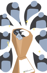
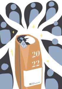
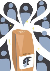
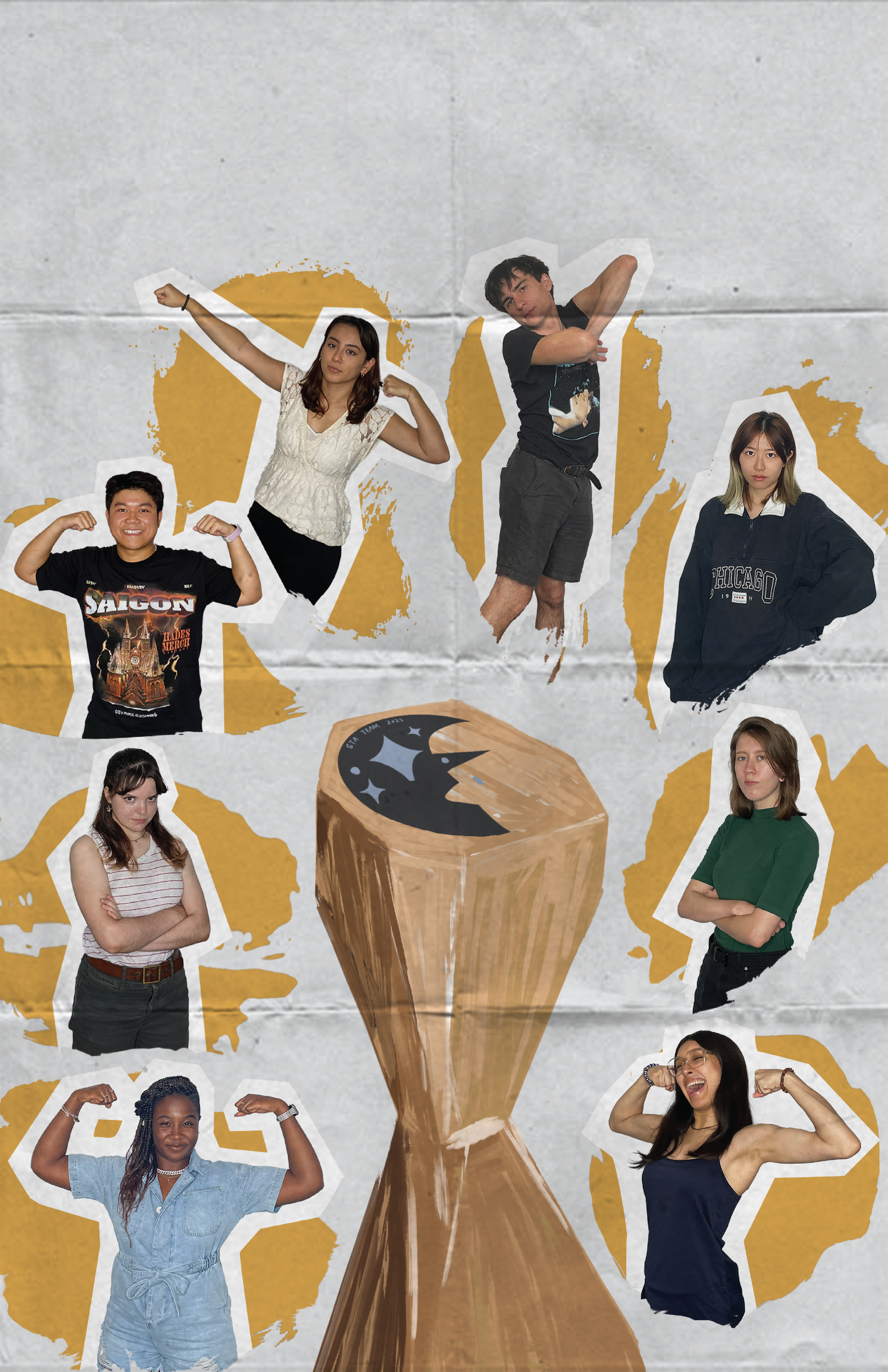
Realizing the classical sports world cup design might not fit for the design, I redesigned the trophy in an abstract way. I decided to use geometric figures to represent the sense of designers. I also attached the STA design team logo, LAITS logo and year to ensure the integrality as a final draft in procreate. Here are the final outcomes:
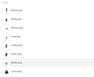
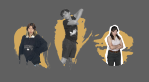
Then I started the formal draft in Illustrator. I first used the Mask tool in Photoshop to get Everyone’s portrait.
To make the poster have a more designer vibe, I’d like to emphasize the brush stroke as the background for each Design STA bust. I found brush stroke png online and photoshop them to paste under each STA.
However, it’s a little bit messy when the colorful bust is attached on a bright yellow so I tried the black&white and add broader, Eventually, to ensure the overall layout looks super clean, I sketched out the white silhouette as the broader for such STA. As I have used the textualized brush stroke as a main object in the center, I decided to make it more vintage and papery style in its background (folded paper) and the (hand-drawing) trophy design. However, I try to figure out if there is anything to include more coding and web elements into the layout. So I might insert the mouse-arrow icon into the poster somewhere.
What I developed in Illustrator for the mouse-arrow icon: 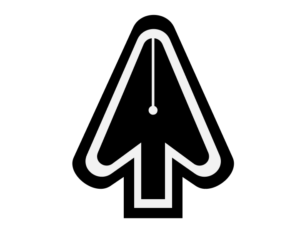
Project: CTX Refold
Start: September 21th 2022
To be Completed: N/A
Staff Guidance: Maddy, Suloni, and Marianne
On Wednesday, I attended the first meeting of CTX Refold for Dr. Gordo with Maddy, Suloni and Marianne. This is my first time attending the client meeting as a note-taker. It’s a Refine-Web-Design project for Retelling Central Austin History. During the meeting, we summarize several goals such as organizing the content orderly, resetting the color palette, and defining its aesthetic-driven style to appeal to the engaged audience. I’m assigned to create a light mode design fro CTX Retold in Figma. I browsed on Figma Tutorial in KB and started to wireframe the site.
