Spooky Month Commenced: AFR and Trainings
It is here! The best month of the year! 
AFR Graphics
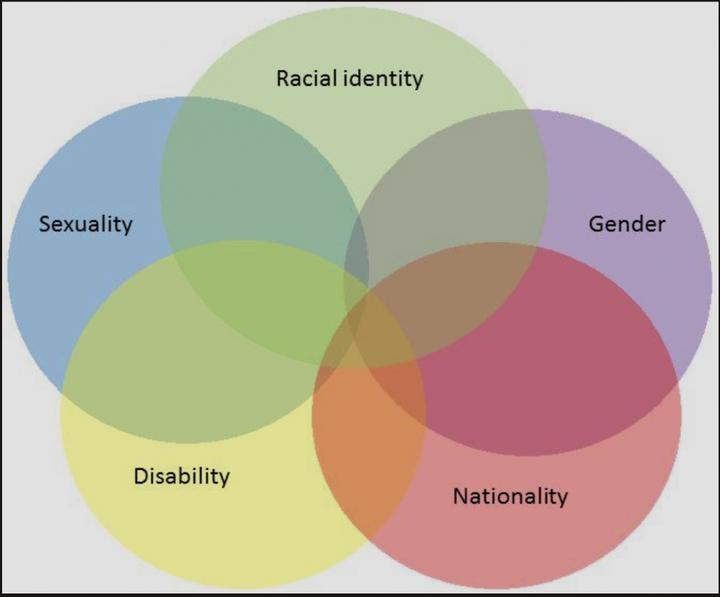
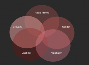
This past week was somewhat lighter on the AFR graphic assignments. My primary assignment was to turn a 6-circle venn-diagram into something more digestible and aesthetically pleasing. The diagram I got looked like this:
The diagram itself is not aligned well and the colors get muddy when they are combined. At first, I wasn’t sure exactly how to mimic this in our style without changing the style of the Venn diagram. When I tried to copy it verbatim with our color style in, it ended up having the same issue.
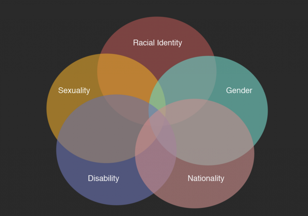
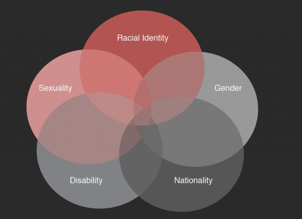
I tried a few other versions with less variety in colors…
All of these had the same basic issue – the colors still become muddy and hard to see. I tried another version where I manually chose colors and didn’t rely on opacity to create the Venn diagram.
This was getting closer. The primary issue with this is that the size of the overlap is huge, while the text is relatively small and squished to the side. After getting confirmation that I could, in fact, change the style of the diagram altogether, I was able to explore other options that would make the diagram easier to read and have larger text.
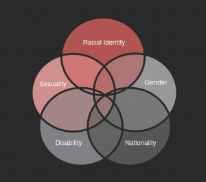
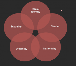
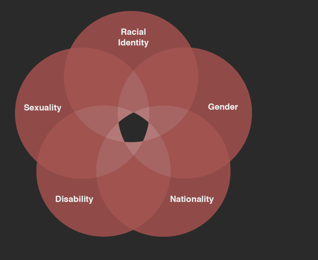
The one on the left looks cool – like stained glass – but it ended up being too clunky for the art style. The in the middle and right are based on a “flower” style Venn diagram where each piece serves as a petal on the flower and there is an open center area. This ended up being the route to go, and Maddy liked the one on the right the most. The final version had a third layer of overlap:
And voila, a flower in bloom! I was very happy with how this came out, and again want to thank Abriella and Maddy for all their help on this (also thank you Valerie for looking over it too.)
What I learned…
To document a few things I learned from doing this particular graphic:
- For most art styles, and especially for AFR, having just a few hues and relying on varying shades of these hues looks better than pulling a ton of different colors together.
- Venn Diagrams do not need to actually be the traditional Venn shape to get the point across – especially if they are trying to combine more than 4 circles together.
- While changing opacity can be a handy trick to get an in between color, it can sometimes also end up being muddy. When you are changing the tint or shade of a hue to create accent colors, you usually want to move the hue over slightly to be either a bit cooler or warmer. If you don’t do this, the color ends up looking muddy, and a bit like Clip-Art from 2005. Manually selecting the different colors in the graph can avoid this altogether, although it is more work.
- Avoid lines for this art style. At all costs. (There are times when it may need to be used, but try to prevent this.)
Trainings
After finishing up this graphic, I began to wok on my trainings again. I haven’t had a chance to touch them since I did the AFR Stinger assignment, so this is a good chance for me to catch up. I had done the A-style graphic format in late August/early September. Yesterday, I drafted up much of the B style for my imaginary class. Here are some parts:
…I wish I could actually take this course.
I’ll finish this training up soon and combine it with the A style graphics for my sandbox course. Then, I’ll move onto some other trainings. I’m really excited to work on the ones that require drawing/art/design in them!
