Been working on reformatting some powerpoints for Texas Global Innovations Labs. Here are some of my favorite transformations!
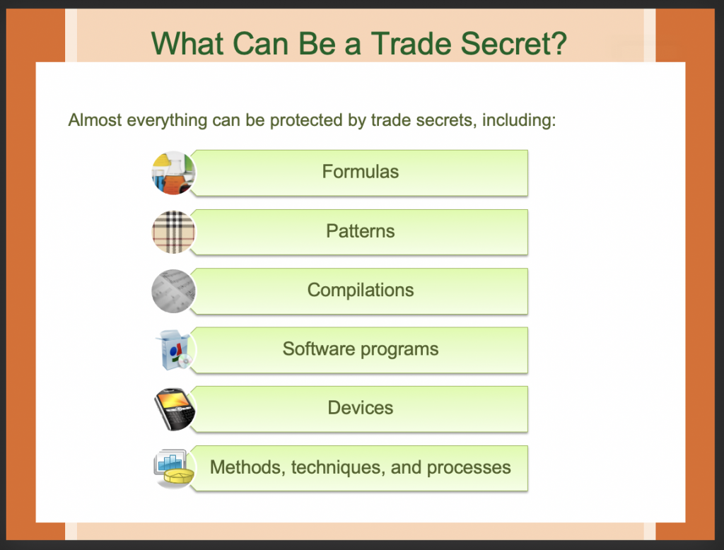
The original slide had a mixture of images and clip art, along with a list of trade secrets:
I found some icons from The Noun Project, placed a color overlay on them in photoshop, and BOOM: 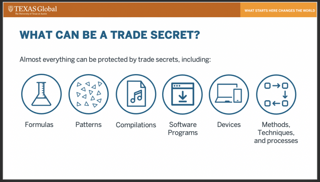
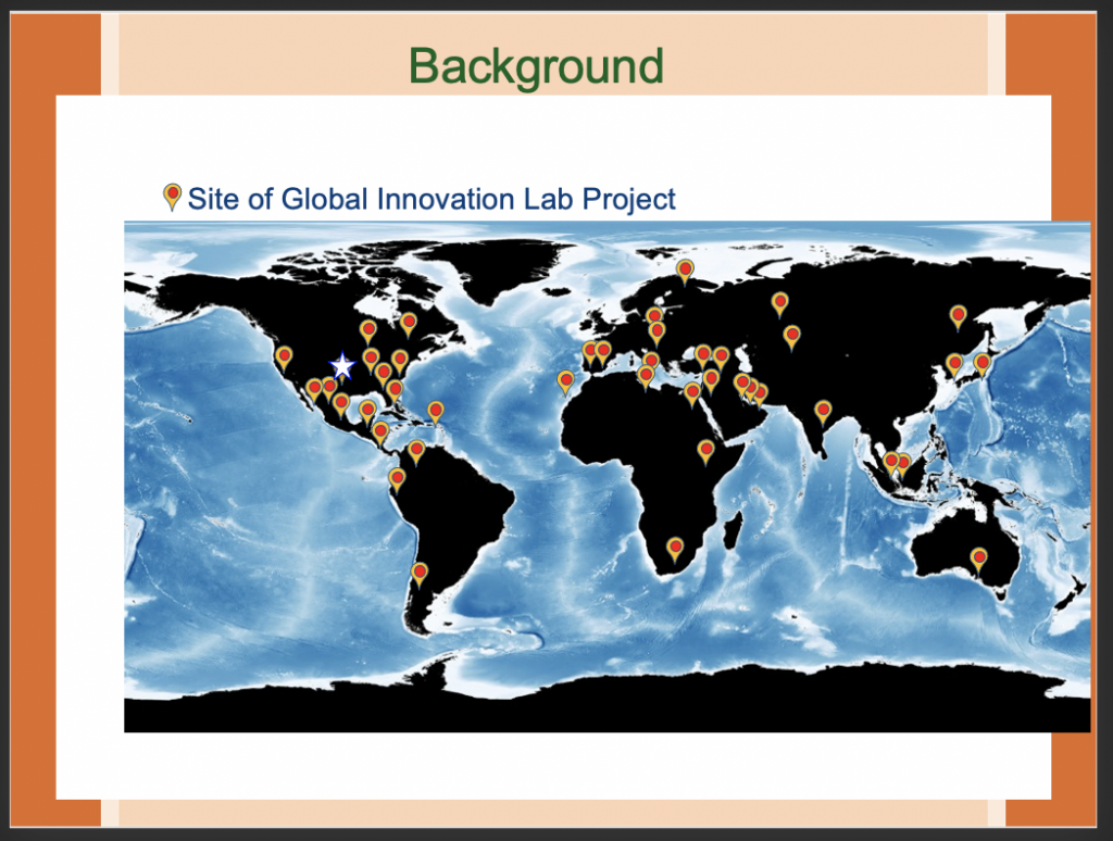
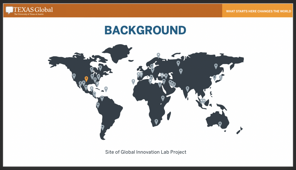
For this slide, the map and pins seemed super outdated. I found a map icon and pin icon on the noun project, then placed the original photo in the background on photoshop to ensure the new pins matched up. After I aligned the pins, I removed the image from the background, and BAM:
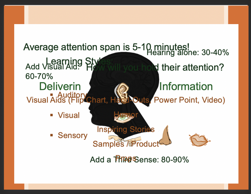
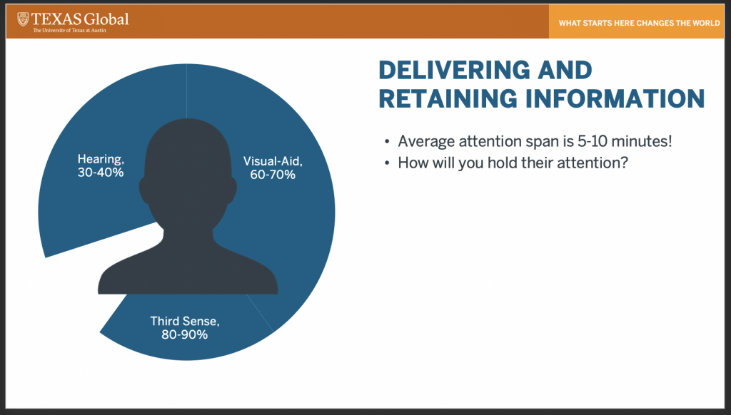
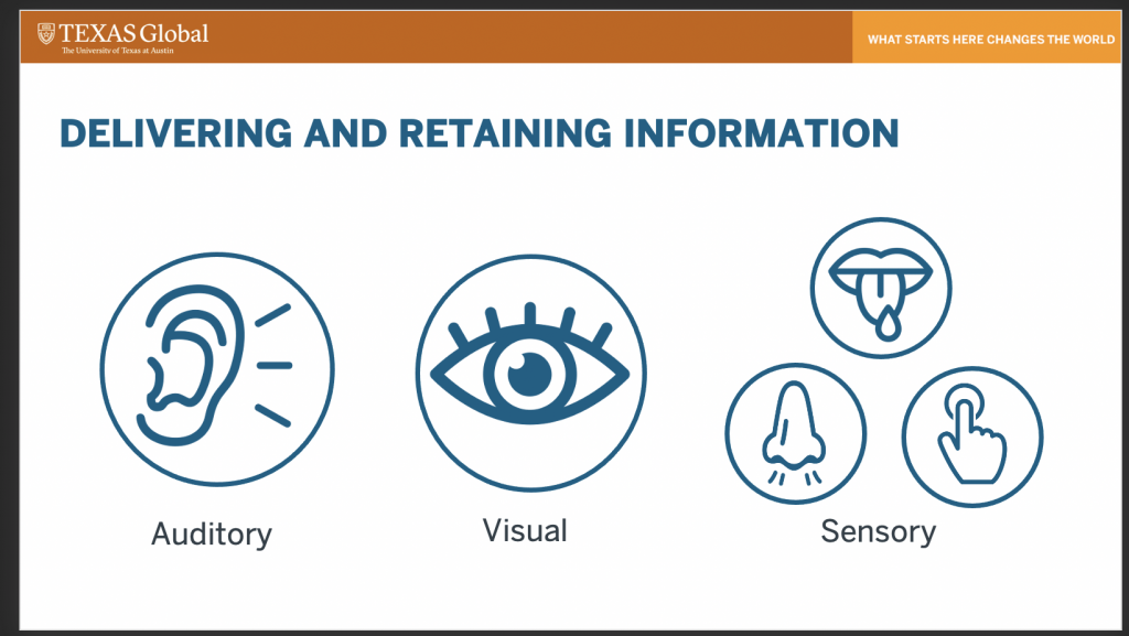
The original slide wanted to indicate that hearing aids, visual aids, and any third sense will grab 90% of a person’s attention. It also wanted to indicate how the senses attracted attention, with visual and auditory holding more weight over the rest.
I decided to split this slide into two, beginning with the percentages of information retention, then with the senses (it took Valerie and I a bit to get this first one adjusted correctly lol):
I just submit the last powerpoint for revision, which concludes my second powerpoint project! These are pretty fun, but some times the original slides have so many layers on top of each other that parsing through the content becomes a bit tedious. I definitely enjoy the template-making / reviewing process a bit more, but y’all know I love my repetitive tasks <3
