Revised Icon: Good Practice
Step 1
Add a grid and margins to your photoshop file. It is a 400 x 400 px template. The grid is 16 px squares. Add padding of 2 squares to all edges. This is the breathing room. No icon material should be placed in this. Add and inner +2 squares from that padding guide edge. This is room to go out of bounds for your icon design if necessary. The main space to work is the center of this board.
Step 2
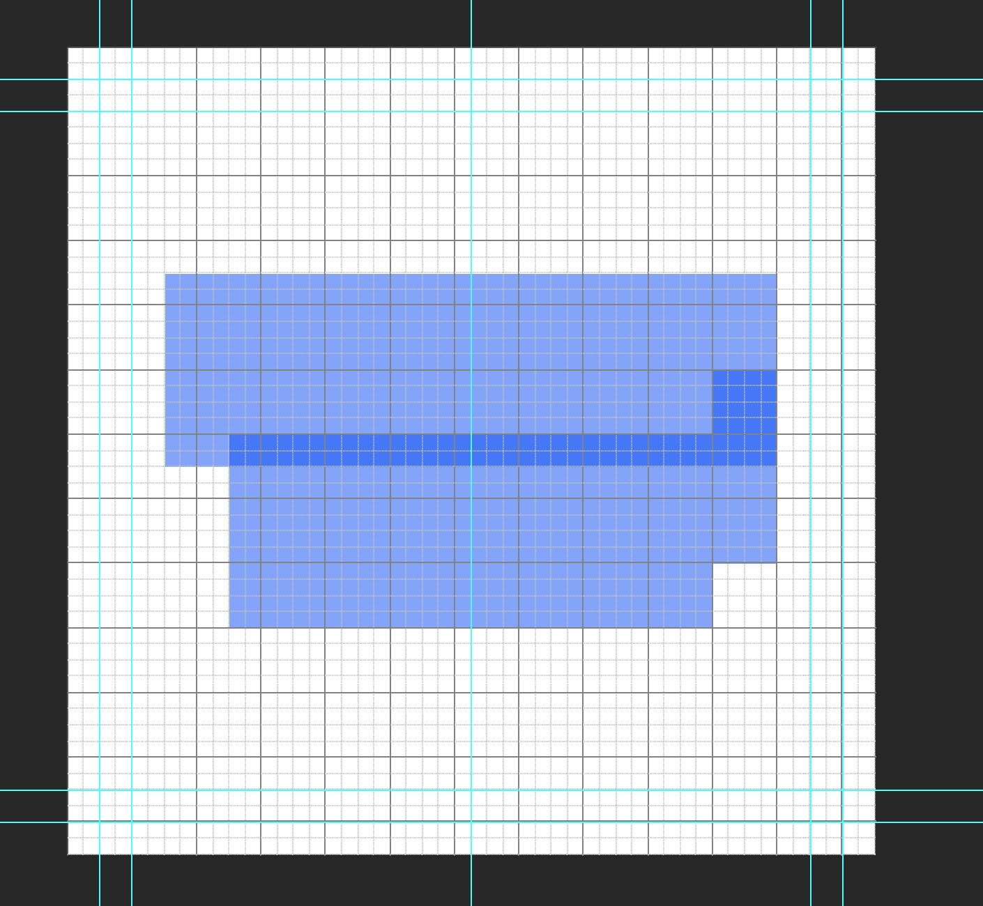
Place the basic shapes for your icon that will inform the form and keep scale consistent. I made mine blue with 40% opacity to see how they layer and overlap. Make sure shapes snap to the grid squares.
Step 3
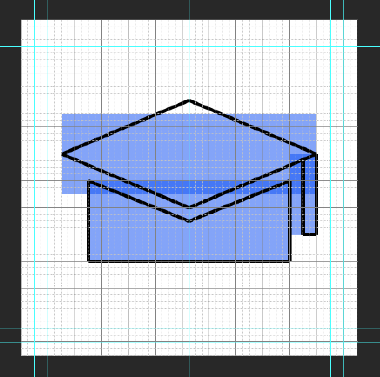
Start drawing your outline for your icon in another layer over the shapes you laid out. The line is black with a thickness of 4 px. Try to make all angles at 45 degrees. This is to keep the pixel edge consistence. Mine had a more titled perspective so the angle is not 45 degrees. If you need to step away from that go down in halves such as 22.5, 11.25, or in multiples of 15.
Step 4
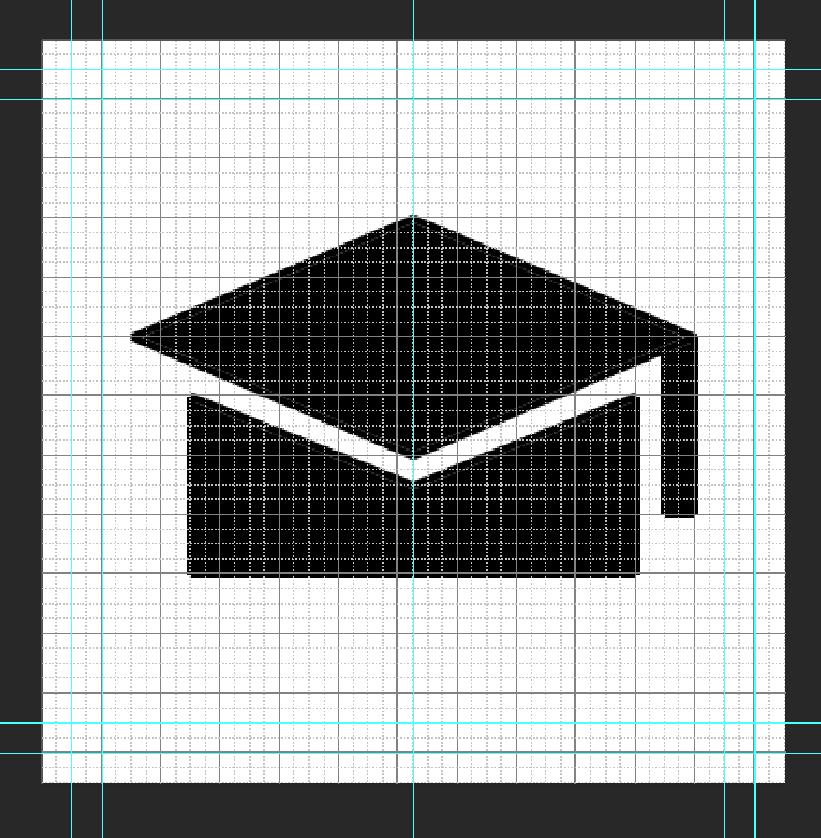
Duplicate your outline folder in photoshop and merge and rasterize the shapes of your icon. Mine was merged in two shapes: top of the hat and the bottom. Then use the paint bucket tool to fill in your shapes.
Step 5
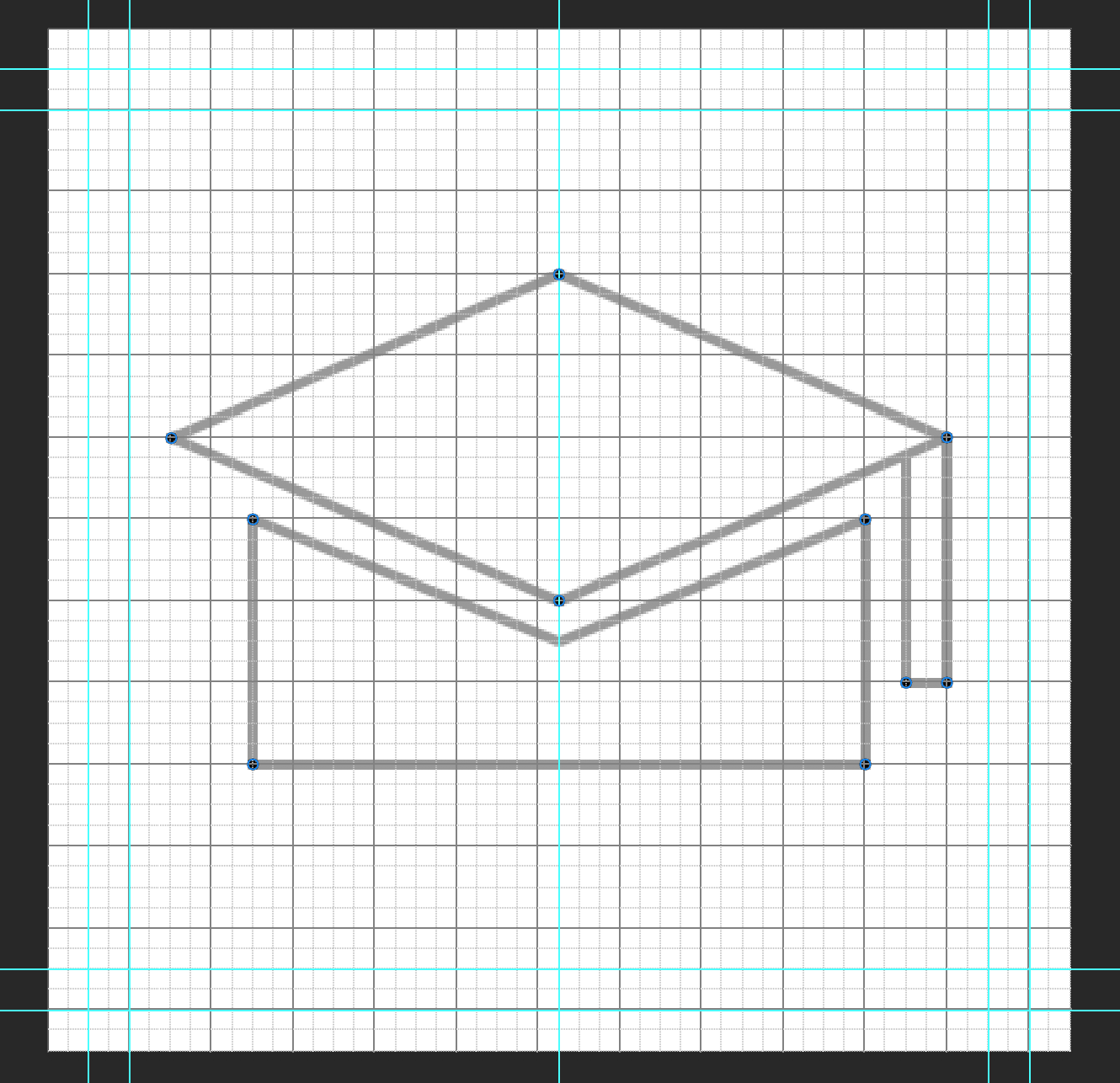
Now add 4 x 4 px circles to the corners of your icon to them a consistent rounded edge. I ended up adding one to the inner corner of the tassel as well.
Step 6
Preview your image without the grid and guides and see what adjustments need to be made. Redo the process to fix mistakes. For mine, I had the re-angle the lines at the top of the bottom cap so the spacing was even of 2 squared from the bottom edge of the top hat. Then adding a 4 x 4 px circle to inner corners as well.


