This week was more bearable after the hectic workload of last week finally wrapped up a little.
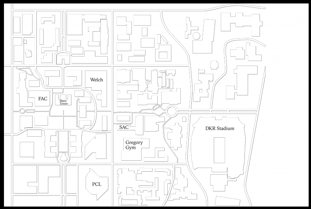
For the RGT, I made a simple campus map base for the main page:
I first took the colored map into Illustrator, then removed all the numbered labels and made all the objects a solid color. Then, I used Photoshop and changed the color of the objects to white, and just added a black choked outer glow and a drop shadow for the outlines. The style is supposed to be similar to the hand icon I did before, i.e. an engraving. I think the map will look a lot more complete after we add the etching marks on specific buildings and stops.
_____________________
I also continued my work on the Russian Animations object creations with my Awake Girl and a notification bell:
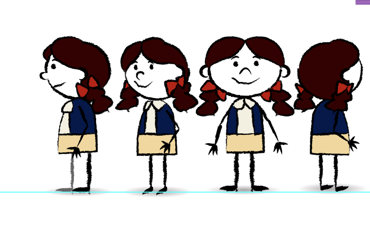
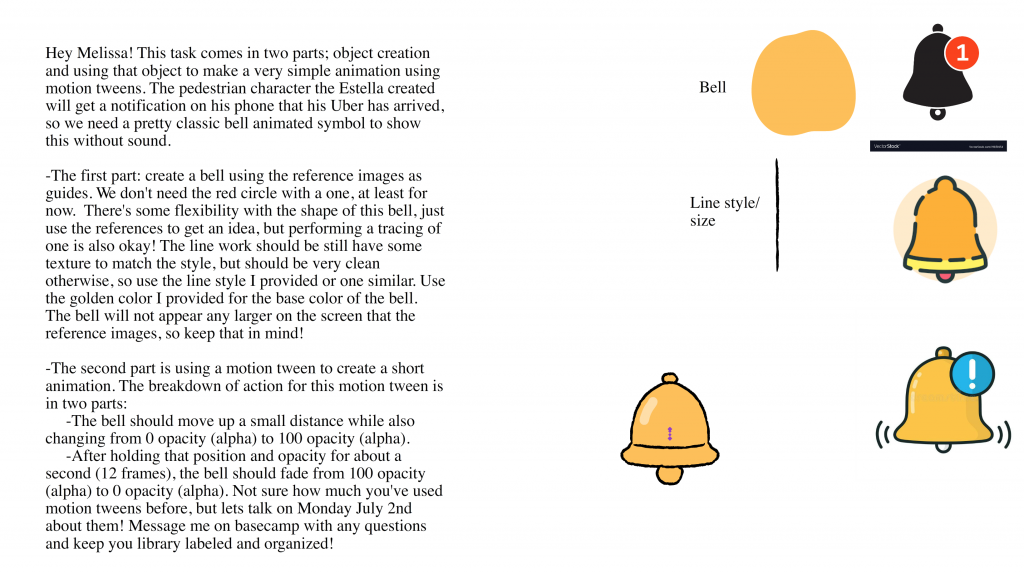
Awake Girl’s looking cute! Not much to say on her other than the fact that it definitely gets easier the more you do. The pigtails are always the hardest part since the Kyle Legacy brush has a hard time drawing curves that look aesthetically pleasing 🙁 Meanwhile, the bell was especially fun for me since I finally got to do a little animation. I had some experience with motion/classic tweens from before, but it was mostly for rotations and position. I’m glad I got the opacity part figured out without much hassle! I look forward to animating more!
__________________
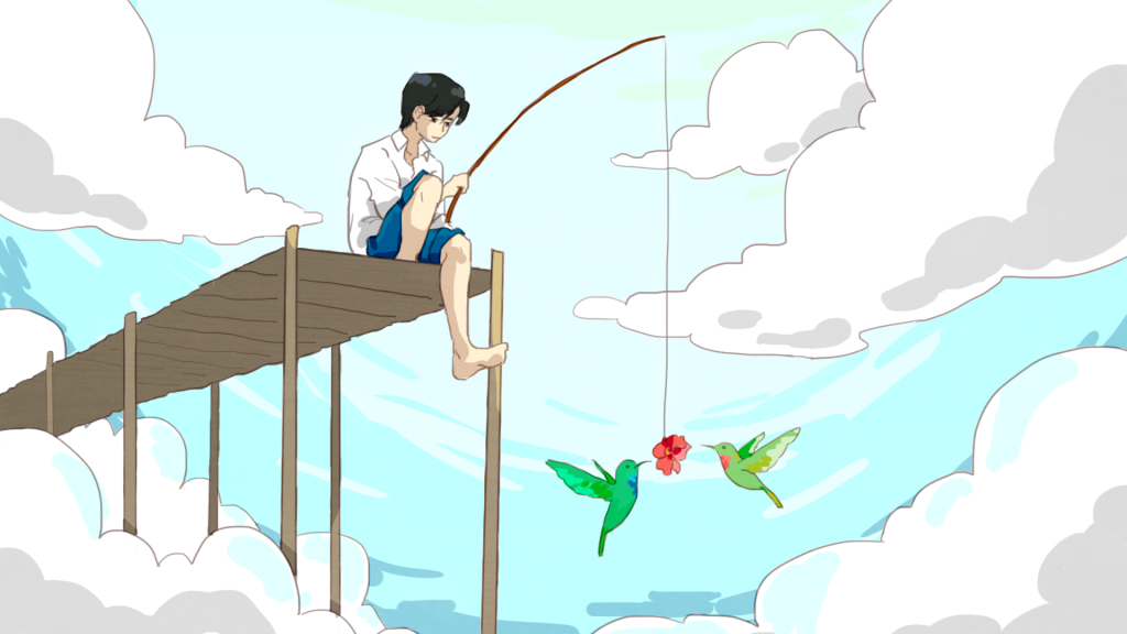
For Russian illustration, I did this work for Kathy. It felt kind of rushed because I was doing it at the end of my week (since I only work 3 days) so I was frantically picking colors the last part of my shift. I don’t usually cell-shade when I color, so it was a bit of a challenge to create interesting textures with a solid brush. I also didn’t know if we were allowed to add effects like sparkles and sun rays (though in truth I was also just running out of time, #procrastination). I liked how my piece turned out overall though, especially the birds!
________________
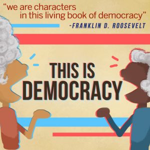
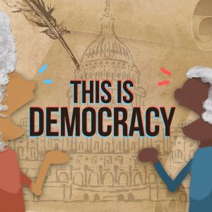
I was also asked to do more edits on my “This is Democracy” design and incorporate a more “historical” look and feel by adding things like the parchment texture, a quill, and the relief of a neoclassical building. I also touched up the wigs a little, but I’m not sure how much more “realistic” they can be if I want to maintain the simplistic and minimalistic look. One thing I’m struggling with by adding all those images in the background is making the two puppet characters stand out just as much as they did in the other drafts. Compared to the older version, the new one has a darker but more “historical” mood, which may or may not be a bad thing? Anyways, I’ll keep working on it!
__________
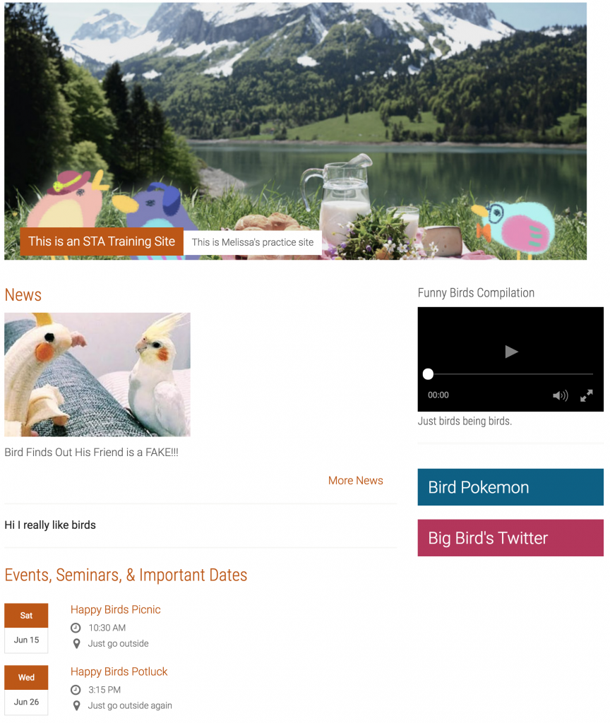
Finally, I also did more Cascade work. I added contact info, staff pages, the sidebar video, some external links, and the magic trick. Most of the Cascade site is done now, I just need to fix a few details:
