Project: French Connexion
Start: Oct 21th 2022
To be Completed: Oct 30th 2022
Staff Guidance: Maddy
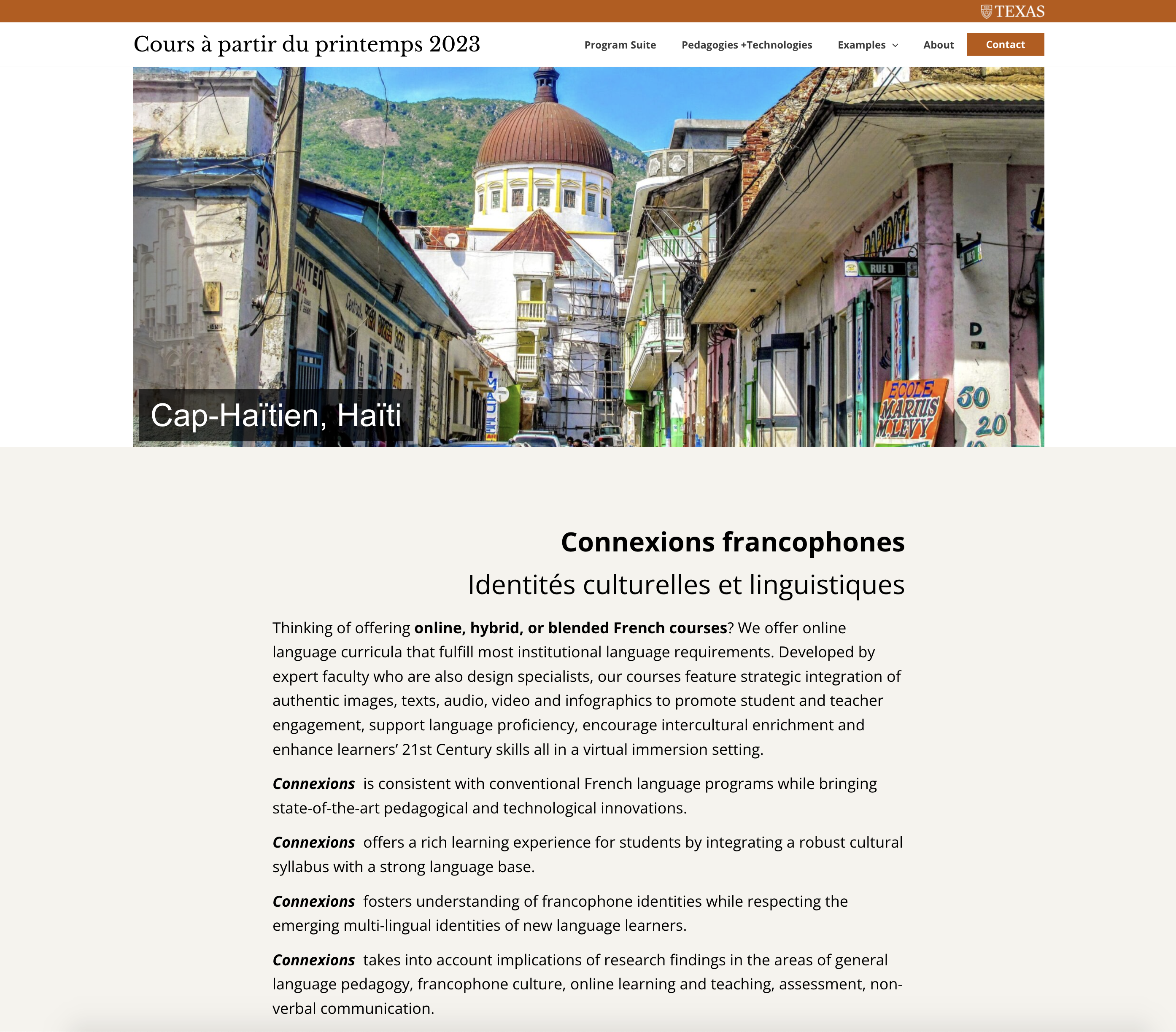
This week I started to design the pages for French Connexions. The final color palette I chose is the blue family with UT slate gray since it looks rational and clean.

Issues on Homepage:
- The white bar on the side of pictures seems awkward when I expand the windows
- better way to place the text on slider
- Text is too big and hard to read
- There is no hierarchy in texts
- How to place the parallel text
Ways to tackle issues on homepage:
- expand the banner for full screen (the width can expand when users stretch the window but the height will be fixed
- use icons to list out parallel text and emphasize the different definition of connexions
- use font weight, size, color, and leading to hierarchy.

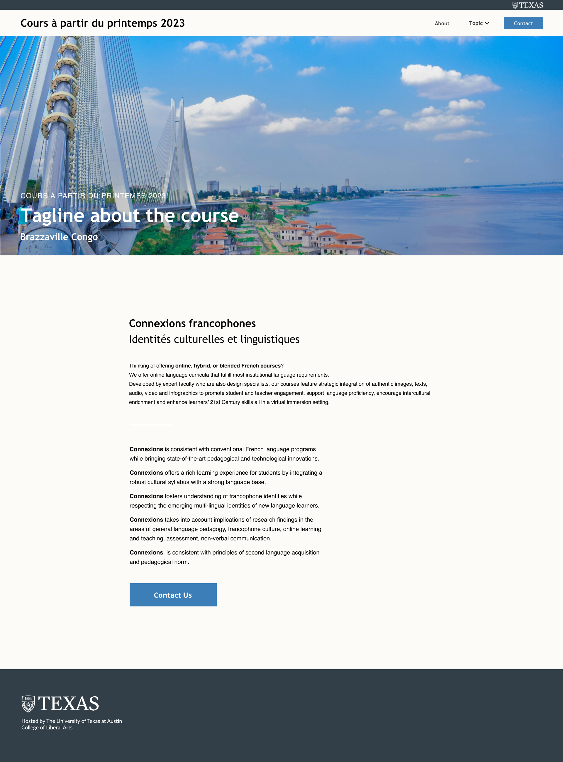
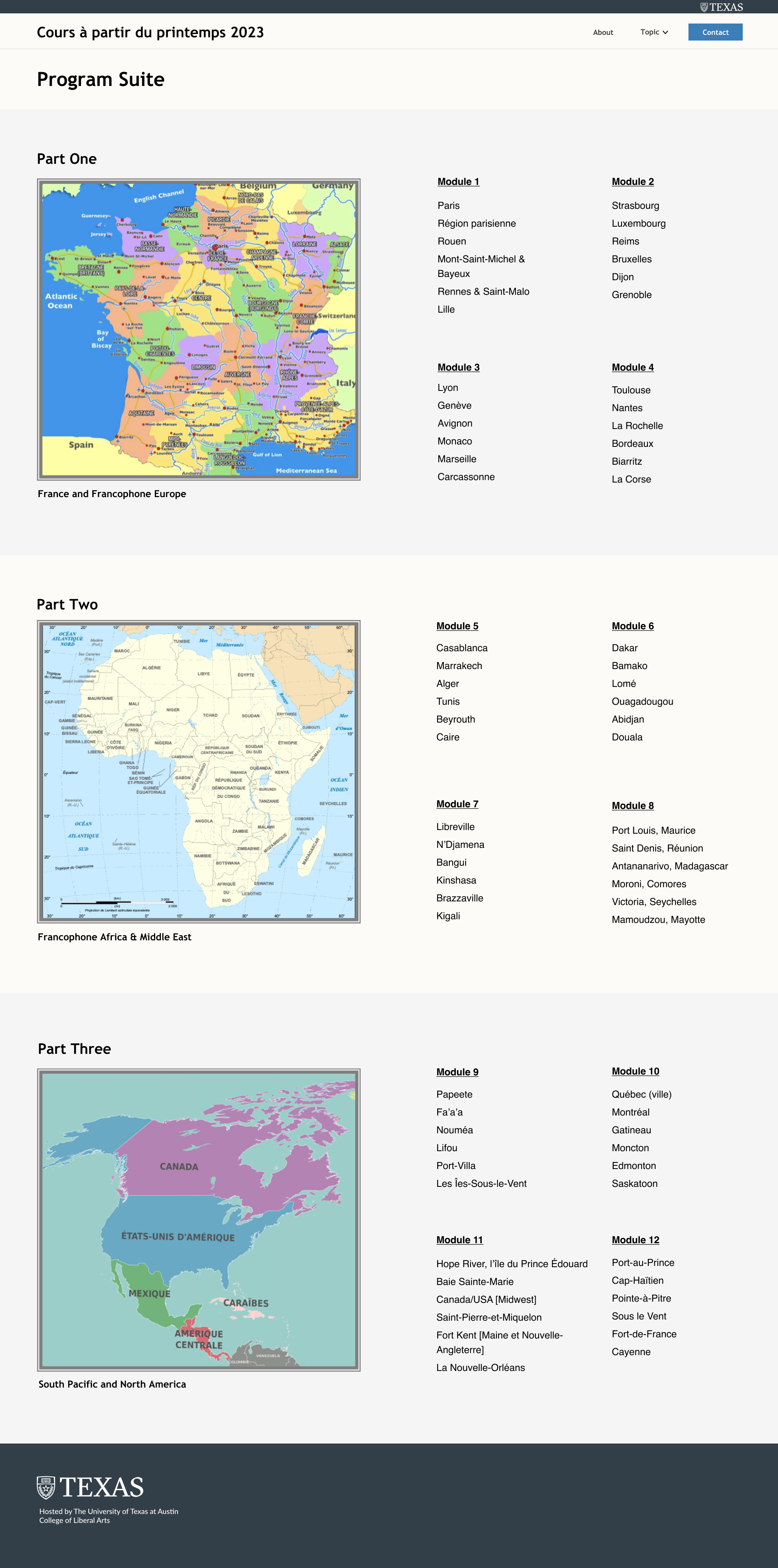
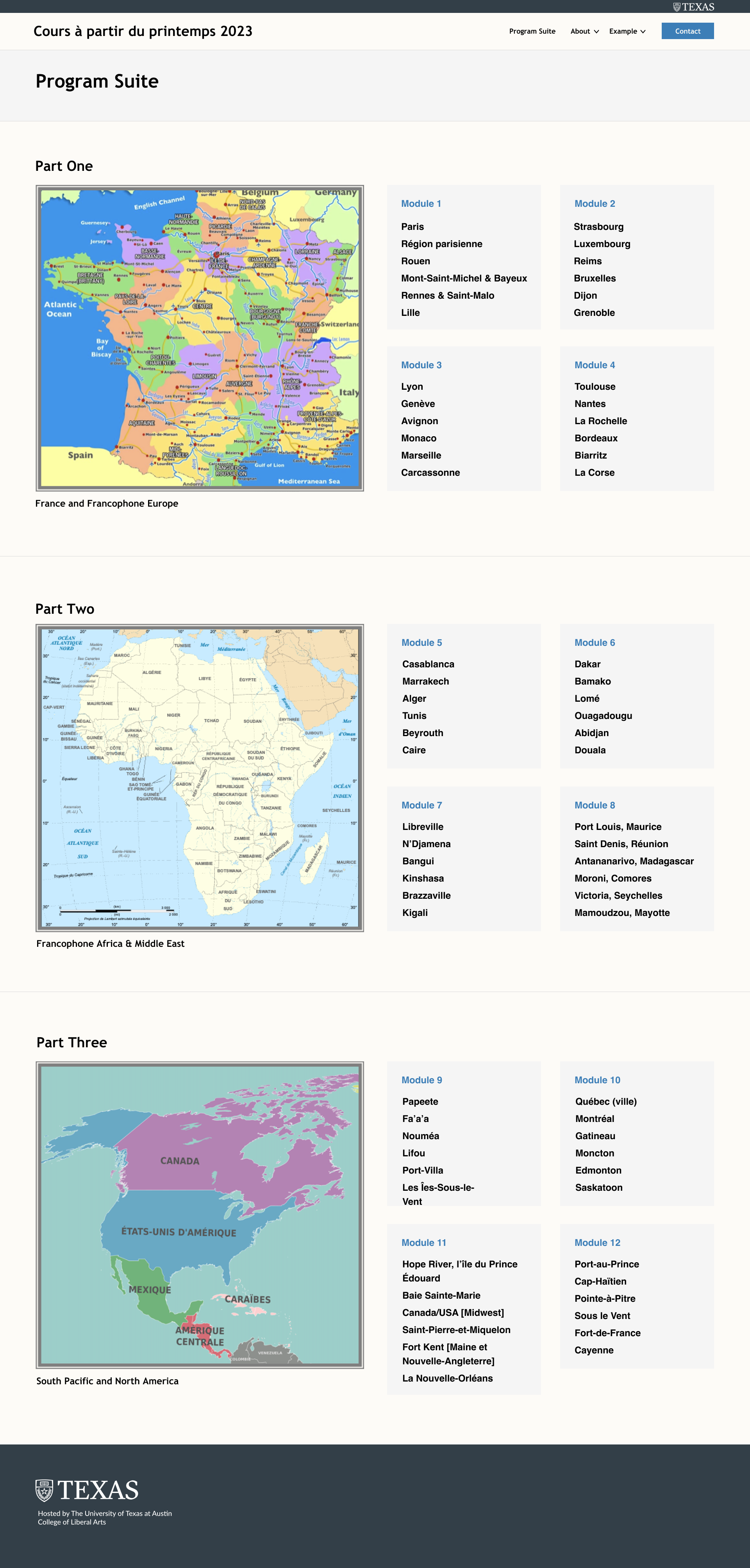
Issues on Program Suite:
- Different padding for titles
- when users minimize the window, text and maps cannot be read on the same page
- uneven padding in left and right
- break between each part
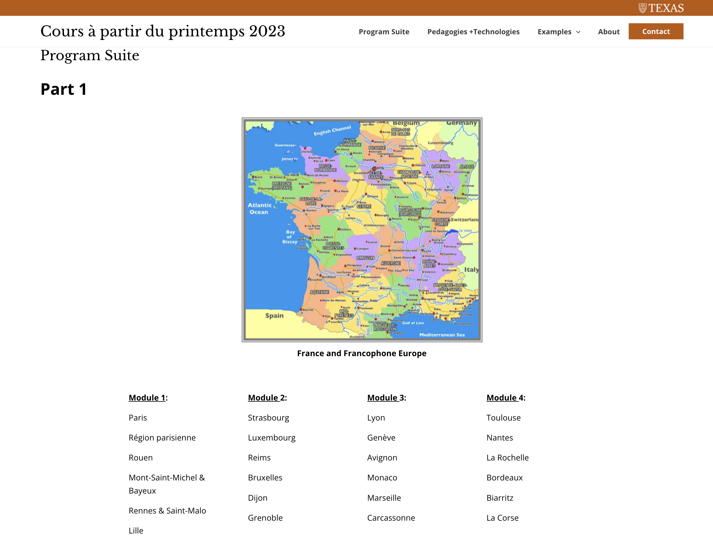
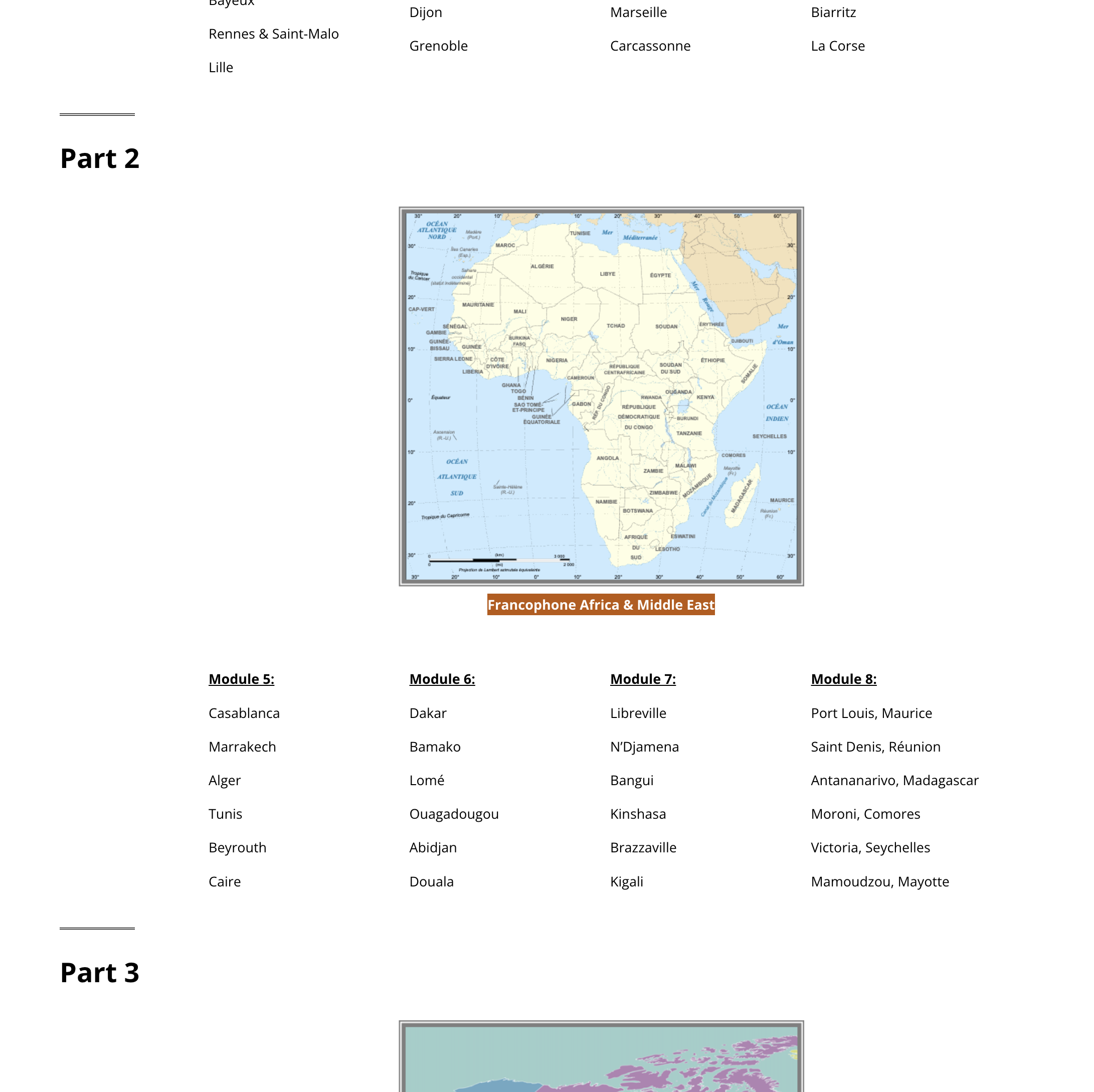
Ways to tackle issues on Program Suite:
- Align text along the map
- Use color block to differentiate each part
- Use boxes to emphasize each module and balance with the block of map (align perfectly)
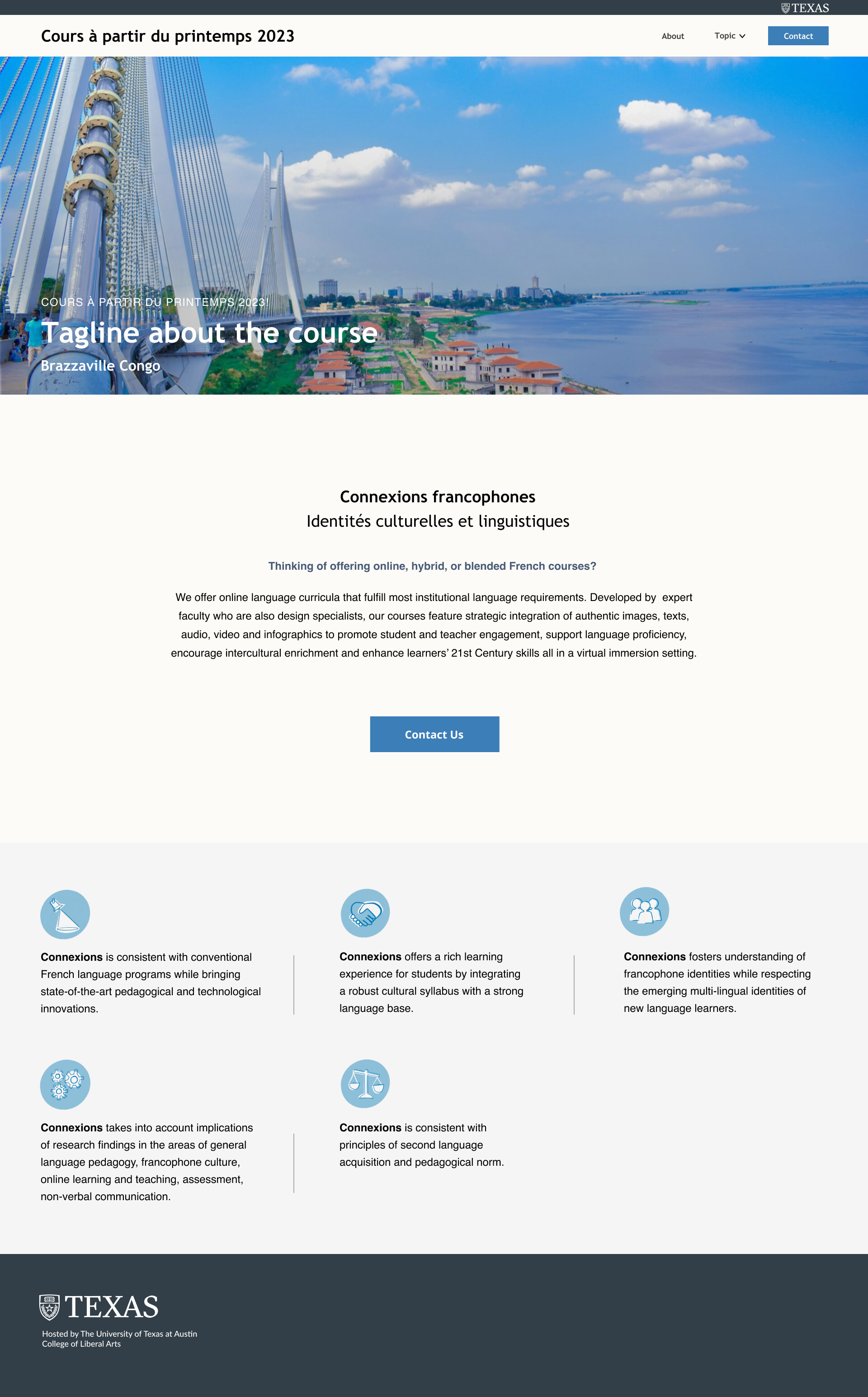
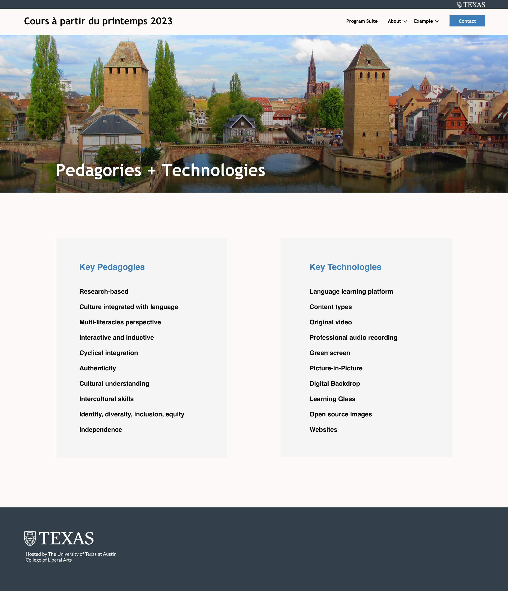
Issues on Pedagogies + Technologies:
- Big leading
- white bar along with the banner
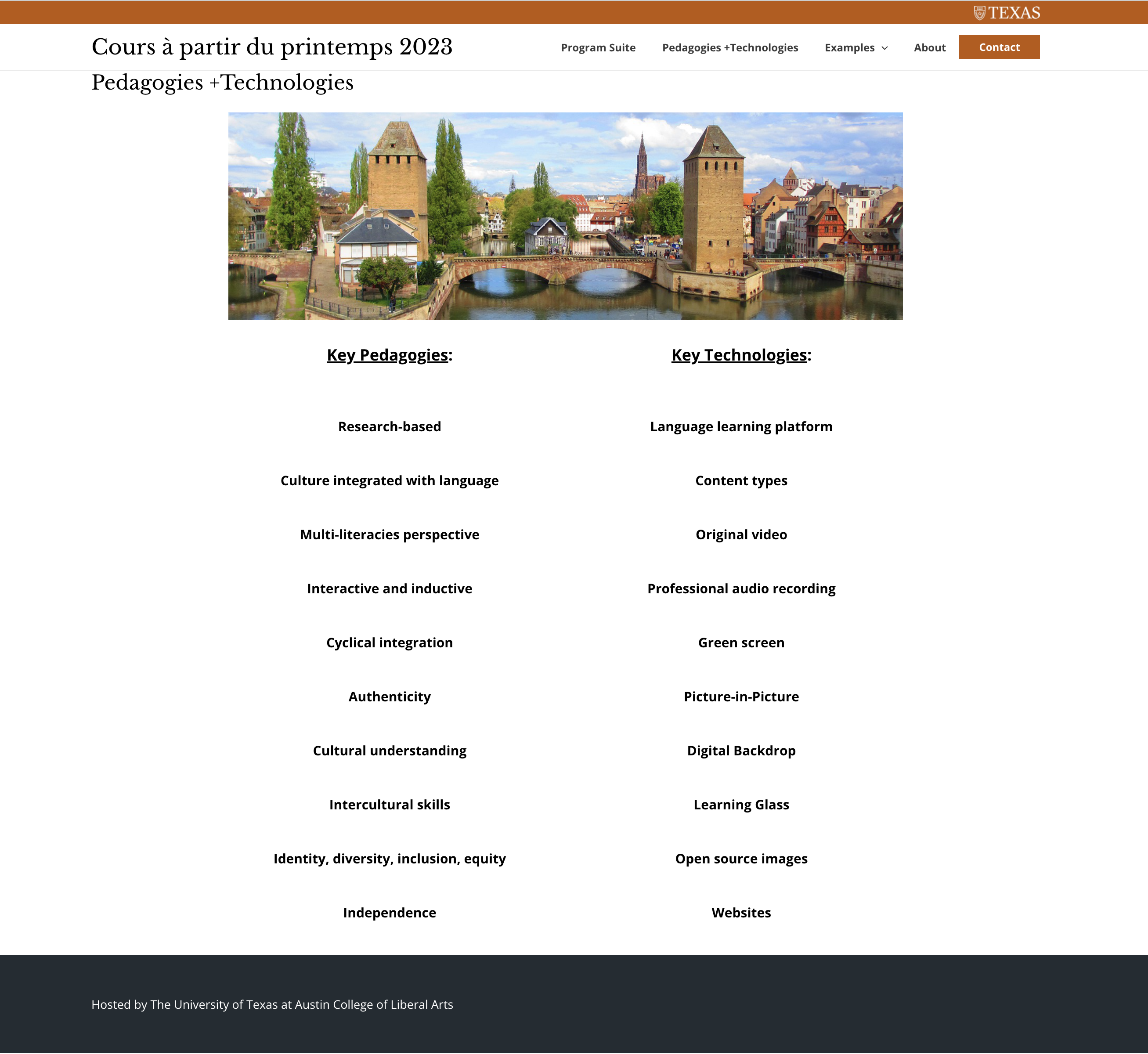
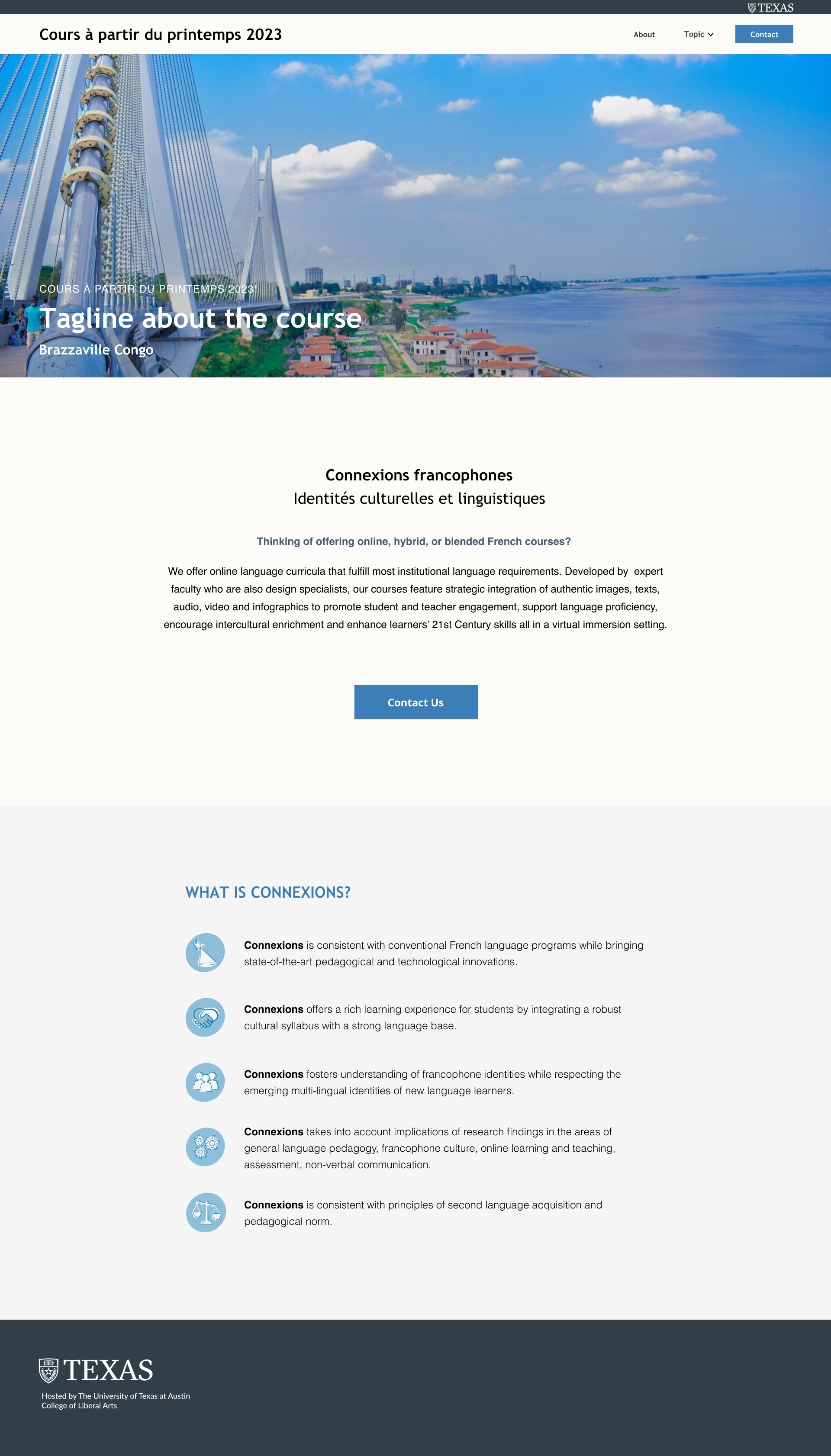
Ways to tackle Pedagogies + Technologies:
- Full width for the banner
- Usr block to make division
- Decrease the leading between text
- Increase the padding of block
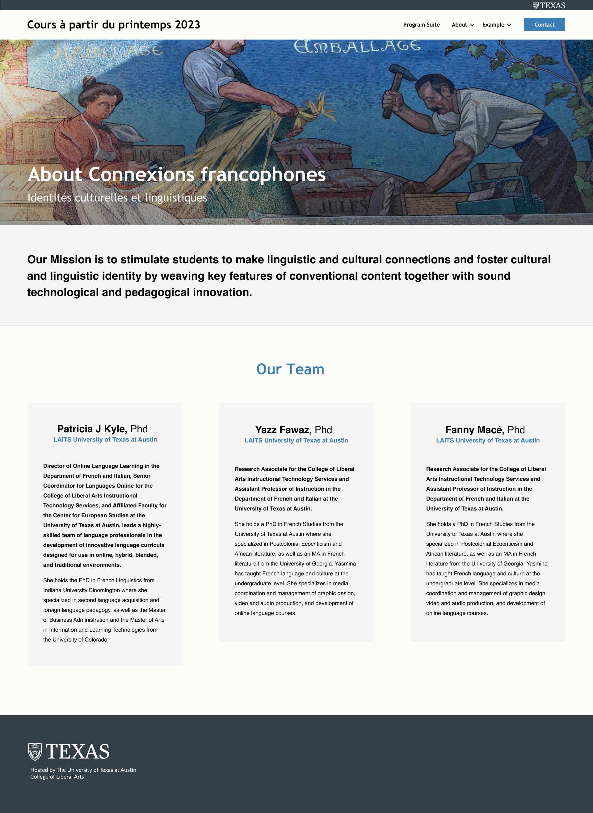
Issues on About
- Mission and Team are mixed together
- long sentences in each paragraph makes users hard to read (50-70 character is the best)
- Hierarchy
- Text block is not align with the pictures
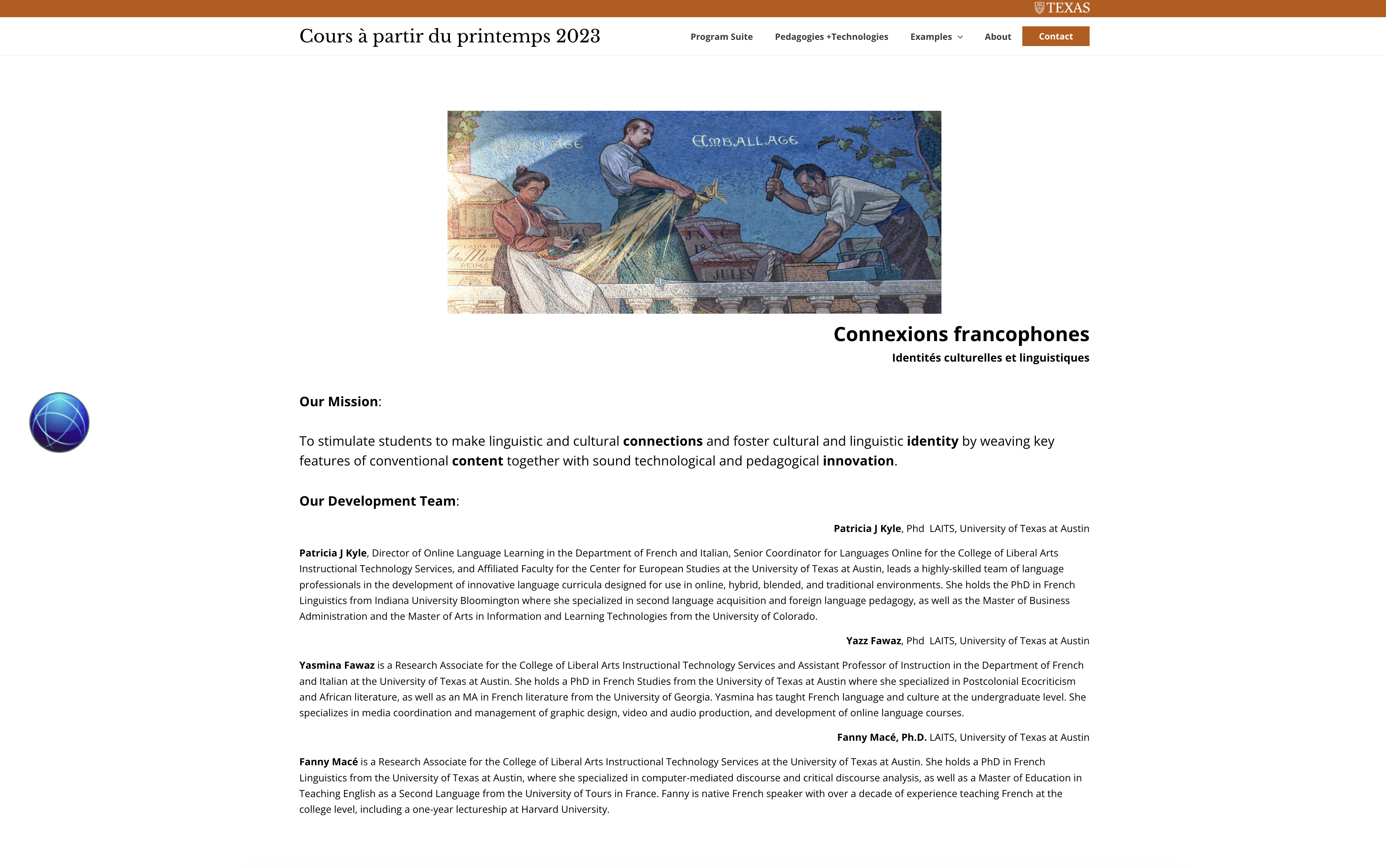
Ways to tackle About:
- Emphasize the mission since it’s the main goal of the site
- Use color block to represent each members of the team
- Use colored text differentiate name, role, contribution on the project and other description
- Full width of the banner (add color overlay to ensure the readability)
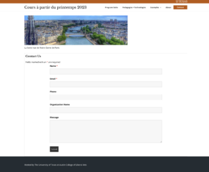
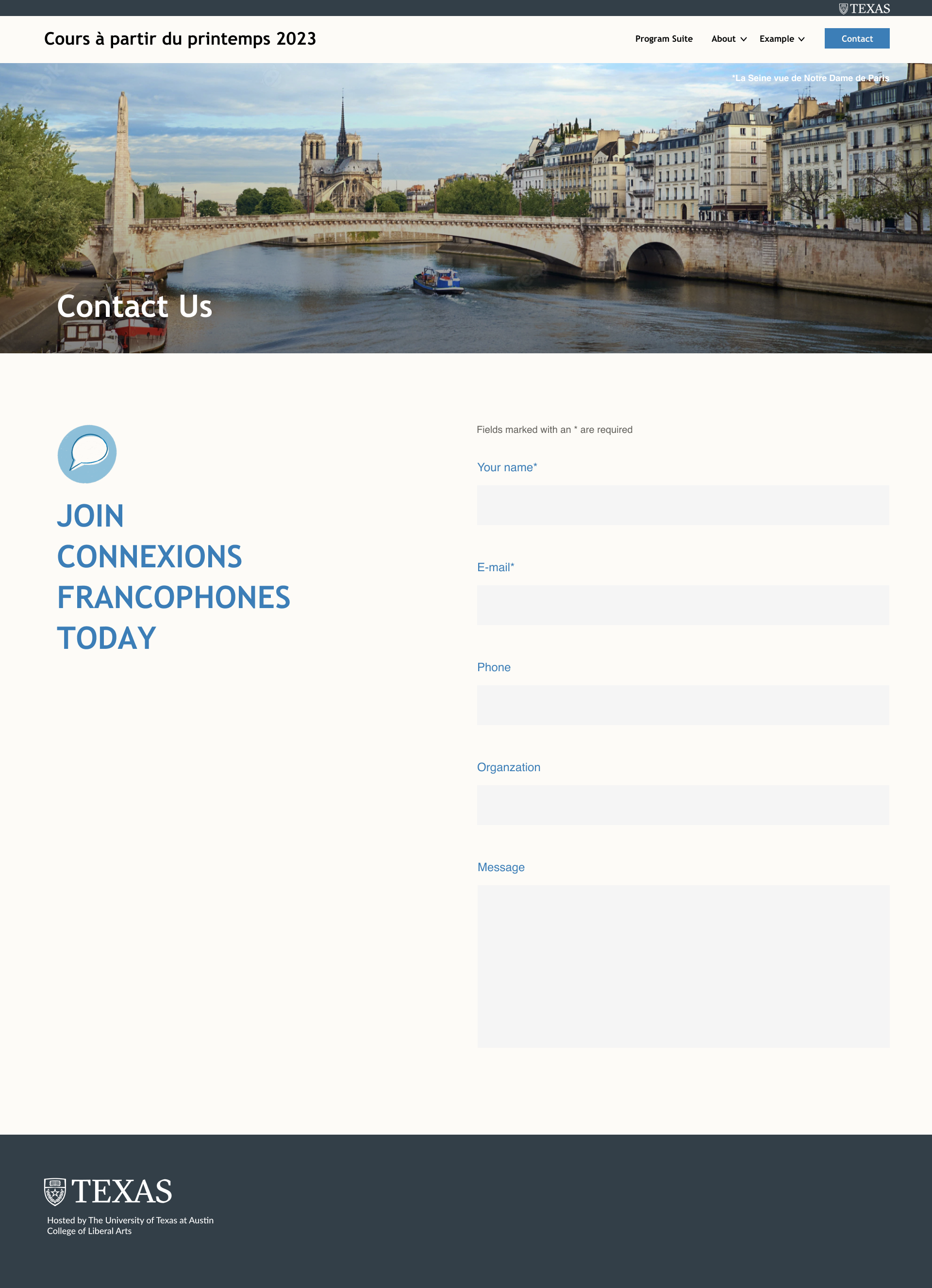
Issues on Contact
- Not consistency color use
- Blurred image at the top
- The caption of the image looks like a part of the contact page
- Text about Contact Us is not aligned to any other part of the page
- The bottom padding is to narrow
- Missing the purpose of contact?
Ways to tackle Contact:
- Find new copyright picture
- Full width for the banner
- add the purpose align with the title
- Use the same color of block from other pages as the enter box
Finally I make the developer note for them to code CSS more easily, including text style, color palette and padding.