Value Institute Brochure
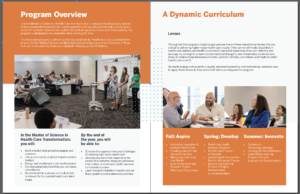
This week, I primarily worked on the Value Institute Brochure. It’s beginning to come together as a print composition, which is exciting. I’ve met with Maddy over the last few days to iron out layout details. It’s been challenging to find ways to improve the existing brochure, since it’s already such a strong piece. I’ve also gotten to think about things I usually don’t think about when designing, such as paying minute attention to the cropping and positioning of photos. It’s definitely been a learning experience.
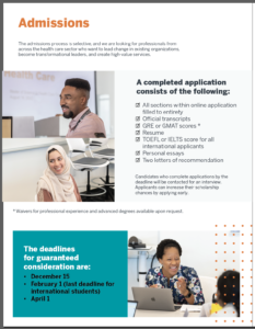
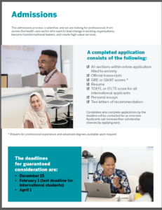
Another aspect of the brochure I’ve been working on is how to incorporate the colors for both Dell Medical School and McCombs School of Business without overcluttering the palette or losing the core UT identity. This has also been a challenge, trying to balance Dell Med blue with McCombs yellow with the quite overpowering burnt orange. Here are some examples of color work on the Admissions page.
STA Crest
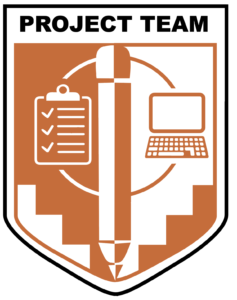
In between working on the brochure, I’ve also made edits to the project team STA crest, going off of De’sha’s amazing feedback! I was doing a bit of research on heraldry for a personal project, so inspiration and visuals from that crept into my design. Now, the design has mostly been finalized, and I’m just working on the finetuning.


