Dana Center
Dana Center: Arkansas Progress
Good Wednesday! I have recently received an email regarding changes to the Arkansas template, and have begun implementing these changes. I will update my blog once I have more progress on this!
Dana Center: Strategic Direction Progress
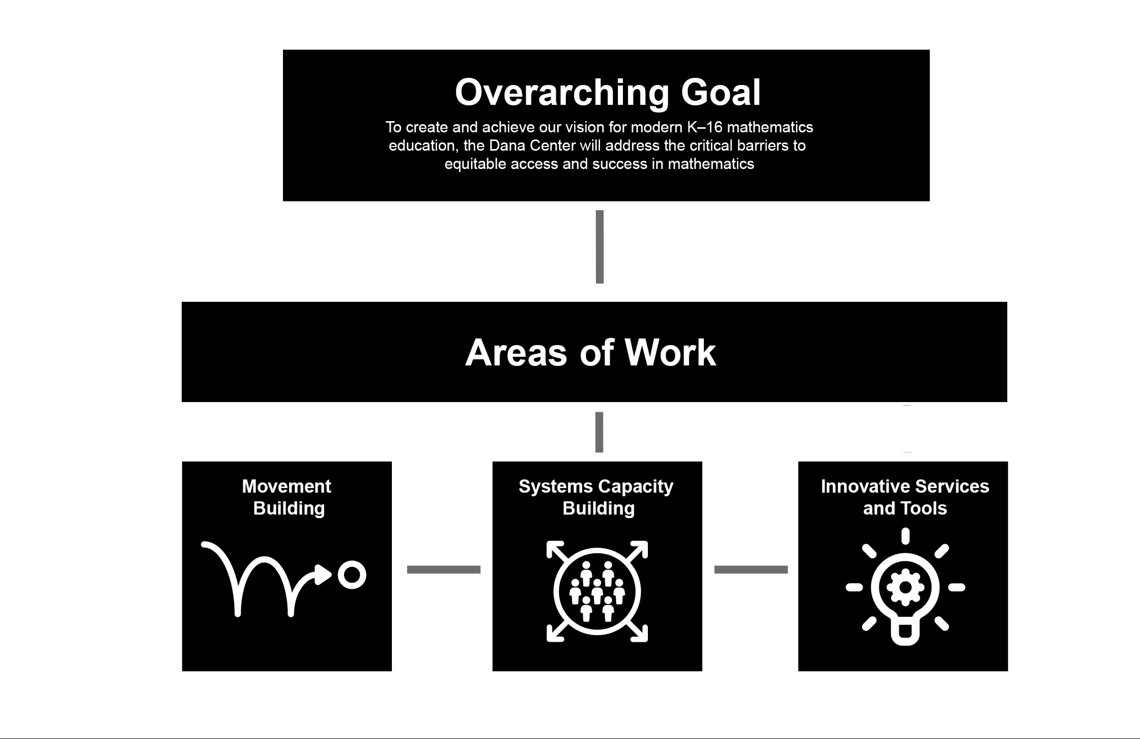
I was recently assigned to the second infographic for the strategic direction portion of the Dana Center project. This entails devising an infographic based on specifics that our clients have requested. Each of these infographics will be used in a variety of mediums, from powerpoints to potentially print, so they have to be modular and easy to move around.
For this particular infographic, we were given this basic outline:
- Graphic 2: Strategic Priorities
- This graphic will feature our overarching goal, with our areas of work surrounding it. This could look like a circle of arrows (with each area of work being an arrow) or something similar.
This will be used as part of our overall strategic direction document as well as in slide decks.
- This graphic will feature our overarching goal, with our areas of work surrounding it. This could look like a circle of arrows (with each area of work being an arrow) or something similar.
- Text components:
- Overarching goal:
- To create and achieve our vision for modern K–16 mathematics education, the Dana Center will address the critical barriers to equitable access and success in mathematics.
- Areas of Work:
- Movement Building
- Systems Capacity Building
- Innovative Services and Tools
- Overarching goal:
For my first draft of this, I was experimenting with different ways to lay out the ideas. I attempted something like this:
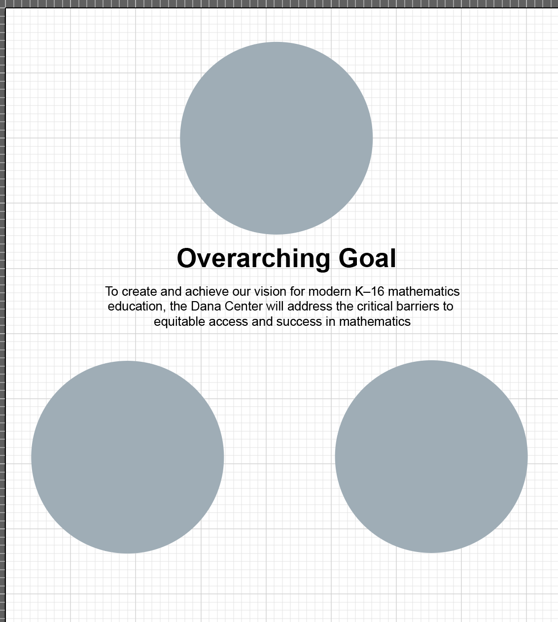
As Cristina pointed out, circles don’t really fit the general structure of these infographics, as we are trying to keep them modular. She sent me some really helpful sketch layouts ideas for a more modular, square style graphic, and I worked from there:

I then drafted up two separate versions, based on the top center and top right options she created.
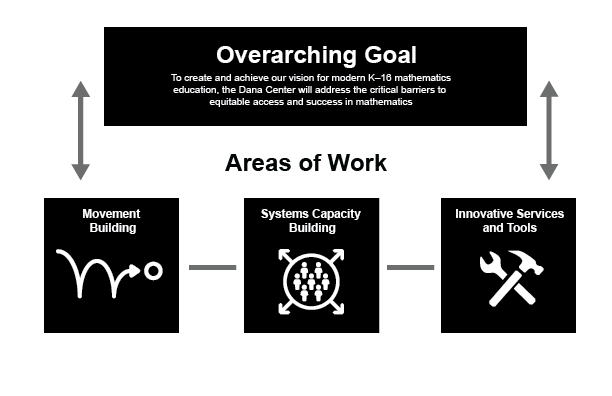
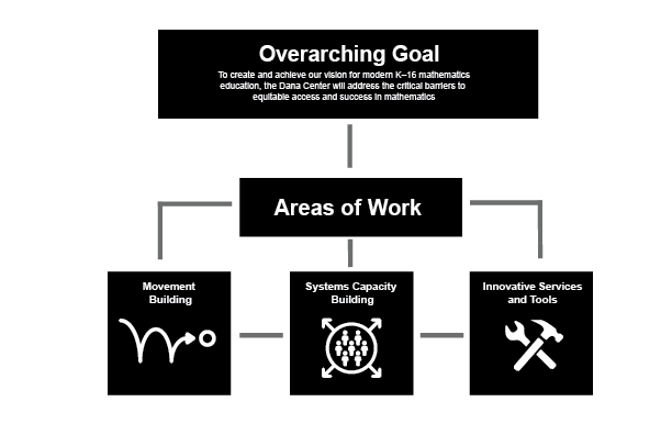
These are definitely a step closer to the general style we are going for. Maddy suggested I change the symbol for “Innovative Services and Tools,” as the Dana Center focuses on mathematical tools – not literal ones. Additionally, the amount of arrows on the drafts make them a bit hard to parse, so I decided to remove as many as possible.
My current drafts look like this:
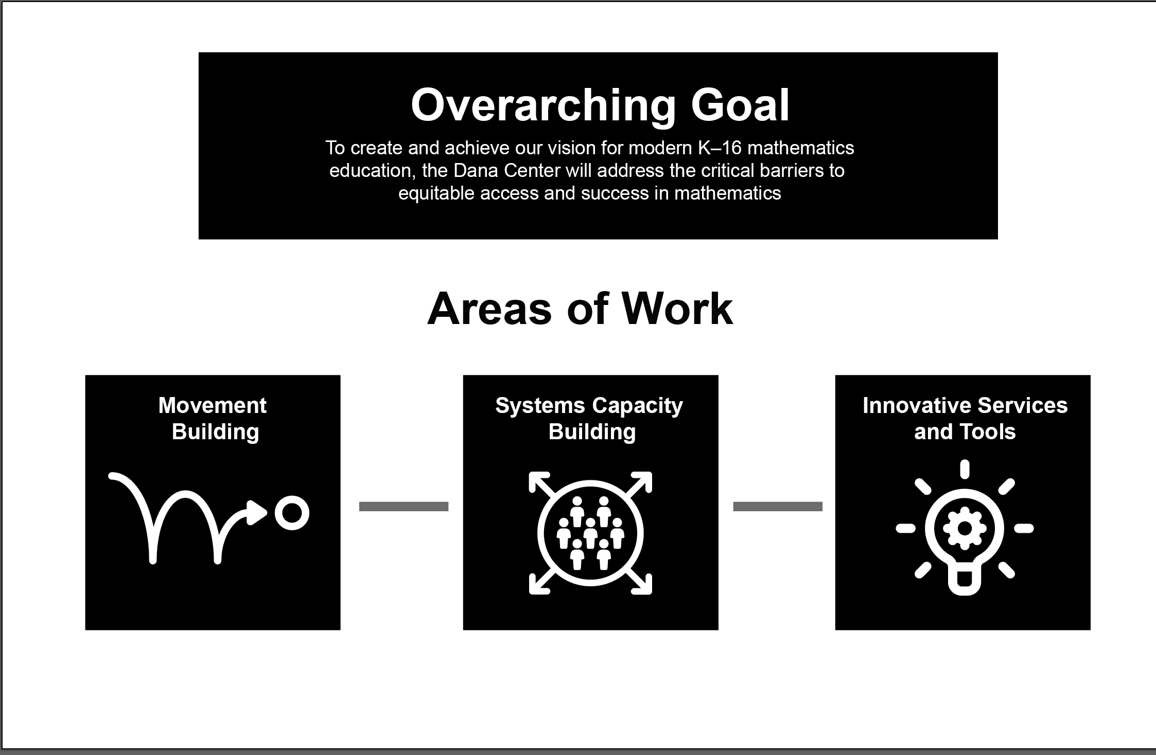
I will update this more after I gain more feedback, and make further changes to these drafts. It will also look quite a bit different once we add colors and/or other design elements.
Iconography Training
Furthermore, I spent some time this past week on the Iconography Training. I will need to take a break from this for some time, so I wanted to share some progress I have made so far.


The communication and video ones were pretty straightforward, but I had a lot of fun making them so far. Additionally, I really like how the reading one came out, and am considering still how I can add more pizzazz to it!