InDesign P.2
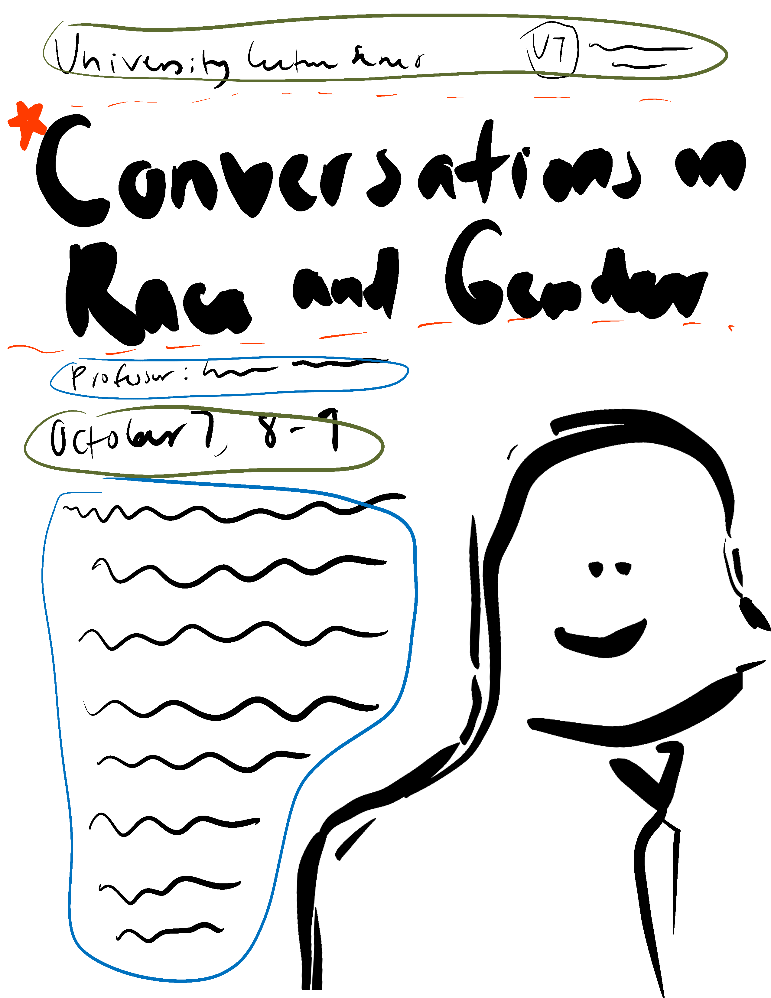
Above are my color palette and the compositional layout of the poster I was planning to make. Here is how it came out with Megan’s suggested edit of bringing down the body text size. I went from 16pt to 14pt which I think helped in creating more hierarchy.


