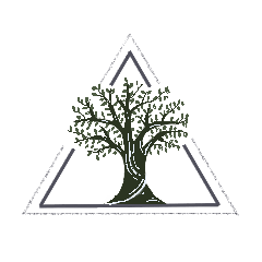
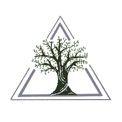
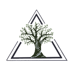
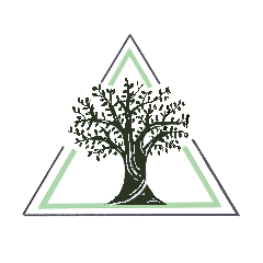
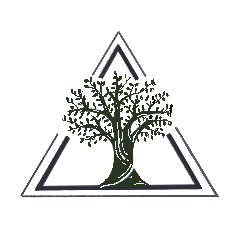
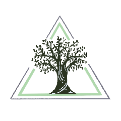
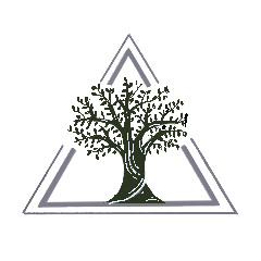
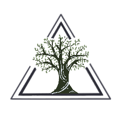
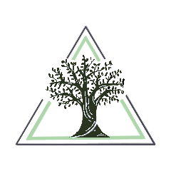
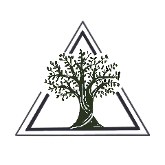
Religiology Logo
I was given the task to create some logo design drafts for a religiology website. I was given a color scheme of natural green tones and was given some sketches by the client for inspiration.
When think of the concept I envisioned the use of trees and geometry. Trees equal growth, prosperity and showcase how we are rooted into our faith. That is how my first design was created.
I was having trouble at first creating my second design, but I decided to continue with the theme of trees. The difference with the second design is that I used a triangle as the shape to surround the tree to represent the Father, the Son, and the Holy Spirit. In addition, triangles are the strongest shape.
Based on review, we decided that the vision of the second design is best to present to the client and I had to create some adjustment to the image, such as thickening the second line and changing the colors of the tree and leaves. These are the edits I came up with.
I included different variations of the trees, ranging from different colors and perspectives. Lastly, I did more edits on the images.

