Logo Design for Religiology
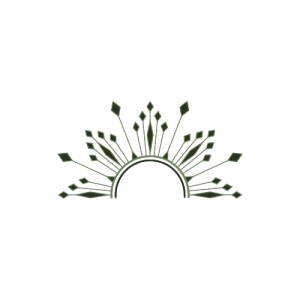
I was assigned to work on a logo for the Religiology department. The clients provided us with a design brief that included a color palette, 240×240 dimension requirements, and two sketches for inspiration (see below). Using Illustrator and Photoshop, I created several drafts and made edits as I received feedback. I’m going to walk through my thought process and some of the feedback. This is still ongoing.


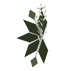
Here are the first two drafts I made. These first few drafts were intimidating because it felt like there were so many possible things to do. So I took the rhombus shapes from the sketches provided and used that as a guiding force. The feedback I received was that the logos were too complex for easy visibility. Also, Suloni and Valerie wanted to see me use a different shape and use the new, brighter color palette . I also stopped using Photoshop and switched to Illustrator, which I probably should have started out with.
Here is the third draft I made, I am not really sure what my thought process was, but I was playing around with different shapes and the circle seemed spiritual in a way, like the circle of life. When the overlapping circles happened to make the shape of a crescent moon, it made sense to me because the moon also seemed spiritual. Then, I placed a plant inside to tie in some of the client sketches. Based on the AI Logo training Valerie assigned me, I tried to focus on visibility and balance.
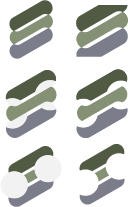
After deciding to do a little more reading into what religion entails, I made this fourth draft. Religion is highly centered around belief and rituals, so I decided to make something with repetition in mind. Also, I read that salvation is very important in religion so as the iterations continued, I tried to kind of create an S shape and but that’s not very relevant. I ordered the colors in the palette from gray at the bottom to greenest at the top because I thought that it could symbolize something with belief in a higher power. I don’t think this logo makes sense.
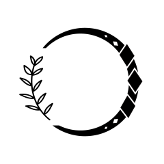
Valerie and Maddy later sent me suggestions that helped me make this fifth draft. They told me to be wary of balanced and aligned curves that follow the shape of the other shapes. For example, in my third draft, the plant stem does not follow the shape of the circle, which is distracting. They also recommended I use black and white then adjust later.
That’s it for now, still working on this and Clio. And I will add that school is not easy! Have a good week.


