Studio Color Correcting
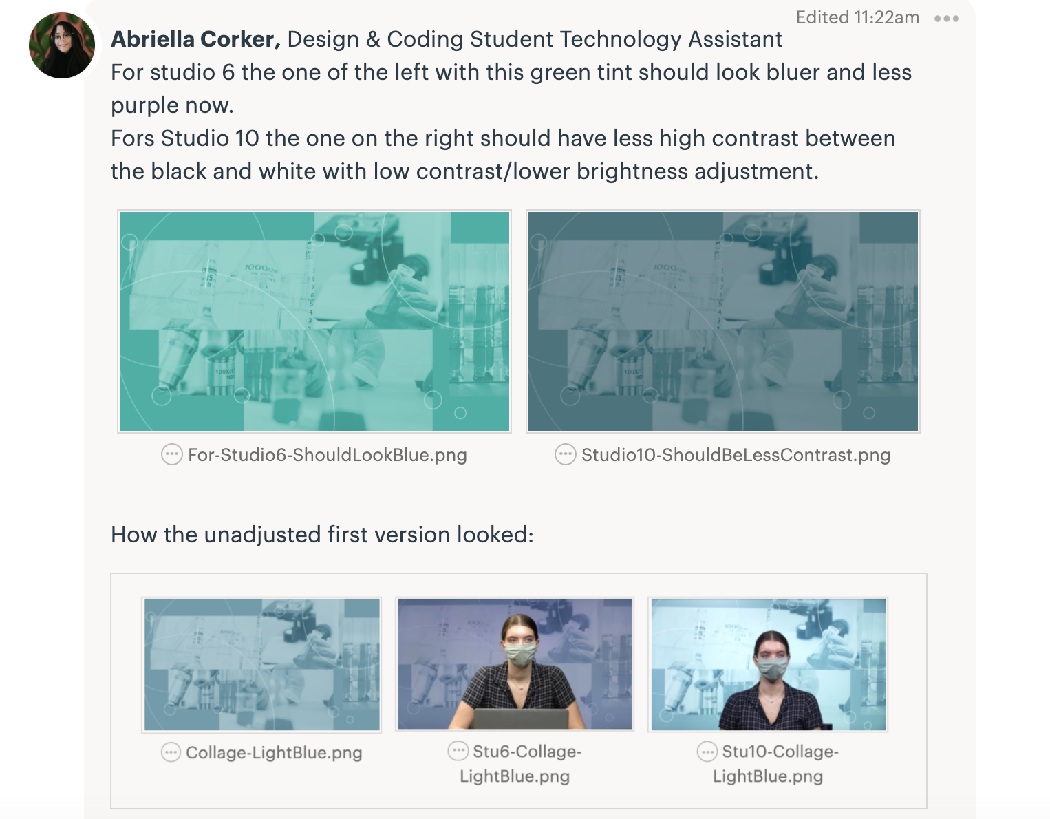
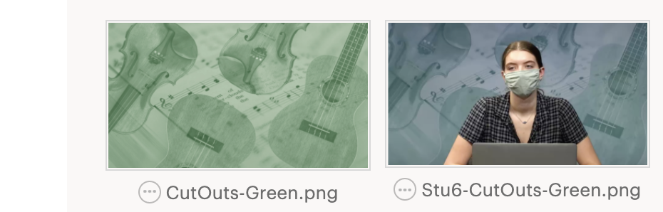
Studio 6 and 10 have different lighting that is affecting the way the wall monitor backdrops appear. One has warmer lights and the other has natural lights. I had a zoom call with Miguel and Maddy to figure out how we can color adjust backdrops before sending them out to studio tests so that they may be more accurate to the colors we want them to look like. In Studio 6, all the images get a purple tint. We realized that if we make something in green the purple tint will make it look blue like so:
Then we noticed that in Studio 10 the lights give everything higher contrast along with a tad bit of tinting. As you can see below comparing the first image with the last. To fix this we need to export a second version of a background with adjustments to extra-less contrast.
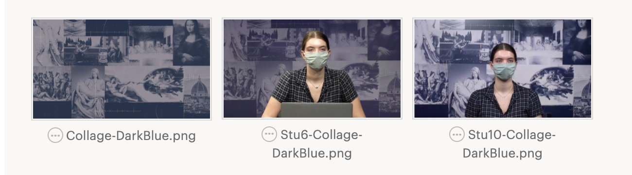
For my edits, I added a transparent overlay of purple to the original BG and then clicked on the original layer underneath the tinted purple one to adjust the hue until it looked blue again. As I suspected adjusting for a more green made it look blue underneath. This is how the two different backdrops for the Studio 6 and 10 ended up looking like.