Hello!! Here are some updates!
This is the progress of a COLA ID I edited:
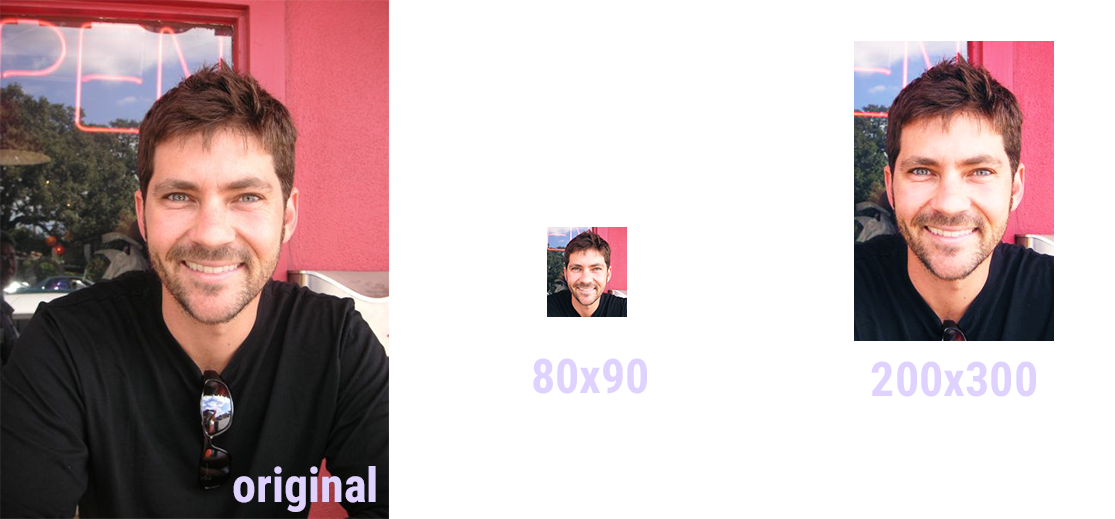
Progresso!
I think I made the 200×300 image a little too harsh in terms of lighting. I might tone that down a bit. I’ve also noticed that a lot of the photo IDs I’ve worked on have usually pulled very warm tones. They’re often very yellow and I usually have to go in and change the color balance to make the image cooler.
I also fixed up the illustration for Tate! Here are the shampoo/conditioner bottles I drew!

Wew. Look at them just chilling.
This is how they looked before:
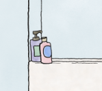
Meh.
Here’s the whole process of them changing in the duration that I’ve worked with them.

Progressssssoooo
I adjusted the bottles so that they’re more upright (left-most image), I added a shadow using the line art black (#1e1d1c) and put the opacity to 30%, and finally brought the opacity from 30% to 15% for a less harsh shadow.
Non-work related, but I designed a T-shirt for an organization I have been with for a long time! Here they are!
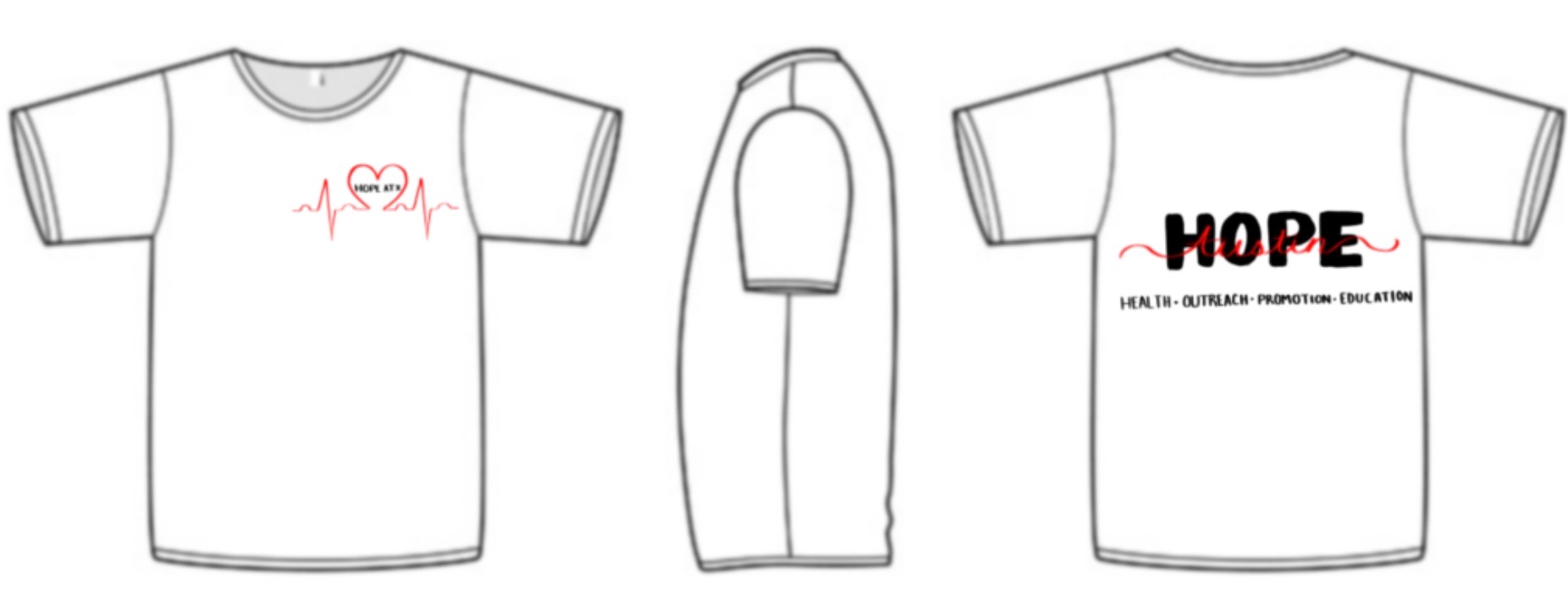
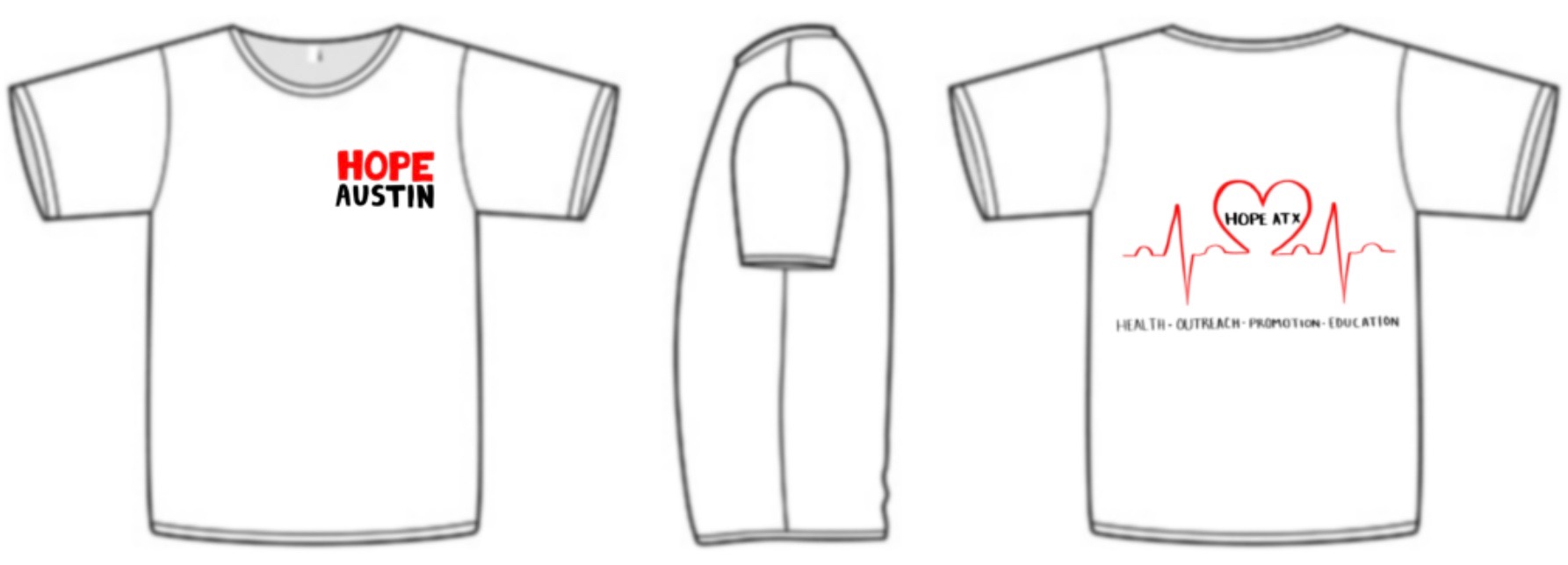
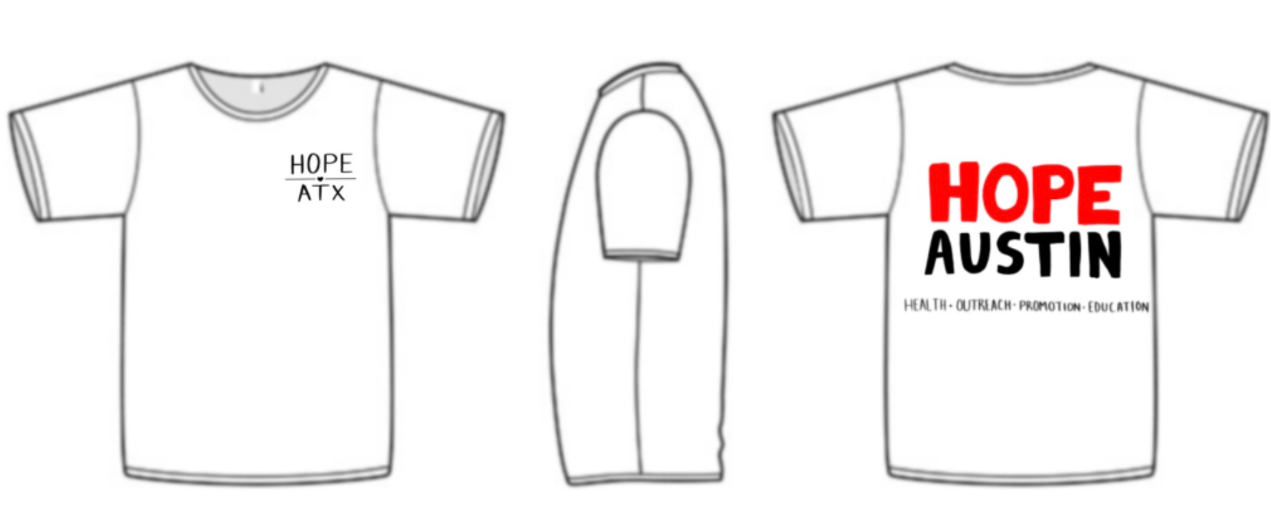
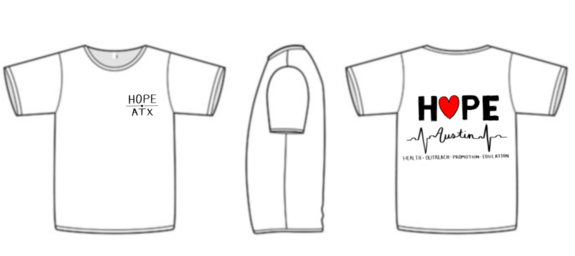
There are 4 designs!
And here’s what my co-chairs ended up liking:
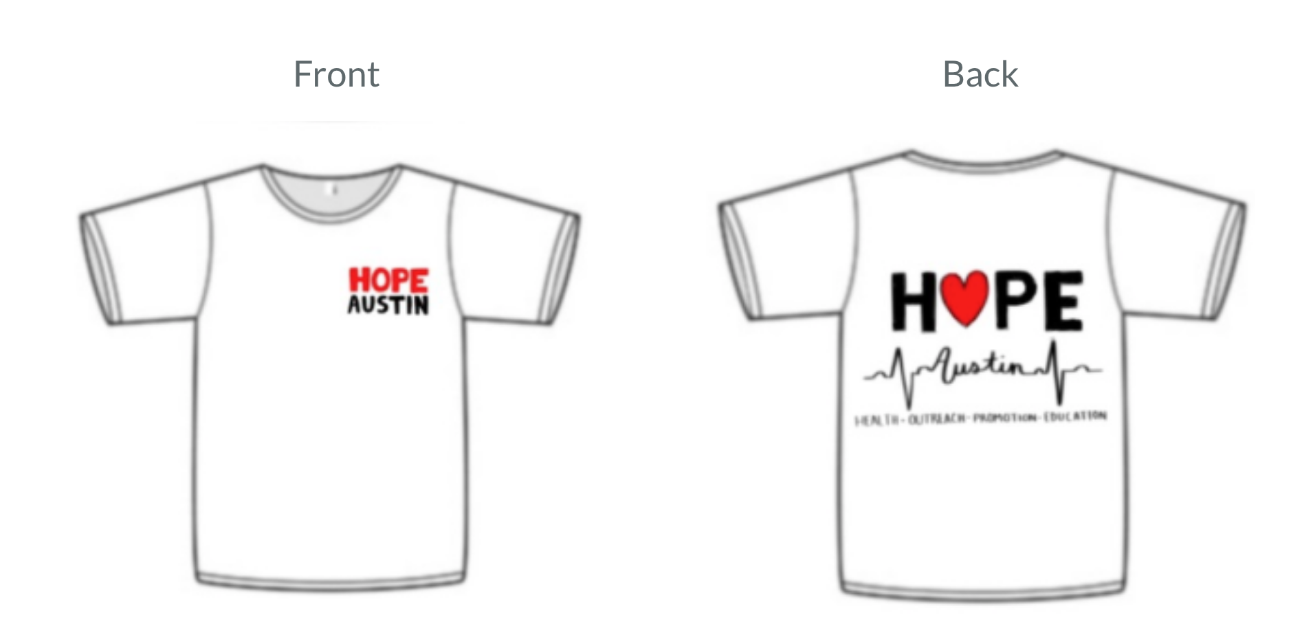
Final draft??? :0
And that’s all I have for 2day!!!!